Installation
To install Compare products:
- Download WooCommerce Compare Products Extension PRO Version or Lite Version
- Upload the woocommerce-compare-products folder to your /wp-content/plugins/ directory
- Activate the ‘WooCommerce Compare Products’ from the Plugins menu within WordPress
Upgrading from Free to Pro
If you have the Free version installed you can safely upgrade and NOT lose your Compare data IF you follow these steps
- It is always a great idea to run a Database Backup BEFORE you attempt the upgrade, that way if something goes wrong we have a reasonable chance of recovering the Compare Data you have created with the Free version.
- On your sites plugins menu Deactivate the Free version which is Compare Products for WooCommerce (IMPORTANT!! DO NOT delete it yet or you will lose all of the Compare data you have created)
- Install the a3 Dashboard plugin (Download it from your a3rev Software My Account page). Install it and use your a3rev customer account creds to connect the dashboard to your customer account)
- Then Go to the a3 Dashboard > Plugins menu and to the WooCommerce Tab. Scroll down until you see the WooCommerce Compare Products card and Click the Green Install Button. Once installed, then activate it.
- Now check that the Compare data has been copied to the Premium version. A major difference with the Pro version is that your Compare data created on the Free version is either applied to a matching Product Attribute or if none exists, a Product Attribute is created. If it has you can now delete the Free Version.
- If the data does not show in the activated Premium, DO NOT delete the Free version. Instead go to the a3 Dashboard > Support menu and raise a support ticket and we will help you.
Admin Settings
When WooCommerce Compare Products is installed and activated it auto-creates a Compare Products admin section on your WooCommerce site.
Getting Started – Planning
It is important to always remember that the compare products feature is a selling tool. You are compiling a data set of product Features and or specifications that when compared side-by-side will help your customers make a purchasing decision.
It can be a daunting task to add the compare feature to an entire store of 100’s or 1,000’s of products. The good news is that the compare feature can be added by 1 Product Category at a time, and there are 3 ways to add it (more about that here). Here are our pre-setup suggestions:
- Start with a Single Product Category. Products in any store that have similarities are grouped into categories.
- Now make a list (with pen and paper, Word Doc etc) of all Features / Specifications that are common to the majority of products in that Category. The list should include anything that you think is a ‘selling’ feature.
- Once you have your list of Comparision features – you are ready to get started.
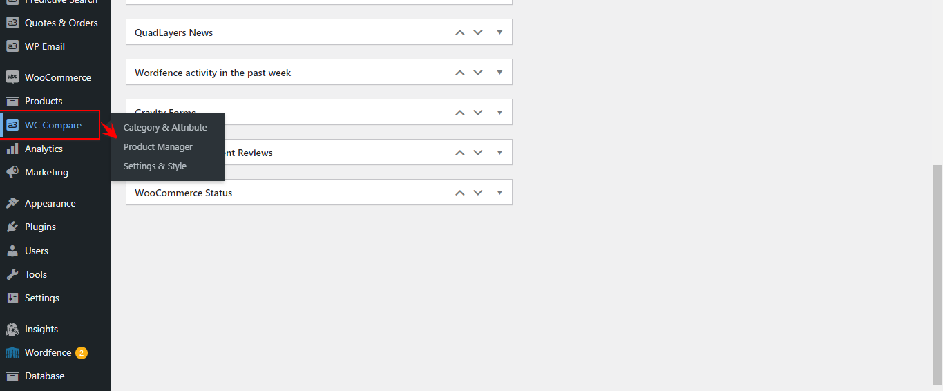
Setup Compare Categories and Attributes then assign them to products
Step 1 – Creating Compare Categories
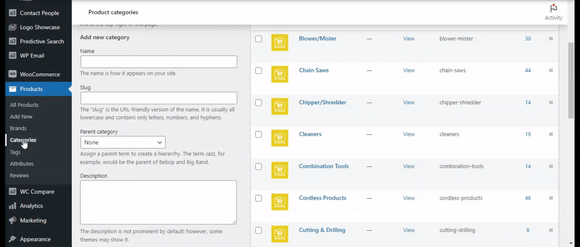
Now you have your list, go to the Product Categories Menu, edit the Product Category that you have chosen and switch ‘ON’ the Compare Product feature for that category.
If you have not created any product categories yet, you can apply the Compare Feature as you create it.
In this documentation, we have used a clients website to illustrate the features.
Step 2 – Creating Compare Attributes
Now that we have activated the Compare Products feature on the product categories, the next step is to take the list you made and create then as Product Attributes.
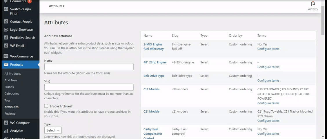
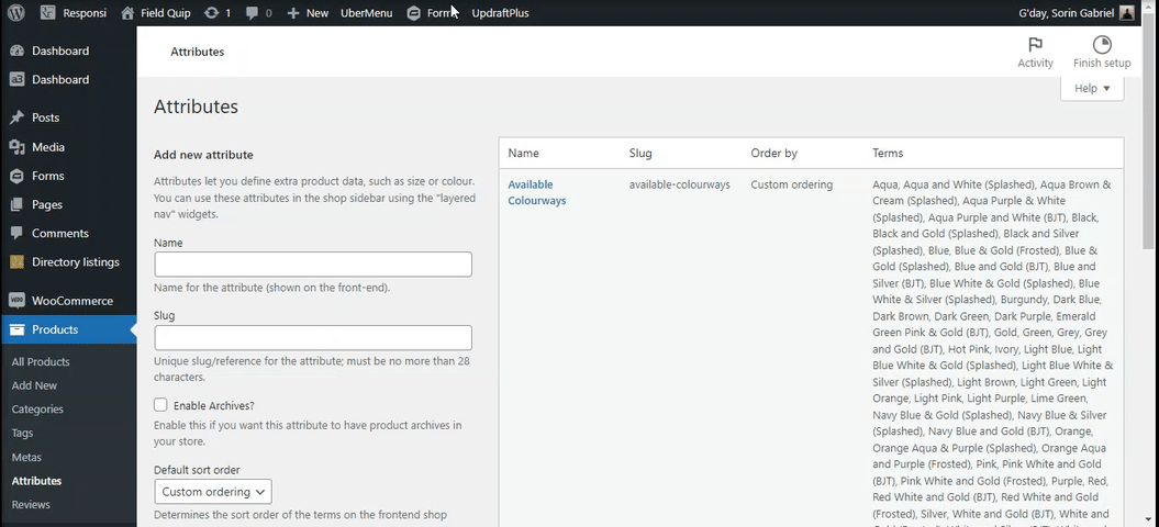
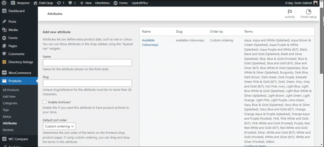
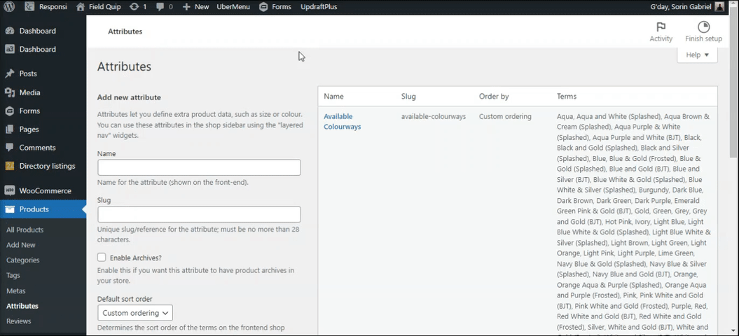
- Go to the Product > Attributes menu.
- From the list you created in the planning stage, now add each item as a Product Attribute.
- Tip 1. The name you enter here is the Comparision Field Title that Customers see in the Comparison Data set on the Product Page Tab and the Comparision table.
- Tip 2. Keep the Attribute name short and concise. The WooCommerce attribute slug length allowed is limited to just 28 characters.
- Tip 3. If you have a longer Attribute name copy and paste it into the Slug field and it will automatically be shortened to 28 characters. If you don’t do that and the name is longer than 28 characters – the Attribute creation will fail.
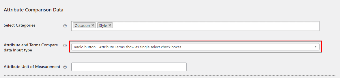
- Assign the Attribute to the Appropriate Compare Category. You will see that a new section has been added to the Product Attribute Creation / Edit Menu – “Attribute Comparision Data” The first field is “Select Categories”. By assigning this attribute to a Category it becomes part of that category’s Compare Data Set.
- Tip!. An attribute can be assigned to an unlimited number of Product Categories. For example if you are selling items that you want to show ‘Warranty’ you can create the ‘Warranty’ Product Attribute and assign it to all Product Categories that have the compare feature activated.
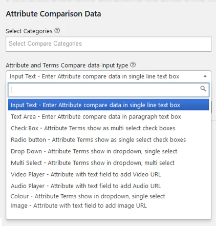
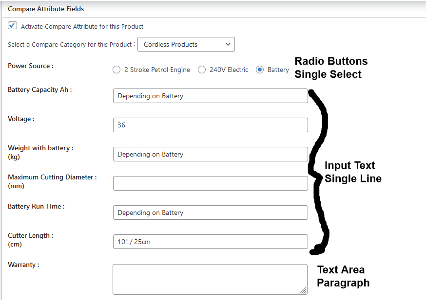
- Set the Compare Data Input Type. Chose the data input type from the dropdown list. This section is designed to make your entry of the Comparision Values much faster and more flexible.
- Attribute Unit of Measurement (Optional). Again this is a data entry time saver.
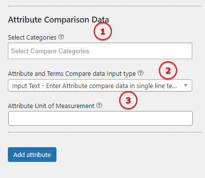
Image Legend:
1. Select Categories – An Attribute can be assigned to any Product Category that is activated for Product Comparisons. Attributes show on the comparison table as the Comparable Product Attributes.
2. Attribute and Terms Compare data Input type – Use these fields to determine how this Attribute will display its compare data.
3. Attribute Unit of Measurement – data-content=”e.g kgs, mm, lbs, cm, inches – the unit of measurement shows after the Attribute name in (brackets). If you leave this blank you will just see the Attribute name.”
Step 3. Creating Attribute Terms.
Adding attribute terms depends on the Input Data Type you have set for the attribute. The dropdown list is self-explanatory.
No Terms Required:
Input Text (Single Line) & Text Area (Paragraph Text Box) – no terms required, as you enter text in the fields when apply it to a product if it is a different value for products or variations.
Terms Required:
Check Box (Multi-Select), Radio Buttons (Single Select), Dropdown (Single & Multi-select). All 4 require terms to be entered. This is a time-saving feature and also keeps the data consistent.
Colour – Attribute terms shown in dropdown, single select. See this section on how to use it.
Image – Attribute with text field to add Image url.
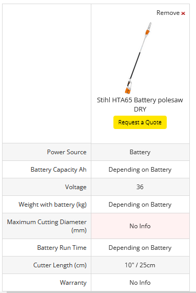
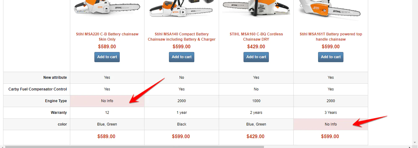
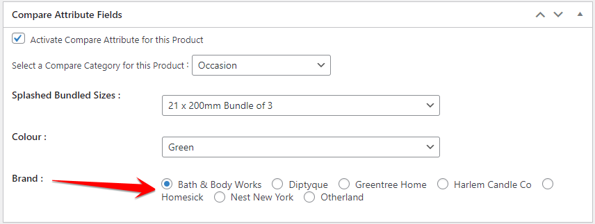
See the screenshot of a Comparison data set where a Product Attribute ‘Power Source’ has Input Data Type – Radio Buttons set. You can see the 3 terms that have been set for the ‘Power Source’ Product Attribute are ‘2 Stroke Petrol Engine’, ‘240Volt Electric’ and “Battery”. When completing the Comparision Data set on the product, the site Admin just needs to select 1 checkbox – saves having to type the data each time and keeps the data consistent. The rest of the data fields in the screenshot are data input type, Input Text (Single Line) or Text Area (Paragraph).
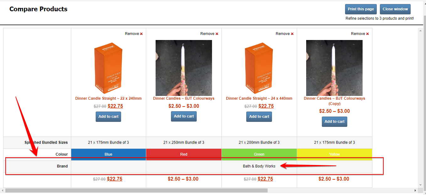
And this is how that would look on the Compare Table
In our example will create a new attribute and assign it to a category named Chain Saws with the data input as Radio button ( Attribute Terms show as single select checkboxes ) and 2 terms : Yes and No. You will see in the video that on our site there are many specifications, each specification/attribute can be assigned to an unlimited number of categories.
If an Attribute has terms these are auto created as the newly created Compare Features Input Values.
Step 4. Sort Compare Attribute Order
Now that you have taken your list and created each item on it as a Product Attribute, Assigned to at least 1 compare category and added terms (if required) Go to the WC Compare > Categories & Attributes menu. There you will find all categories that have the Comparison Feature turned ON. On the Product category listing that you have just assigned the Attributes to, open it and you will see all the attributes you created. We call this a Comparison Data Set.
On this interface you use drag and drop to sort the Compare Attributes into the order that you want them to show in when compared.
You can also manage all other features and functions of Compare categories and attributes from this menu.
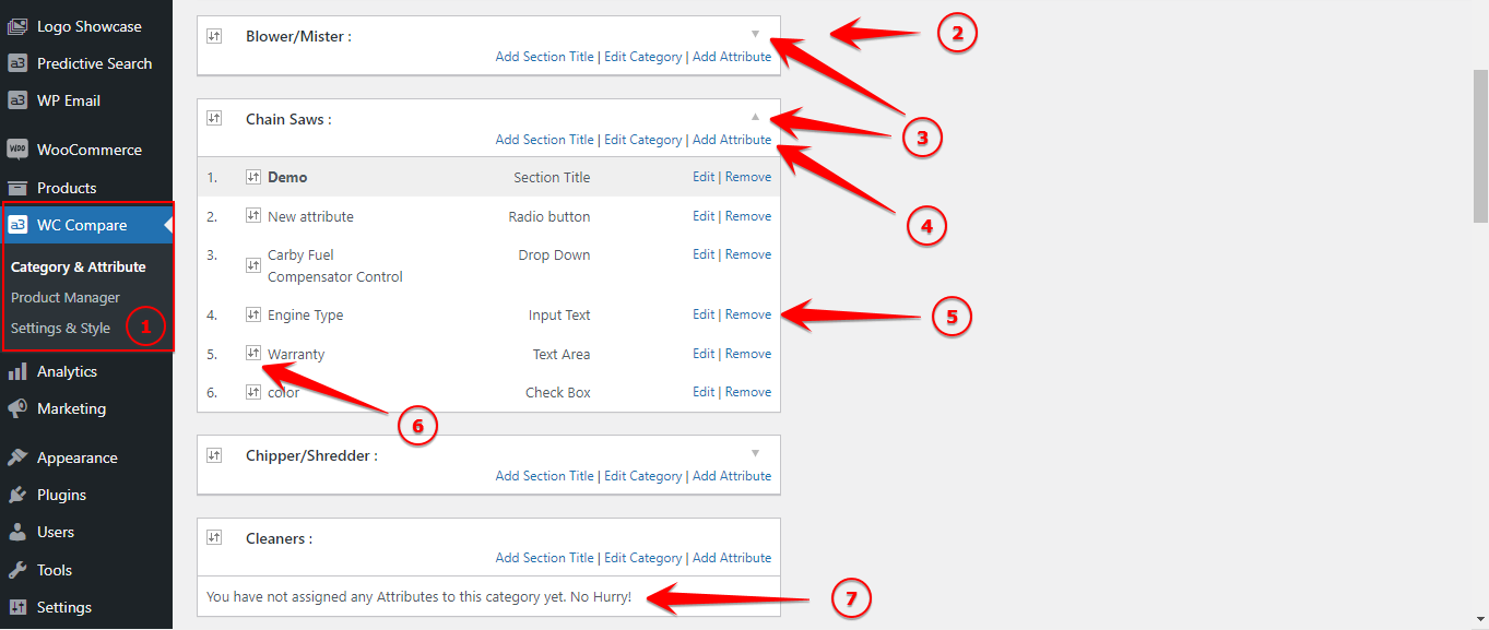
Image Legend:
1. Woo Compare Settings – Here are the most important settings for our plugin. On default the Category & Attribute will be open.
2. Categories – All Product Categories that have the Comparison Feature turned ON are auto shown on this panel. Each Category shows as a floating bar with the category Name.
3. Dropdown Arrow – Use the dropdown arrow on each category to view all Product Attributes that have been assigned to that Product Category.
4. Shortcode links – Easily access the Category and the Attribute page. Also you can create comparison table Section Titles and drag and drop into place.
5. Attributes – Easily control all the specifications assign to the category. Edit or remove any attribute.
6. Drag and drop – To sort the Attributes display order in each category. This is the order that Attributes will show on the front end in the Comparison table.
7. When there are no features assigned to a category it auto shows that message. When features are assigned that message does not show.
Applying to Products
There are 3 ways to Add and edit Compare features to your store products
- On a Product’s Editor (The slowest way)
- Compare built-in Compare ‘Product Manager’ (Much Faster)
- WooCommerce Product Import / Export CSV (Always the fastest)
In the following sections we will detail each one.
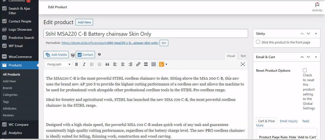
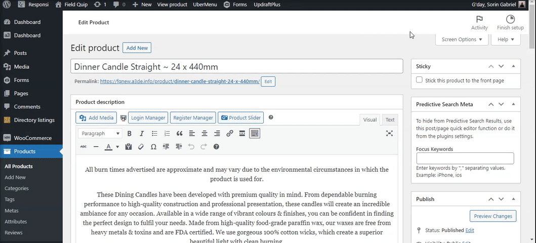
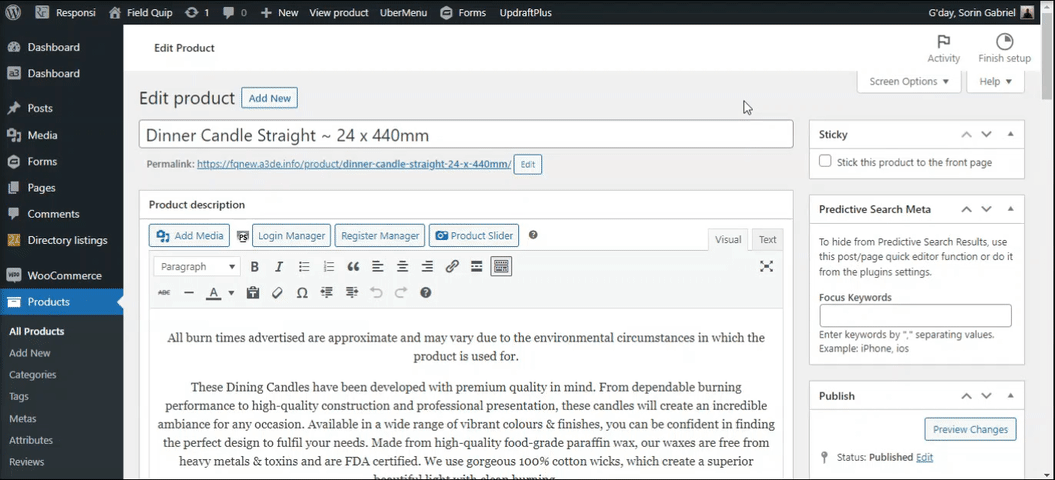
#1. Product Editor
Now that you have the Compare Data set for a Category, you can go ahead and start adding the compare feature to your products. In this section we will show you how to use the Product edit page to add the compare features. It is the slowest way, but good to know how it works.
Go to a product you want to add the compare feature to and edit it. On first install the Compare Meta will be found on the right sidebar of the product page editor. From default the compare feature is turn OFF, giving you the flexibility to roll out Compare to any or all products.
Tip! We recommend dragging and dropped the Compare Meta field to the main page of the editor, anywhere there that you like. It will be much easier to work with.
After moving it from the sidebar to the page editor screen, turn it ON and Select a Compare Category to assign this Product to. Once you select a category, you will see all of the Attributes that you have assigned to that Product category.
Tip! If you don’t see the Product Category in the dropdown list – that means you have not applied the Compare Feature to that category. That will also mean that you probably have not assigned any Attributes to it either.
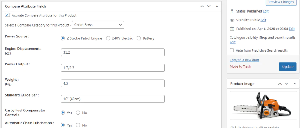
The next image shows the Compare data Set that was created by assigning Product Attributes to this Product Category.
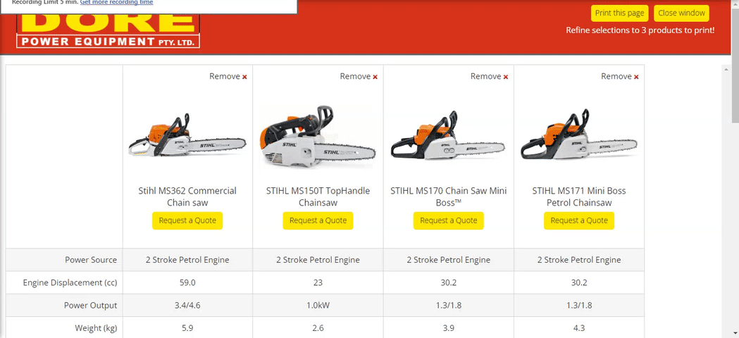
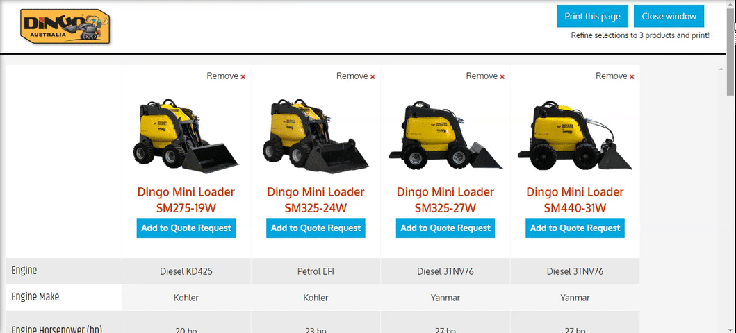
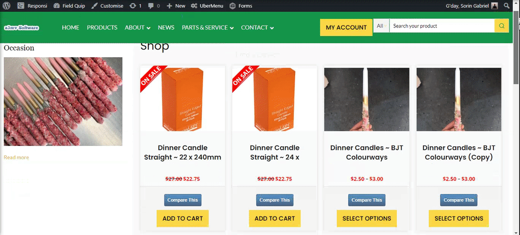
The video below show you how that can look on the Comparison table. It shows 4 Chainsaws have been added to the comparison table.
#2 Compare Products manger
The built-in Compare Products Manager is a tremendous time saver over having to edit each product individually.
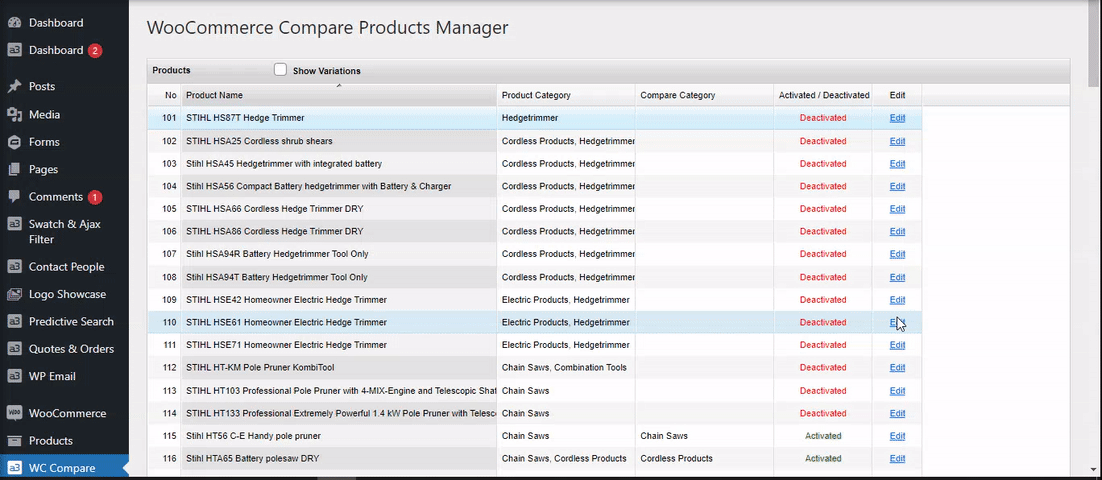
Go to WC Compare > Product Manager. When opened it automatically fetches all active products and Variations (if selected) direct from the WooCommerce products database for easy on page management of just the Compare feature.
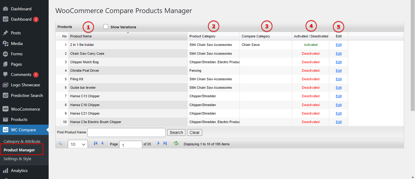
Image Legend:
1. Products – By default it shows parent products to speed up initial loading. Click the Show Variations check box to reveal all product variations.
2. Product Categories are displayed for easy reference.
3. Compare category/s that the products is assigned to is displayed for easy reference.
4. See at a glance if the Compare feature is activated or deactivated for any product and its variations.
5. Edit – Click the edit link and the Compare feature manager for that product or variation opens in a pop-up screen.
*Note – The Product Manager is a PRO version feature. Free version users must visit the actual product page to assign a product and its variations to a Compare category and set the feature fields.
Pop-up manager window. From here you can easily Activate / Deactivate the Compare feature for this product and setup the attributes fields. Activate and the Compare Button shows on the product on the front end – Deactivate and the button is hidden.
#3. Product CSV Sheets
Compare Products is fully integrated with the core WooCommerce Product Import / Export feature. It allows you to Batch add or update hundreds or 1,000’s of products via CSV.
Using CSV is the fastest way to:
- Add existing Compare Features to Products
- Create new Attributes and Terms and assign to existing Categories.
- Even Create new Product Categories for compare.
YES – that is correct you can use the CSV to create Product categories, Attributes and their Terms
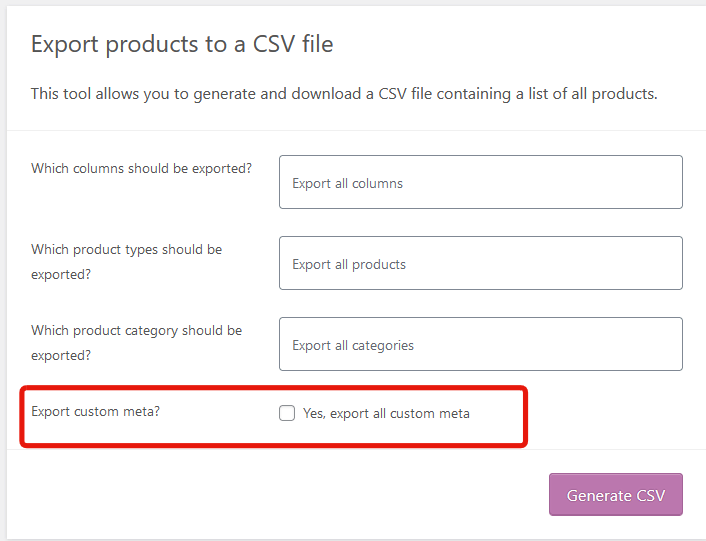
Go to the Product Menu and click on the EXPORT Button at the top. Configure it to export the products and the data that you want and check the ‘Yes. Export all custom meta” at the bottom. see screenshot
Tip! It is always best to set up at least 1 product with compare so that you can see the Compare Meta Columns that are created.
Compare Active | Compare Category | Compare AttributesThis is what the sheet could look like showing the 3 columns
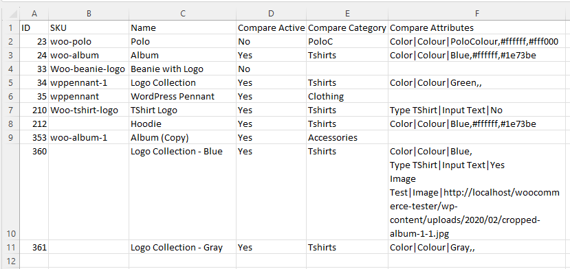
As you can see from the image the format for the Compare Attribute Column is:
Attribute name|Attribute type|Term name or Compare ValueA full list of the Attribute Types is:
Input Text
Text Area
Check Box
Radio Button
Drop Down
Multi Select
Video Player
Audio Player
Colour
Image
so this is an example
Size|Drop Down|LargeWhen the sheet is imported
Logo|Image|http://logo_link_here.jpg In this example it will check if Logo attribute exists on the site, if it does not it will auto create Logo Product Attribute as ‘Image’ type, and the logo image will be assign to product as compare value.
The Attribute will be auto added to the Compare Set assigned to the Compare category that is listed in the rows Compare category.
If a new category is added to the Compare category Column it will be auto created on the site if it does not exist.
Woo Compare Style and Settings
This WC Compare > Settings and Style menu divides the front end display of the product comparison feature in sections that allows you to:
- Set the style and layout of the compare feature on your product pages.
- Set the style and layout of the Compare Widget.
- Set the style and layout of the Compare feature on product cards.
- Set the style and layout of the Comparison table page.
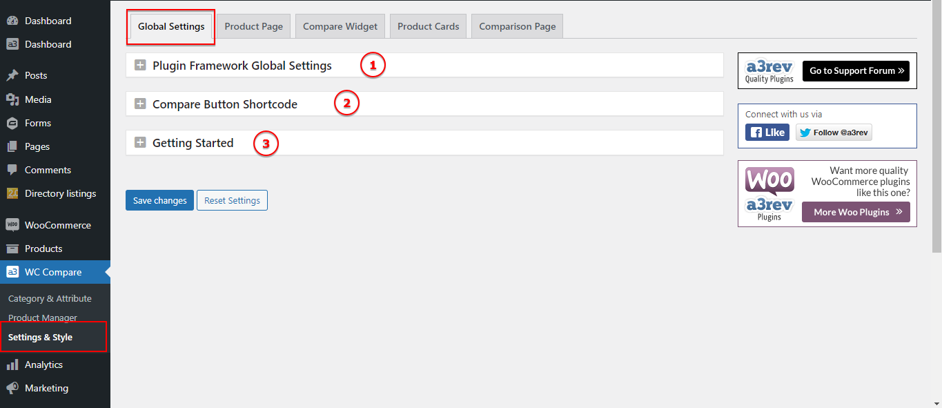
Image Legend:
1. Plugin Framework Global Settings – Open this panel and you will can Check For New Plugin Version, Customize Admin Setting Box Display, connect to Google Fonts API or Clean up on Deletion.
2. Compare Button Shortcode – Display the WooCommerce Compare Products button in templates, page builders like Elementor, Divi and Beaver Builder with the Compare Button Shortcode.
3. Getting Started – Here you will find a Brief Overview of the Compare Product plugin.
Compare Button Shortcode
The Compare Products plugin for WooCommerce provides a useful feature that allows customers to compare products easily. With the Compare Button Shortcode, this functionality can be integrated into a variety of templates and page builders enhancing the user experience.
On General Settings of the plugin you will find the shortcode for the Compare button:
[wc_compare_bt product_id="" button_text="" button_class="" card_display="1/0" ]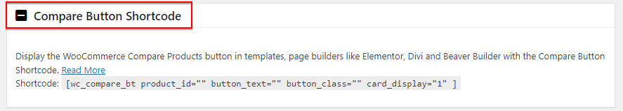
Note:
The compare button show by shortcode will use styles and settings from the Product Page or Product Card settings tab depending on your chosen display parameters 0 / 1.
Parameters:
- product_id : ID of product for this button. Leave empty for automatic get current product id from query loop ( work when use this shortcode on template for product : Elementor, Gutenberg, Page Builder plugin … )
- button_text : Custom text for compare button. Leave empty for use global text from the Product Page settings tab
- button_class : Custom class for compare button.
- card_display = “0/1” : Choose from where the style will be pull. We have 2 parameters: 0 and 1.
Parameter =0 will show Compare as the Button or Linked text style that is set on the Product Page settings.
Parameter =1 will show Compare as the Button or Linked text style that is set on the Product Card settings.
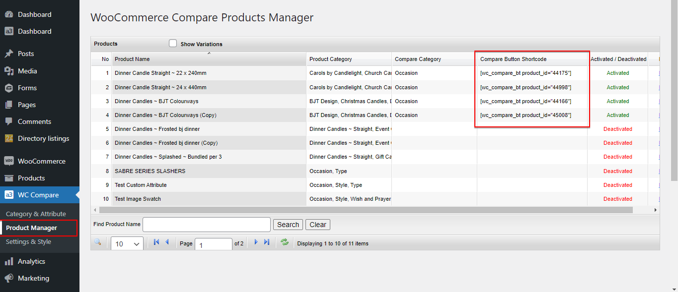
In the Product Manager panel of the plugin are display the shortcodes containing the IDs of specific products assigned to compare. This makes it easy to add a compare button for a particular product anywhere on your website, without having to manually enter the product IDs.
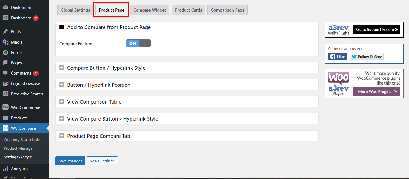
Product Page Settings
From here will gonna setup and style what will be display on products page front end. If this option is turn On, will show a button that will allow to add the product to the Compare Specification Table and a link that will redirect to the compare table page.
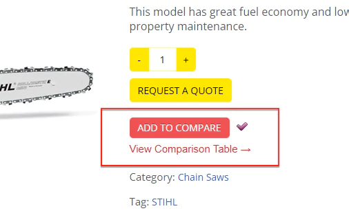
Compare Button / Hyperlink Style
Customize the Add to Compare button/hyperlink.
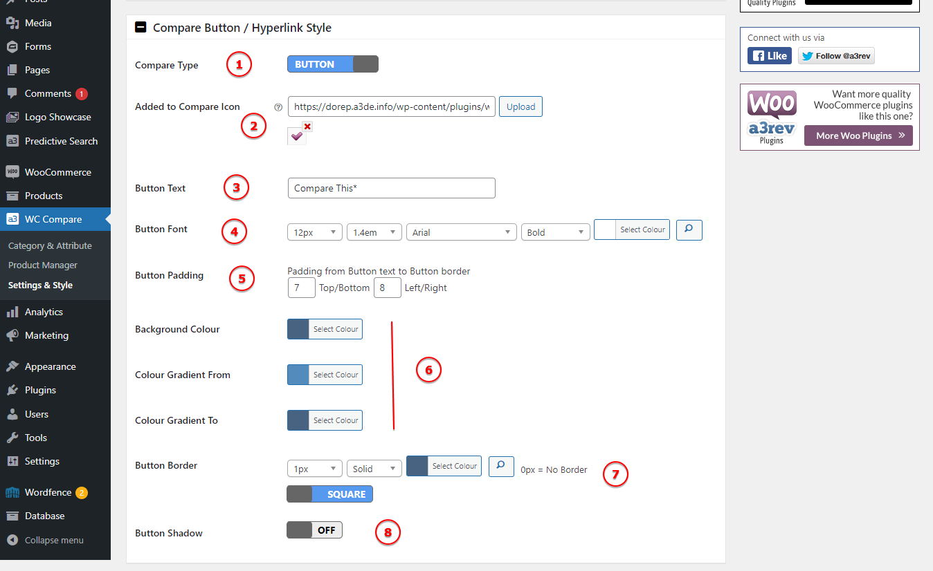
Image Legend:
1. Compare Type – Select to display from button or a hyperlink.
2. Added to Compare Icon – Upload a 16px x 16px image, support .jpg, .pgn, .jpeg, .gif formats.
3. Button Text – The default text is: Compare This*, but you can change it to your needs.
4. Button Font – Select a font and font proprieties for the button.
5. Button Padding – Padding from Button text to Button border.
6. Background Colour – Select the button colour.
7. Button Border – Add a border for the button.
8. Button Shadow – Style the button by adding shadow to it.
Button / Hyperlink Position
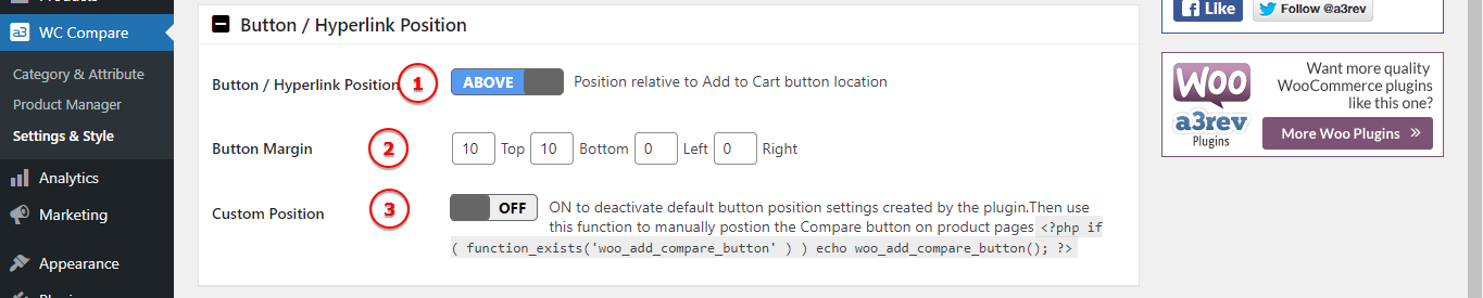
Image Legend:
1. Button / Hyperlink Position – Position relative to Add to Cart button location. It can be Above or Below
2. Button Margin – Controls how far away the button is from other elements.
3. Custom Position – ON to deactivate default button position settings created by the plugin. Then use this function to manually position the Compare button on product pages “<?php if ( function_exists('woo_add_compare_button' ) ) echo woo_add_compare_button(); ?> “
View Comparison Table
As default the View Compare Link is On.
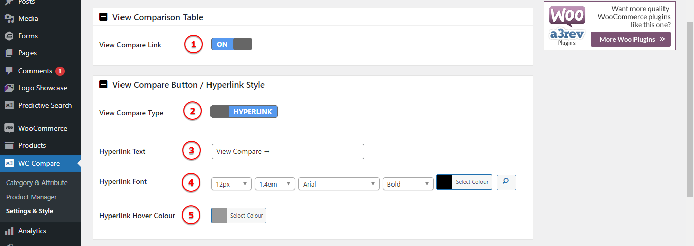
Image Legend:
1. View Compare Link – Deactivate or activate this function.
2. View Compare Type – Choose from a hyperlink text or a button to be display. Same as Add To Compare.
3. Hyperlink Text – The default text is: View Compare →, but you can change it to your needs.
4. Hyperlink Font – Select a font and font proprieties for the hyperlink.
5. Hyperlink Hoover Colour – Select the colour when a pointer is hovering over the text.
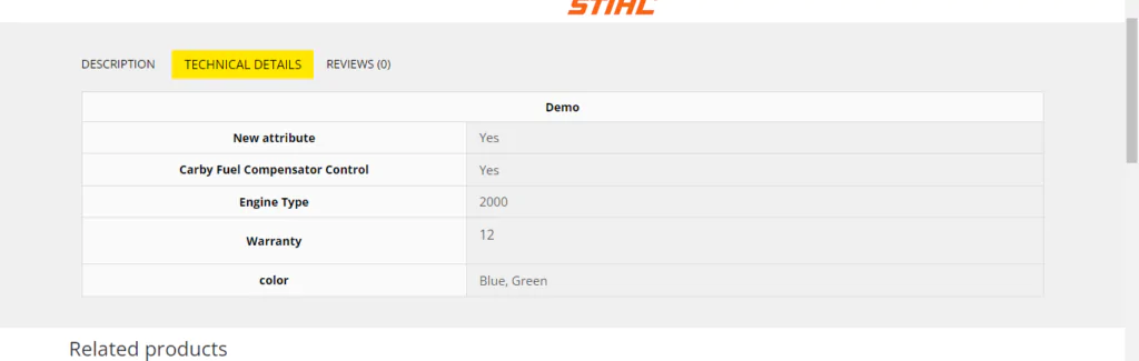
Product Page Compare Tab
This will add or remove the Compare attribute/specification from the Attributes Tab.
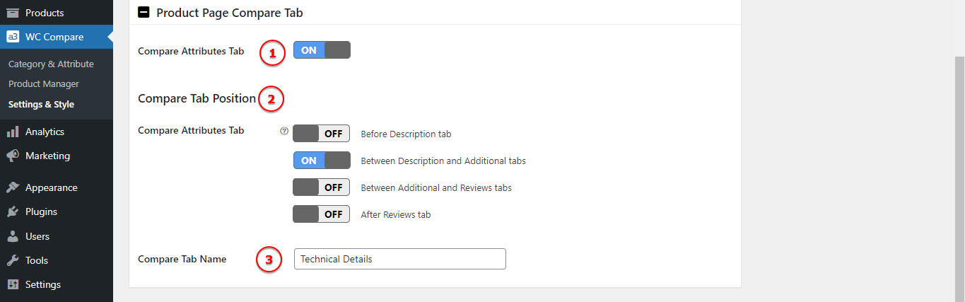
Image Legend:
1. Compare Attributes Tab – Turn On/Off this tab.
2. Compare Tab Position – Select the position of the Compare Attributes tab on the default WooCommerce product page Nav bar. Products Compare feature list shows under the tab.
3. Compare Tab Name – Change the tab name. By default is: Technical Details.
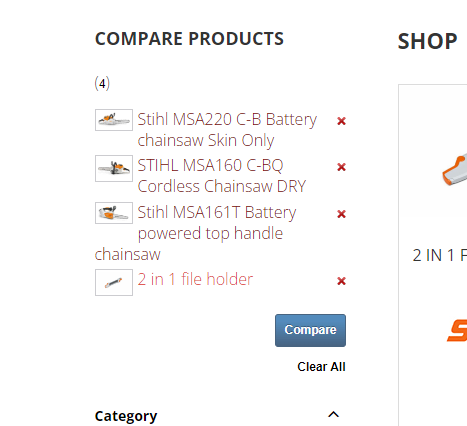
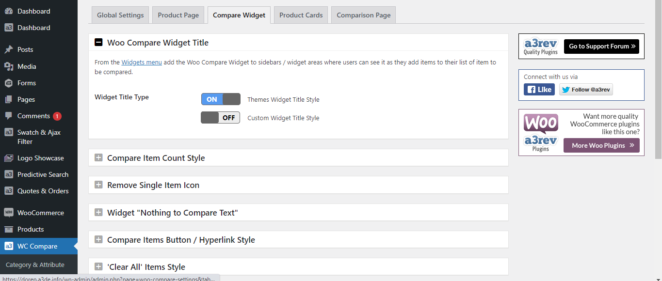
Compare Widget
This widget will add the compare products on the sidebar. When a user clicks on the Compare this button on a product the product is auto added to the Compare sidebar Widget or Compare basket. It have many benefit to use it.
The Compare Product Widget is fully customizable being able to integrate perfectly with your theme design and functions.
From the Widgets menu add the Woo Compare Widget to sidebars / widget areas where users can see it as they add items to their list of item to be compared.
All the settings for this feature are found on 3th tab of the WC Compare > Settings and Style.
The first option – Woo Compare Widget Title have 2 options:
- Themes Widget Title Style – Turn this option On and the Title will inherit the theme style
- Custom Widget Title Style – Using this option you can customize the Title of the Compare widget. There are many options for style like: Title Font, Title Container Alignment, Title Container Width, Title Container Padding, Title Container Margin, Container Background and Bording.
Compare Item Count Style
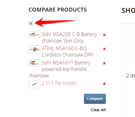
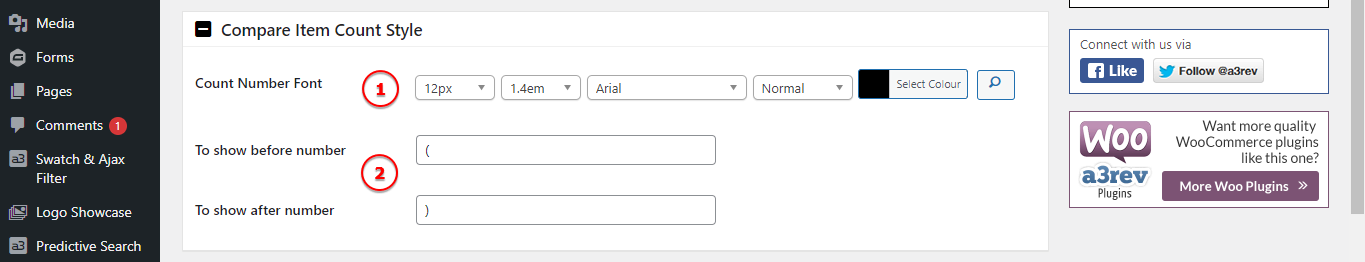
Image Legend:
1. Count Number Font – Add a custom family font.
2. To show before and after the number
Remove Single Item Icon & Empty Items Text
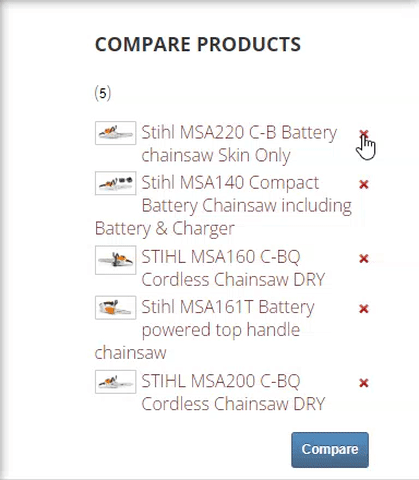
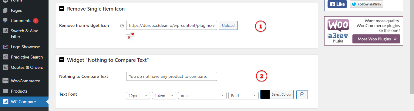
Image Legend:
1. Remove from widget Icon – Remove and add your own custom icon to show when want to remove a product from the compare list. Upload a 10px x 10px image, support .jpg, .pgn, .jpeg, .gif formats.
2. Nothing to Compare Text – When there is no product to compare a text will show up. Customize the text as the style of it.
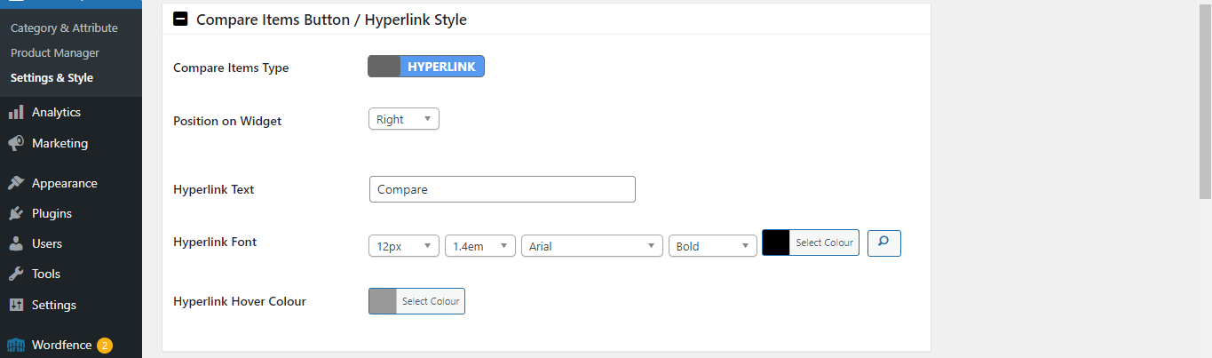
Compare Items Button / Hyperlink Style
Customize the button that redirect to the Compare Product Tab Page. Same like the others button you can have options for font, color, shadow, custom text for the button or hyperlink etc..
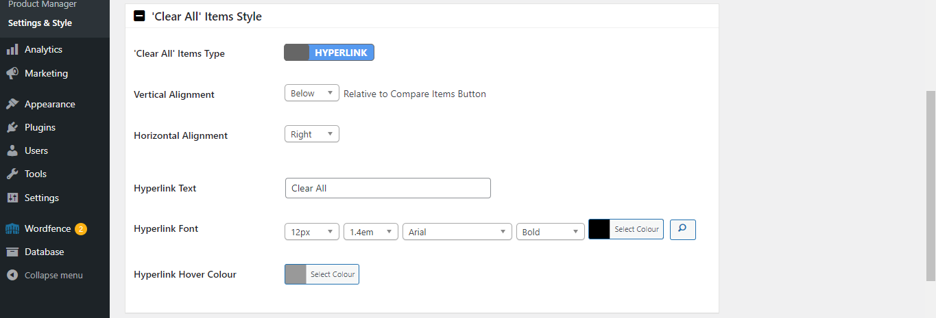
‘Clear All’ Items Style
Style the hyperlink/button that clear all the item bulk. It can be a button or a hyperlink, both fully customizable.
Product Image Thumbnail Style
Style the thumbnail image of the comparted product.
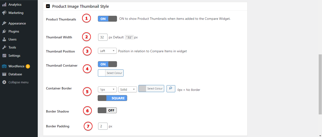
Image Legend:
1. Product Thumbnails – ON to show Product Thumbnails when items added to the Compare Widget.
2. Thumbnail Width – Default is 32px -change it if it’s need.
3. Thumbnail Position – Position in relation to Compare Items in widget.
4. Thumbnail Container – Set the background colour.
5. Container Border – Add a border to the thumbnail container.
6. Border Shadow – Add a shadow to the thumbnail container.
7. Border Padding – Space between the image and the container border.
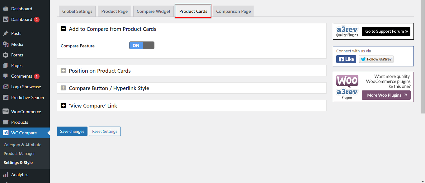
Product Cards
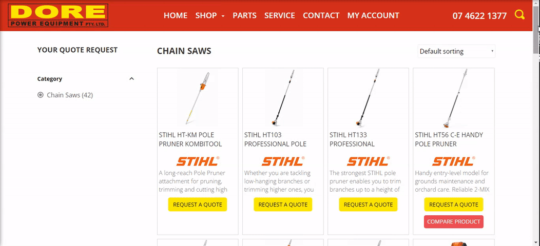
Turn On and the Compare Feature will be applies to all product cards on the Shop, Product Category and Product Tag page.
Position on Product Cards
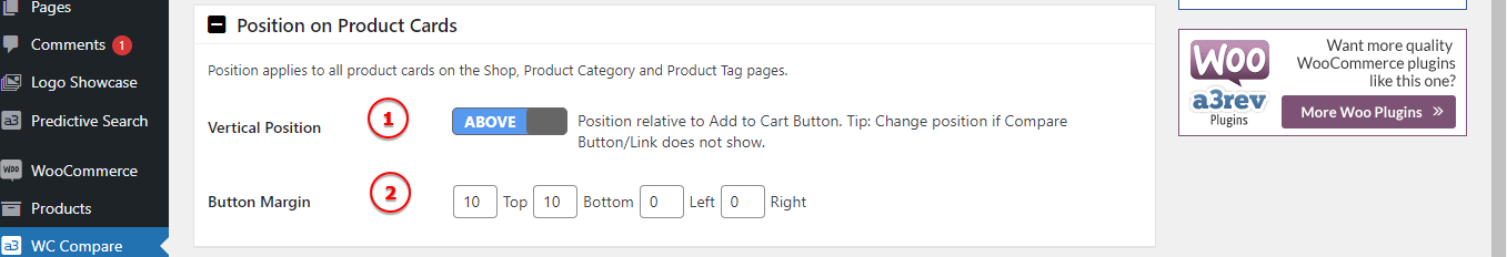
Image Legend:
1. Vertical Position – Position relative to Add to Cart Button. Tip: Change position if Compare Button/Link does not show.
2. Button Margin – Controls how far away the button is from other elements.
Compare Button / Hyperlink Style
Image Legend:
1. Compare Type – Select to display from button or a hyperlink.
2. Added to Compare Icon – Upload a 16px x 16px image, support .jpg, .pgn, .jpeg, .gif formats.
3. Button Text – The default text is: Compare This*, but you can change it to your needs.
4. Button Font – Select a font and font proprieties for the button.
5. Button Padding – Padding from Button text to Button border.
6. Background Colour – Select the button colour.
7. Button Border – Add a border for the button.
8. Button Shadow – Style the button by adding shadow to it.
‘View Compare’ Link
Image Legend:
1. View Compare Type – Choose from a hyperlink text or a button to be display. Same as Add To Compare.
2. Hyperlink Text – The default text is: View Compare →, but you can change it to your needs.
3. Hyperlink Font – Select a font and font proprieties for the hyperlink.
4. Hyperlink Hoover Colour – Select the colour when a pointer is hovering over the text.
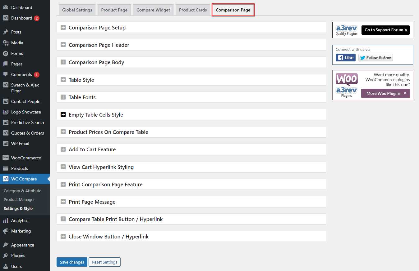
Comparation Page
From here we style and setup the page that hold the comparation products. This is where the users do their product comparison.
Comparison Page Setup
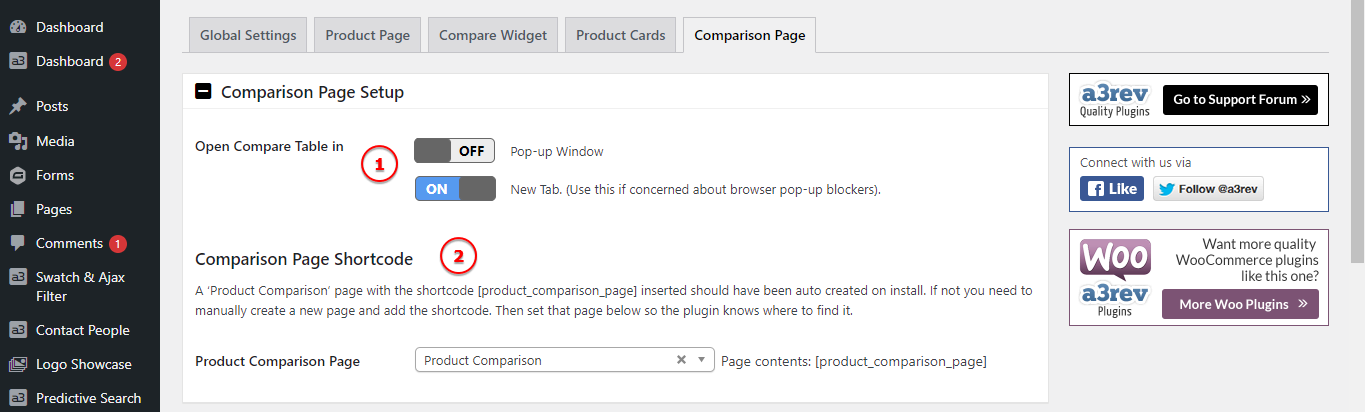
Image Legend:
1. Open Compare Table in – There are 2 options to open the Compare Table page: Pop-up Window and a New Tab Window ( we recommend to use this one if concerned about browser pop-up blockers ).
2. Comparison Page Shortcode – A ‘Product Comparison’ page with the shortcode *[product_comparison_page]* inserted should have been auto created on install. If not you need to manually create a new page and add the shortcode. Then set that page so the plugin knows where to find it.
Comparison Page Header
Now let’s start styling the table comparation page. Will gonna start with the header, so the page will match with your website design.
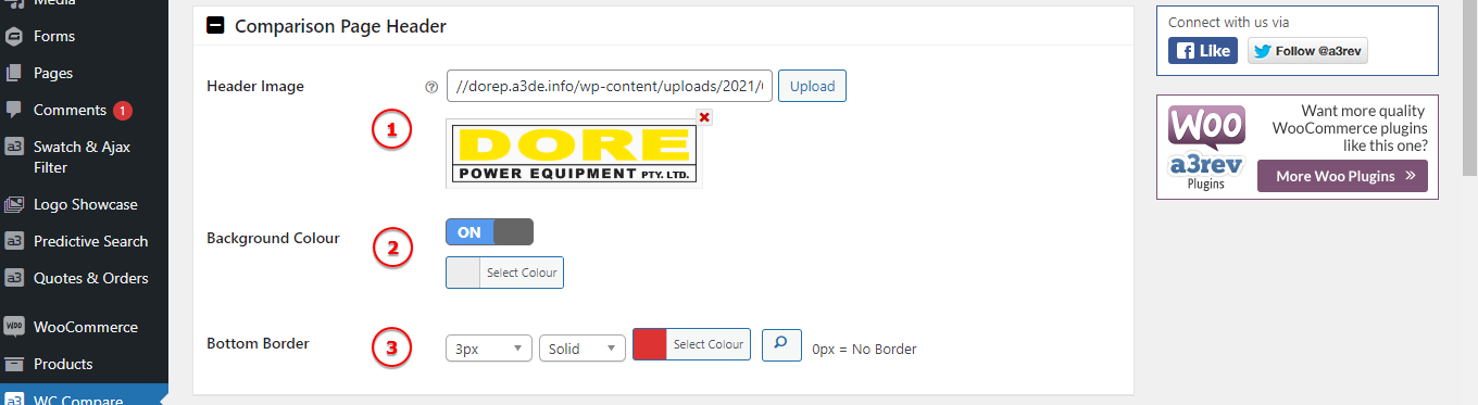
Image Legend:
1. Header image – Upload an image with formats .jpg, .pgn, .jpeg. Any size.
2. Background Colour – Select a color for the header background.
3. Bottom Border – To make a difference between header and page body you can add a border at the bottom of the header section.
Comparison Page Body
Now that we have our header done it’s time to style the body of the page.
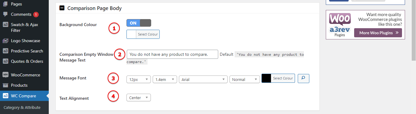
Image Legend:
1. Background Colour – Select the page body background.
2. Comparison Empty Window Message Text – The default message is: You do not have any product to compare. Change it as you wish.
3. Message font – Setup a font and style it for the Empty Message Text.
4. Text Alignment – Align the text for the Empty Message Text.
Table Style
Style how the table of the product specification looks like.
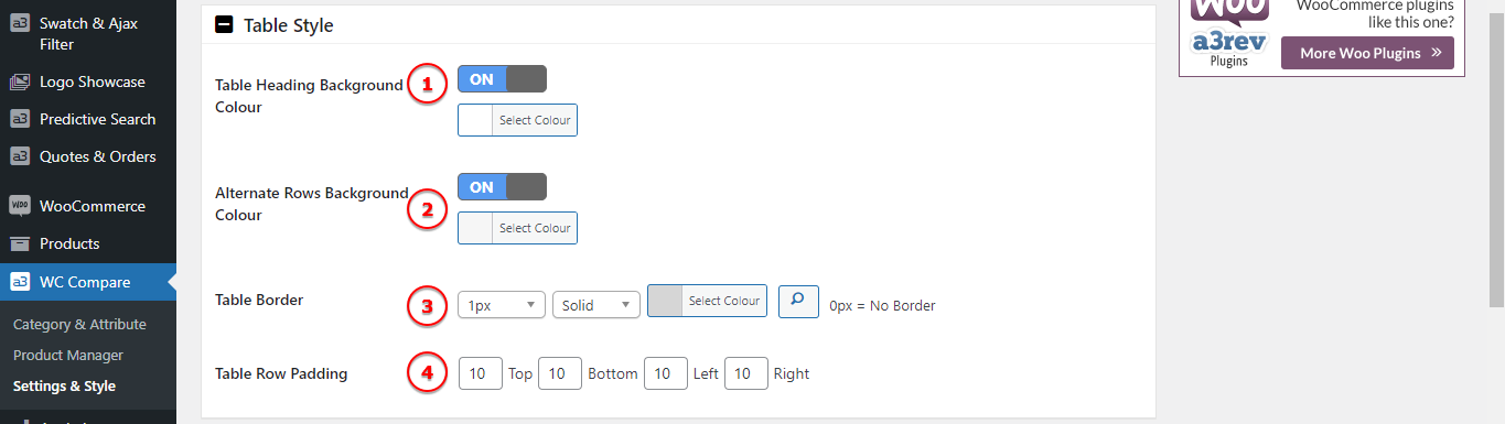
Image Legend:
1. Table Heading Background Colour – Choose a color for the first row of the comparation table.
2. Alternate Rows Background Colour – One way to improve the readability of large tables is to color alternating rows. See bellow image.
3. Table Border – Get a border around your table by using this settings.
4. Table Row Padding – Row padding is the space between the cell edges and the cell content.
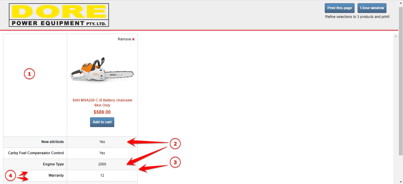
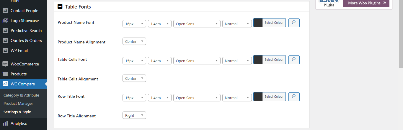
Table Fonts
Select the fonts that you want to use for the compare table. The fonts can be configure for: Product Name, Table Cells and Row Title.
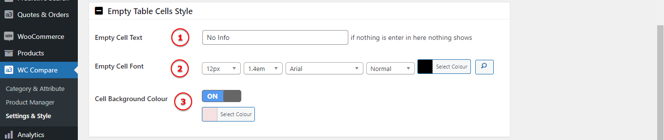
Empty Table Cells Style
When a attribute will have no data insert for a product the cell it will still show. You can customize a default message or leave it empty. Select the text font and the color background of the cell.
Image Legend:
1. Empty Cell Text – Add a custom text or ;eave it empty and nothing will show.
2. Empty Cell Font – If you add a text then you can style the font from here.
3. Cell Background Colour – Style the empty cell by adding a colour for the background.
Product Prices On Compare Table
Bellow and at the end of the table are the Prices rows. Choose the display position and play with the style till you got the desire look.
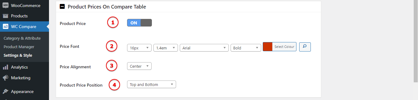
Image Legend:
1. Product Price – Turn On or Off the product price feature.
2. Price Font – Select a font for the price text.
3. Price Alignment – Position the price text left, center or right.
4. Product Price Position – Display where the price to show: Top and Bottom, Only Top or Only Bottom.
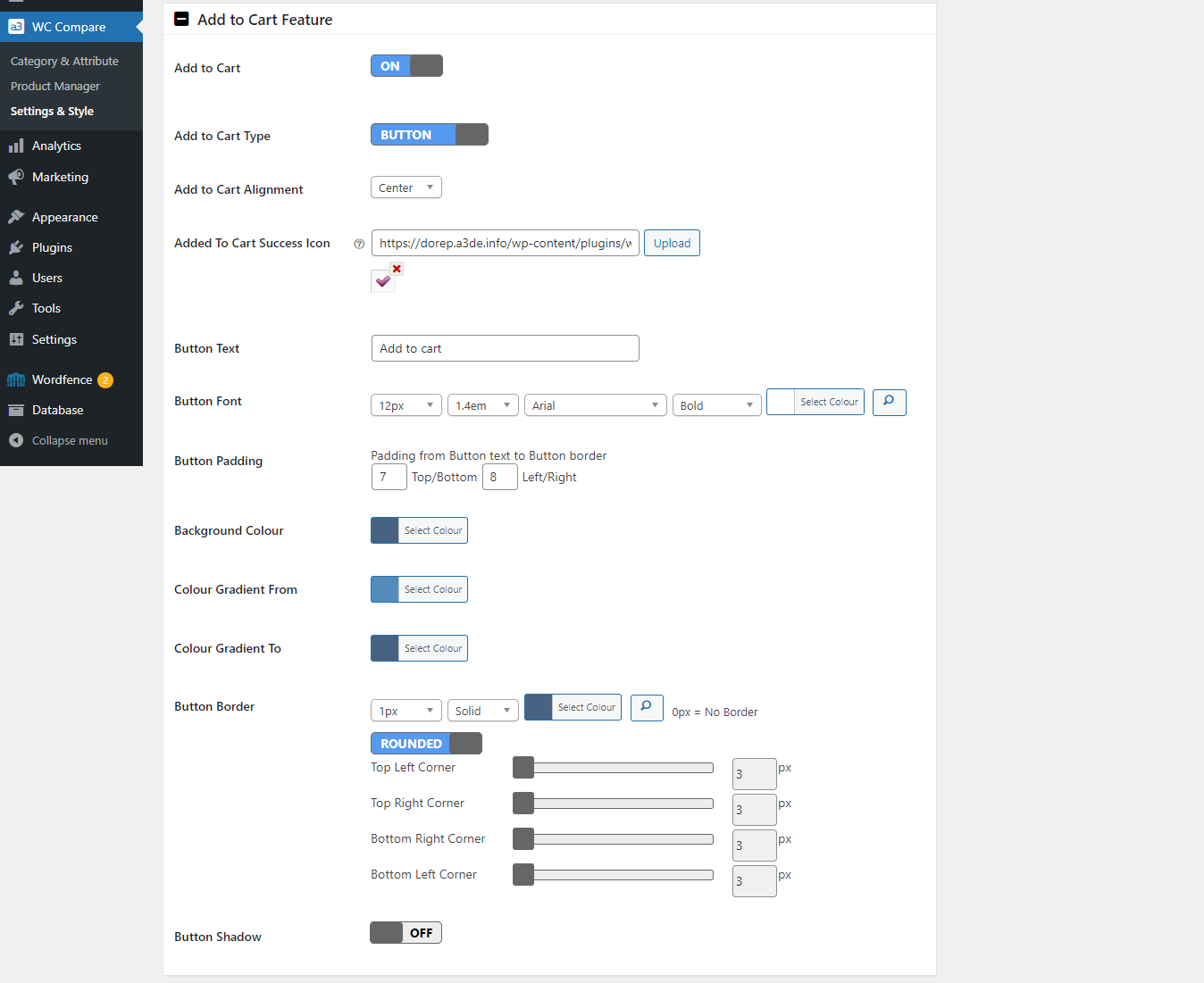
Add to Cart Feature
Directly from the Product Comparison page the client can add the selected product to cart or make a enquire. Like the others buttons of this plugin this can be customize with background color, custom fonts, choose the alignment of the button/hyperlink with a custom text. Also you can add a custom Added To Cart Success Icon.
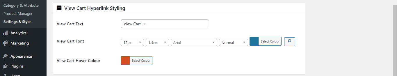
View Cart Hyperlink Styling
When the client make a action and add to cart a product a text will show from where they can be redirect to Vie Cart page.
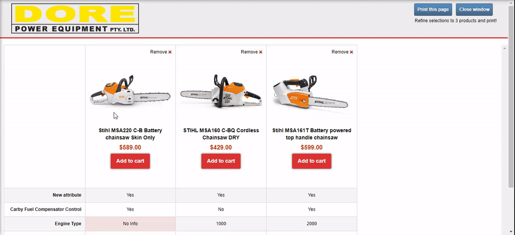
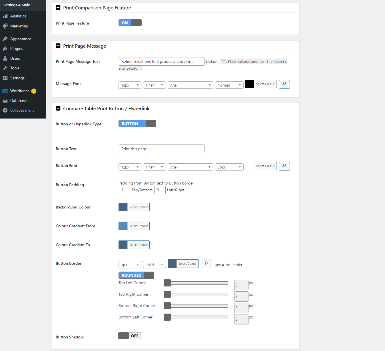
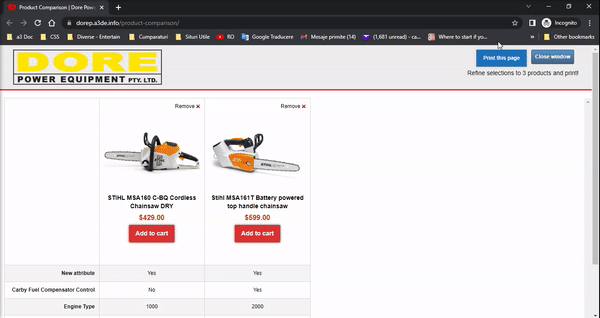
Print Comparison Page Feature
On the right corner of the page will have the Print button. On those tabs you can turn Off this feature, add a custom Message Text and choose of to be a hyperlink or a button. Both can be styles as need it.
Close Window Button / Hyperlink
To close this window tab customize the button or the hyperlink text. that can be found on the top right corner of the page.
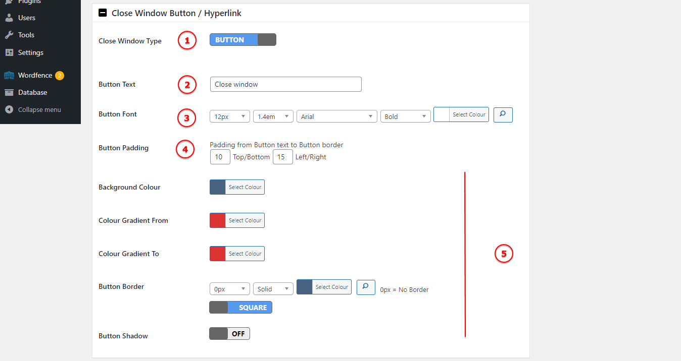
Image Legend:
1. Close Window Type – Choose if t have a button or a hyperlink.
2. Button Text – The default text is Close window – change it if it’s need.
3. Button Font – Select a custom font for the button/hyperlink.
4. Button Padding – The space between the text and the inside button border.
5. Button Style – Customize the button look.
Colour Fields Type
In the beginning of the doc it’s mention that you can add colour fields to the compare product table. In this section will see how to use Input Data Type > Colour. This Input type is working same like others, if you don’t know how to setup please check this section .
You can create a new Attribute Comparison Data with this field type or edit a existent one and highlight specific fields in comparison table.
In our example we will edit a already create attribute, changing it from a text field to a colour input type. This attribute have 4 terms, to make it easier for demo purpose we select them as colours. We assign each term (colour) to 4 products witch will compare.
Step 1: Choose the Attribute and Terms Compare data Input type -> Colour.
Step 2: Configure the terms of the selected attribute by applying color to both the text and background.
Step 3: Now, we simply need to choose the appropriate field for each product’s terms.
Step 4: See the changes on product compare table.
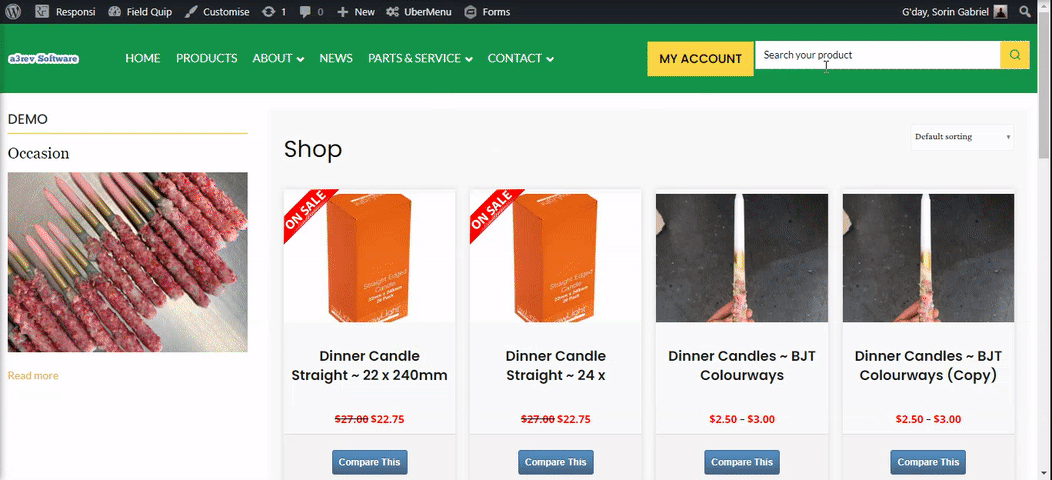
Image Fields Type
Same as the others Input Type the Image is to populate a attribute term, in our case with a image. The process is very simple. In our example will gonna edit the “Brand” attribute, adding images for some terms that this attribute have.
In our demo the radio buttons will be replace with images. Like you see in our example, this product have select as input field the radio buttons and on comparation table they show as text.
Step 1: Choose the Attribute and Terms Compare data Input type -> Image. You can edit a existent attribute or create a new one and apply the Image data type with the selected category.
Step 2: Next, we simply need to input the image URL for the desired products. When the input type is set as “Image”, in the product editor a new field will appear allowing you to enter the URL for the desired image.
Step 3: See the images you add into the comparation table.
Troubleshooting
Compare Button is not showing.
On the Settings tab set the ‘Button Position relative to Add to Cart Button ‘ to ‘Below’. If you have the Catalog Visibility premium extension activated you must do this or the Compare Button will not show.
Compare Pop-up window won’t open.
On the Settings tab change the ‘Compare Fly-Out Type’ from Fancybox to Lightbox. This normally happens when you are not using a WooTheme. Some theme developers use Lightbox as their theme default pop-up tool and it blocks the default WooCommerce fancybox tool from working.
Comparison Window not showing any products.
If you can see the items in the comparison pop-up window or new page table whilst your logged in, but in other browsers as a logged out user the comparison window shows no products – this is a caching issue. If your site is hosted on WP Engine you need to contact their support and ask them to exclude /product-comparison/ from the caching on their Varnish layer.