Plugin Download
Download WooCommerce Quick View Ultimate plugin from here.
Overview
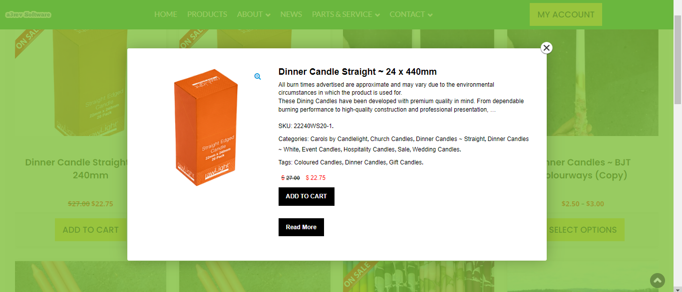
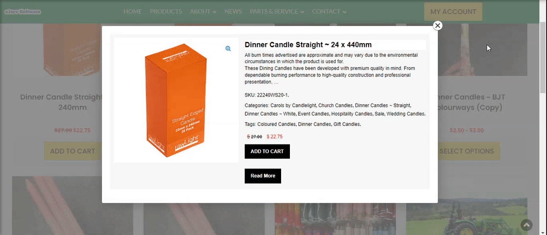
WooCommerce Quick View Ultimate gives your customers a true supermarket shopping experience. In a supermarket shoppers browse products on the shelves, picking up the ones they are interested up, reading all the relevant information and either adding the item to their cart or putting it back on the shelf and continuing to browser. You can now give your customer exactly the same experience with Quick View Ultimate.
Installation
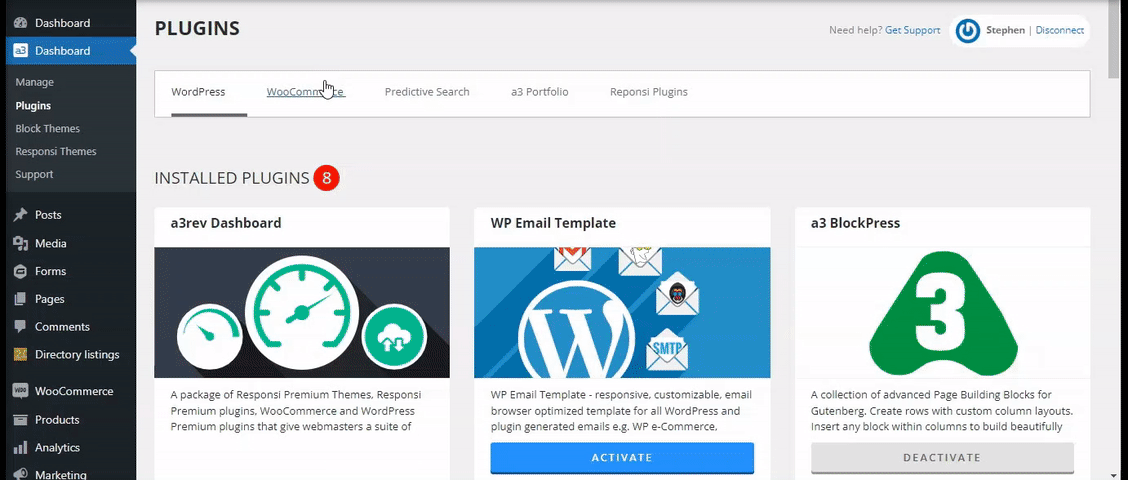
The plugin is available on a3 Dashboard > WooCommerce Plugin. Find the Quick View Ultimate plugin on the list, install and then activate it.
From your WordPress admin dashboard go to the WooCommerce menu. Click on it and you will see that the Quick View Ultimate menu item has been added to the menu list.
Plugin Settings
From this panel you can set up the plugin general settings.
Plugin Framework Global Settings
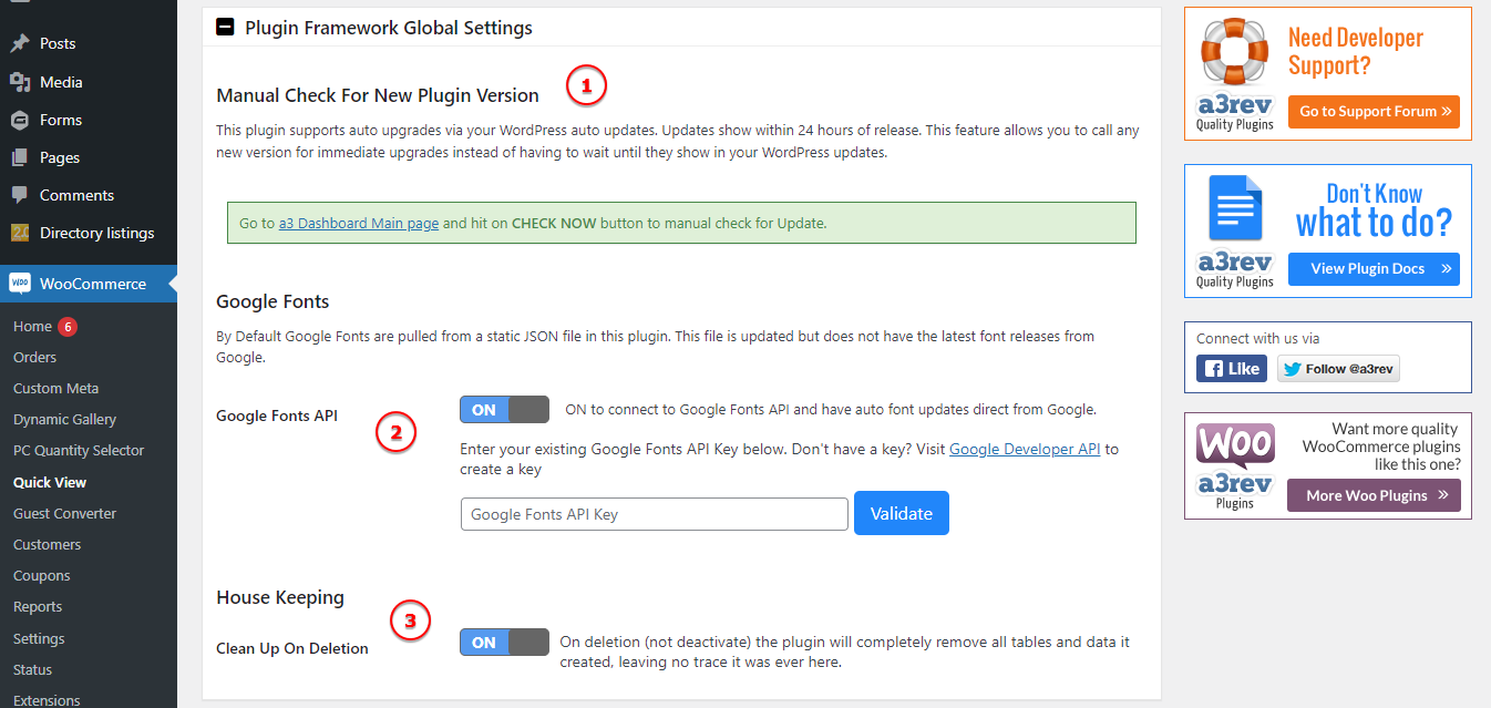
Image Legend:
1. Manual Check For New Plugin Version – This plugin supports auto upgrades via your WordPress auto updates. Updates show within 24 hours of release. This feature allows you to call any new version for immediate upgrades instead of having to wait until they show in your WordPress updates.
2. Google Fonts – By Default Google Fonts are pulled from a static JSON file in this plugin. This file is updated but does not have the latest font releases from Google. ON to connect to Google Fonts API and have auto font updates direct from Google.
3. House Keeping – On deletion (not deactivate) the plugin will completely remove all tables and data it created, leaving no trace it was ever here.
Quick View Activation

Enable or Disable the Quick View from you product cards.
Quick View Content Type
Select what kind of content the popup will show. You can choose from two kind of content.
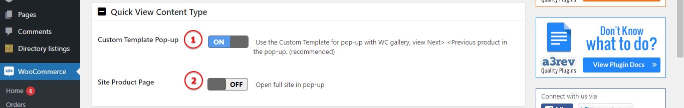
Image Legend:
1. Custom Template Pop-up – Use the Custom Template for pop-up with WC gallery, view Next> <Previous product in the pop-up. (recommended)
2. Site Product Page – Open full site in pop-up. Use this option and on pop=up will show the product page.


Quick View Button
On this panel are the settings for the button that will be display on your product cards.
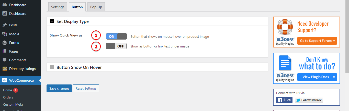
Image Legend:
Show Quick View as:
1. Button that shows on mouse hover on product image.
2. Show as button or link text under image.
Button Show On Hover
When Show Quick View as is set to Button that shows on mouse hover on product image, these settings let you customize how the Quick View button appears and behaves when customers hover over a product card.
The plugin supports defining the Quick View button inside Gutenberg block-based layouts.
If your shop or category pages are built using Gutenberg blocks (e.g., the Products by Category, Hand-picked Products, or custom block-based templates), you need to specify the CSS class name of the product card.
This is done using the Card Class Trigger setting below.
🔧 Why it matters:
Block-based layouts don’t use traditional WooCommerce product markup. This feature allows the Quick View button to render inside the correct element even if the layout is powered by Gutenberg blocks.
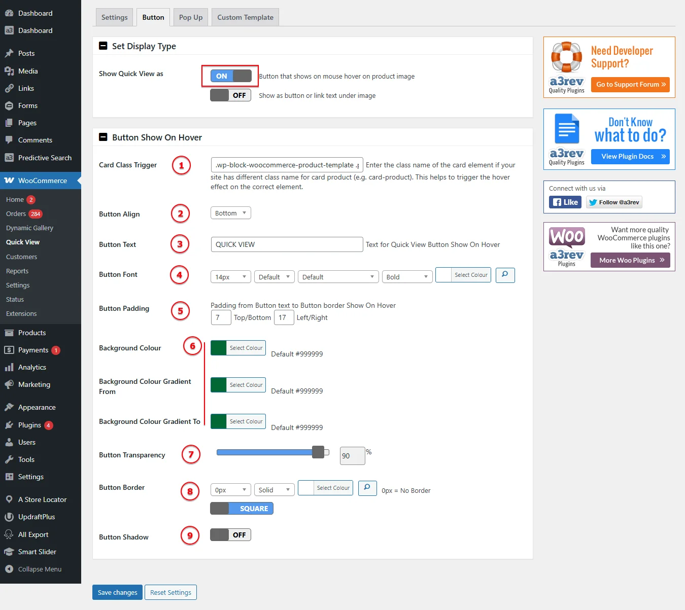
1. Card Class Trigger
Field: .wp-block-woocommerce-product-template (example)
Use this field to define the CSS class name of the card container for each product on your shop or category page.
This is essential when using custom themes or blocks where the product card structure differs from the standard WooCommerce layout.
- 📌 Example: If your theme wraps each product in
<div class="custom-product-card">, enter.custom-product-cardin this field. - ✅ This tells the plugin exactly where to inject the Quick View button.
2. Button Align: Controls the vertical alignment of the Quick View button inside the card area.
Options:
- Bottom (default)
- Top
- Middle
3. Button Text: Enter the text that will appear inside the Quick View button.
- Default:
QUICK VIEW - You can customize this to match your brand tone, e.g.,
View Now,Peek, orQuick Look.
4. Button Font: Customize the font styling of the Quick View button:
- Font Size (e.g., 14px)
- Font Family
- Font Style (normal, italic)
- Font Weight (bold, light, etc.)
- Font Color
Click the color picker to select the button text color.
5. Button Padding: Set the internal spacing of the Quick View button. Controls space between the text and the button’s border.
- Top/Bottom and Left/Right padding values in pixels.
Example: 7 / 17 means 7px top/bottom padding and 17px left/right padding.
6. Background Colour: Select the solid background color of the Quick View button.
- Default:
#999999 - Use your brand color for a seamless design match.
Background Colour Gradient From / To: (Optional) Define a gradient background for the button.
- The button will fade from the first color to the second when hovered.
- You can use this instead of a solid background color.
7. Button Transparency: Use the slider to set the button’s opacity.
0%= fully transparent (invisible)100%= fully opaque- Default:
90%(slightly see-through)
8. Button Border: Control the border style of the button:
- Set the border width (in pixels), style (solid, dashed, dotted), and color.
0px= No border.
9. Button Shadow: Toggle ON/OFF to enable or disable a drop shadow effect on the Quick View button.
- OFF = No shadow (default)
- ON = Adds visual depth, making the button stand out on hover.
Button/Hyperlink Show under Image
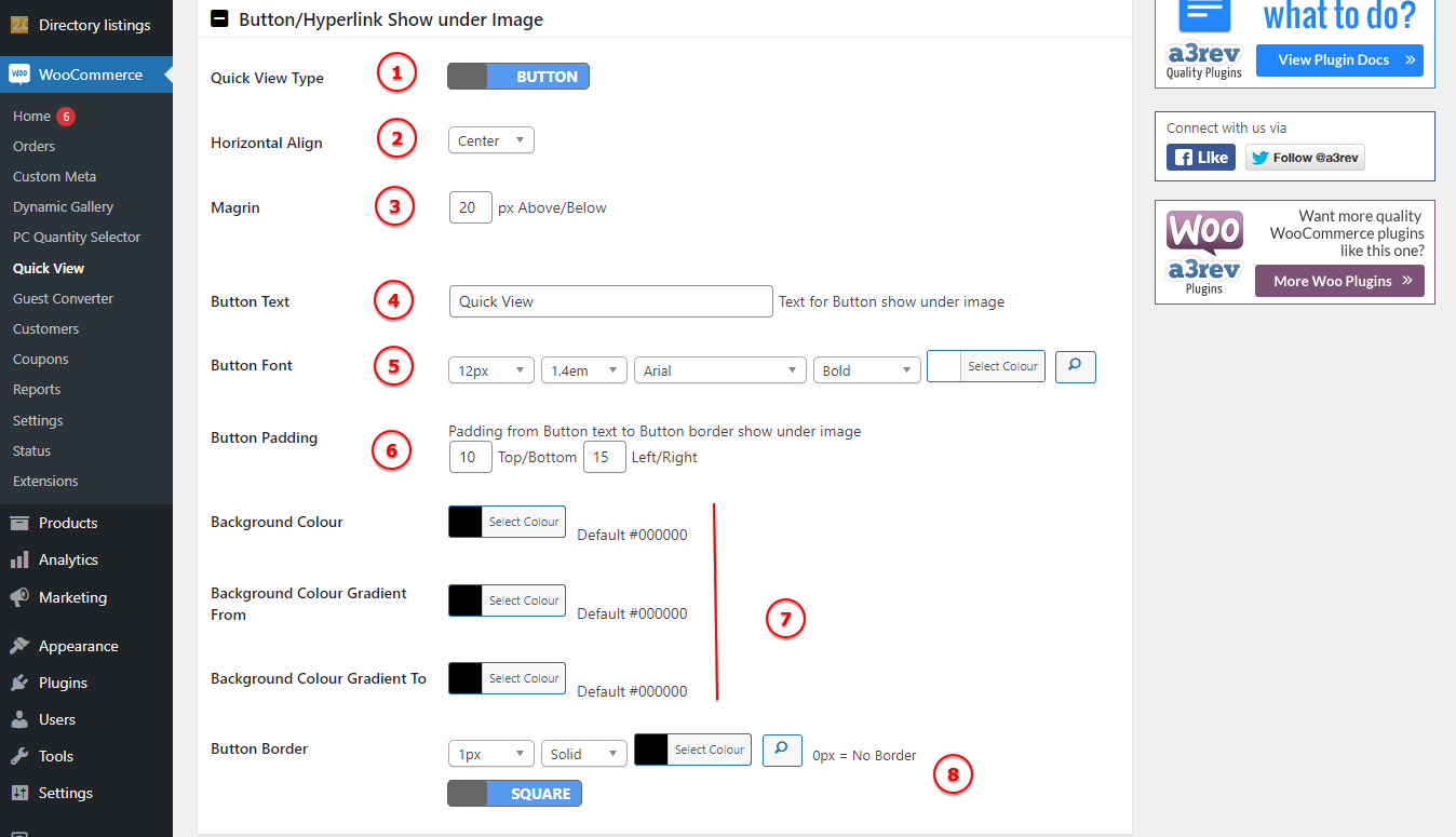
Image Legend:
1. Quick View Type – Choose if to use a button or a hyperlink text. If on the above setting you choose button that show on hover you can’t have the hyperlink text, so this panel will don’t have options for hyperlink text.
2. Horizontal Align – Select the text/button alignment: Left, Center or Right.
3. Margin – Select the space on top and bottom of the button in rapport with other content.
4. Button Text – Text for Button or hyperlink. The default is “Quick View”.
5. Button Font – Add a custom font family and style it.
6. Button Padding – Padding from Button text to Button border.
7. Background Colour – Add a custom colour for the backgound.
8. Button Border – Select a border for the button and style it.
Pop Up Style
Style the pop-up container and the contain.
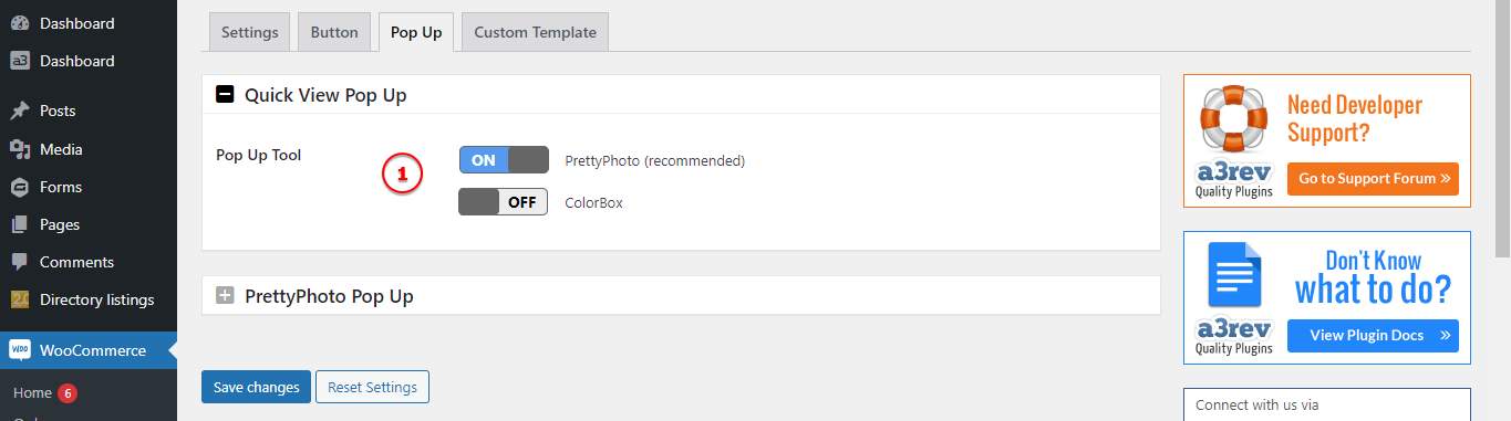
Image Legend:
1. Pop Up Tool – Choose from PrettyPhoto (recommended) or ColorBox lightbox.
PrettyPhoto Pop Up
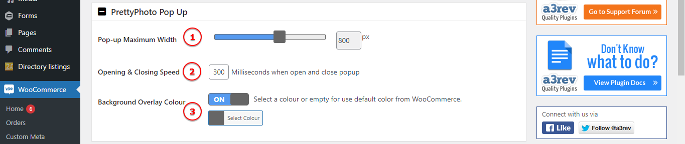
Image Legend:
1. Pop-up Maximum Width – Choose the width of your pop-up by pixels.
2. Opening & Closing Speed – Milliseconds when open and close popup.
3. Background Overlay Colour – Select a colour or empty for use default color from WooCommerce.
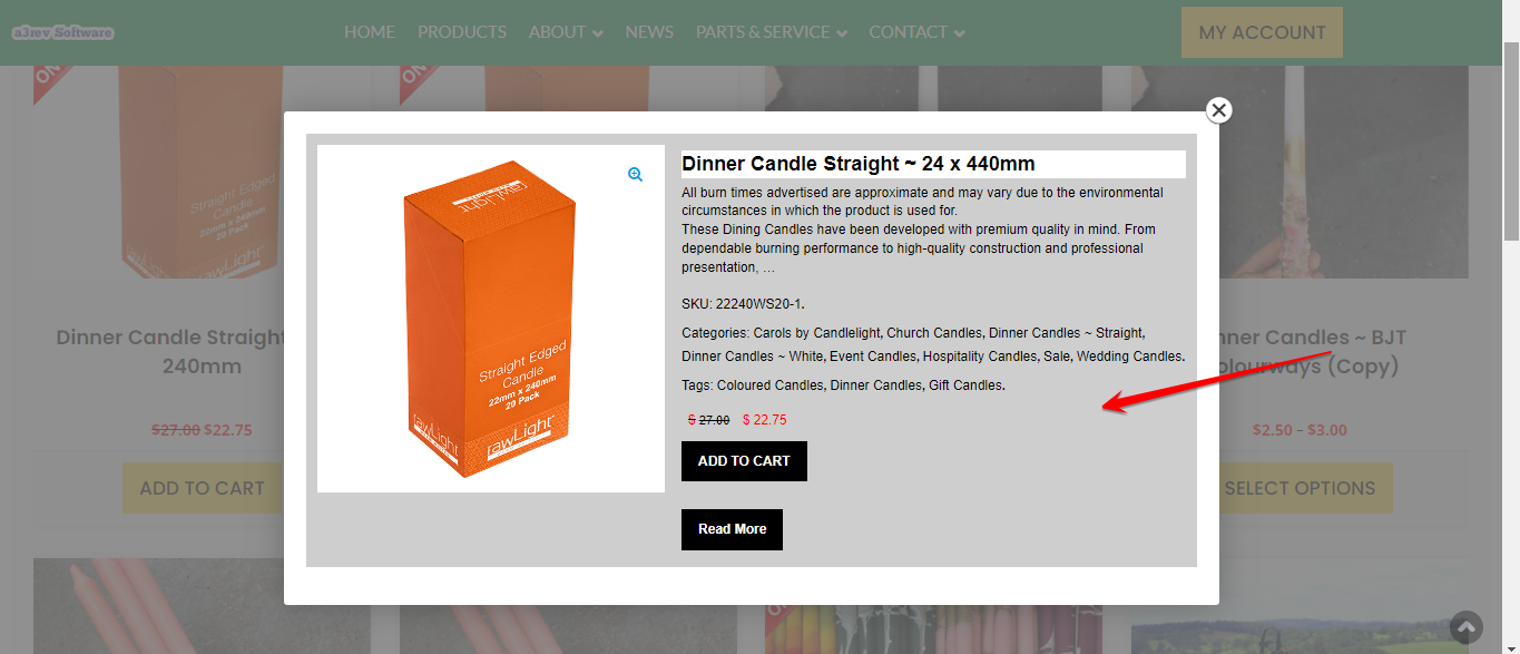
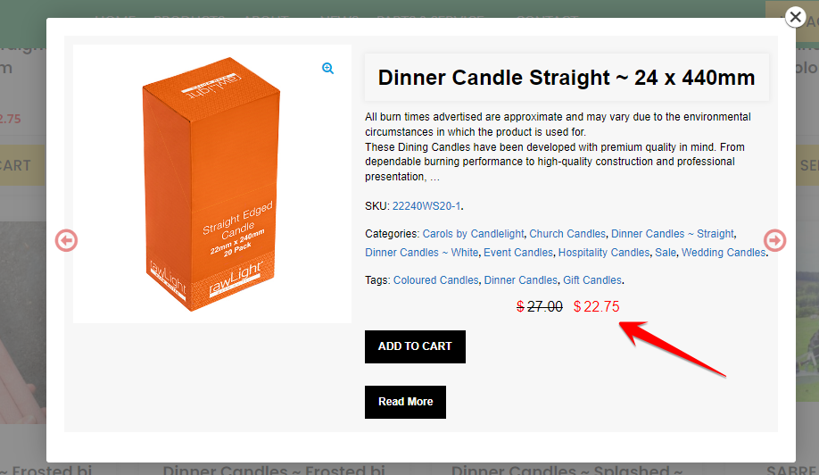
Custom Template
If you choose to use the Content Type: Custom Template Pop-up you will see this panel, using the Site Product Page type it will have it hide.
From here will style template of the pop-up content. Many of the settings are the same as fonts, buttons, text style etc. So it will be very easy to customize the content style, to match with your website design.
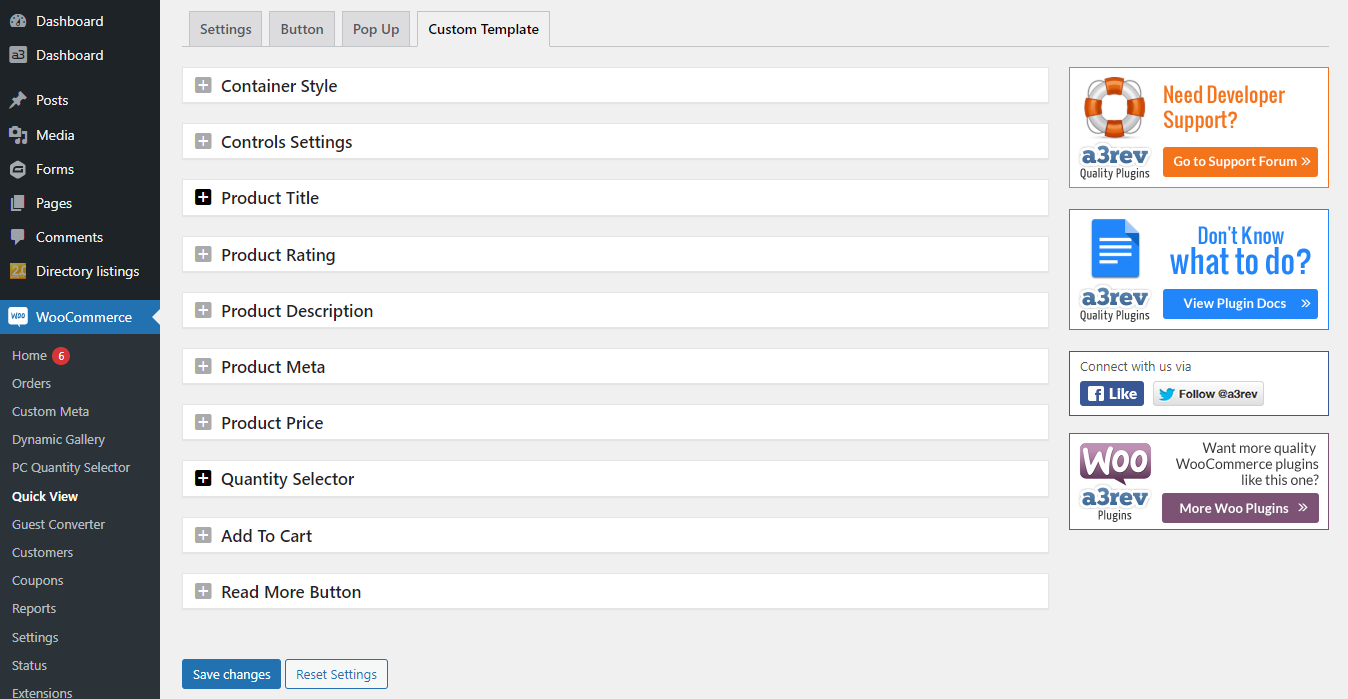
Container Style
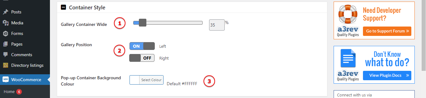
Image Legend:
1. Gallery Container Wide – Set the gallery wide inside the pop-up container.
2. Gallery Position – You can choose the gallery alignment to Right or Left.
3. Pop-up Container Background Colour – Add a colour to the gallery container.
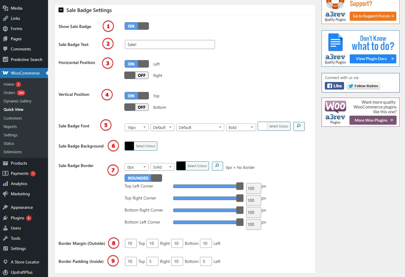
Sale Badge Settings
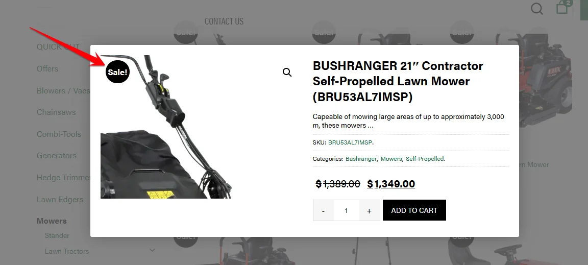
This panel allows full control of the Sale Badge that appears inside the Quick View Popup for on-sale products.
Image Legend:
1. Show Sale Badge: Toggle ON/OFF to enable or disable the badge in the popup.
2. Sale Badge Text: Customize the text (e.g., “Sale!”, “Hot Deal!”, etc.).
3. Horizontal Position: Show badge on the left or right of the popup image.
4. Vertical Position: Show badge at the top or bottom of the popup image.
5. Font Settings: Customize font size, family, weight, and color.
6. Background Color: Set the background color of the badge.
7. Border Settings: Define the border style, width, and corner radius.
8. Margin (Outside): Adjust spacing around the badge.
9. Padding (Inside): Fine-tune spacing within the badge itself.
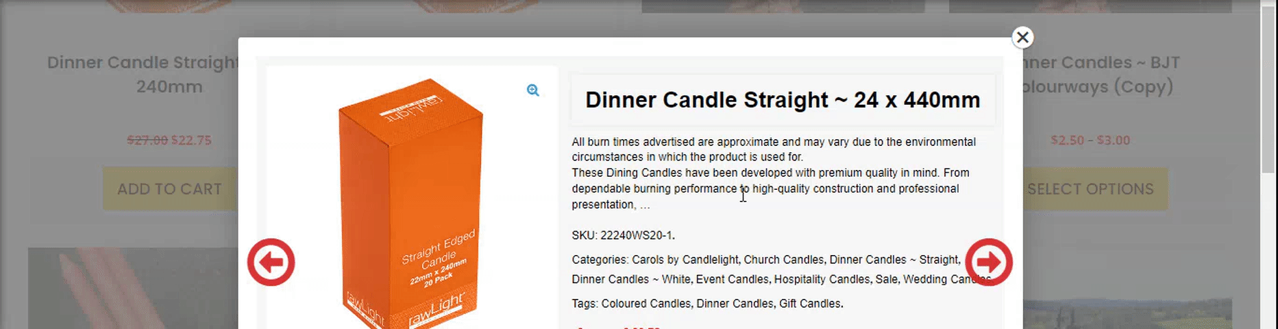
Controls Settings
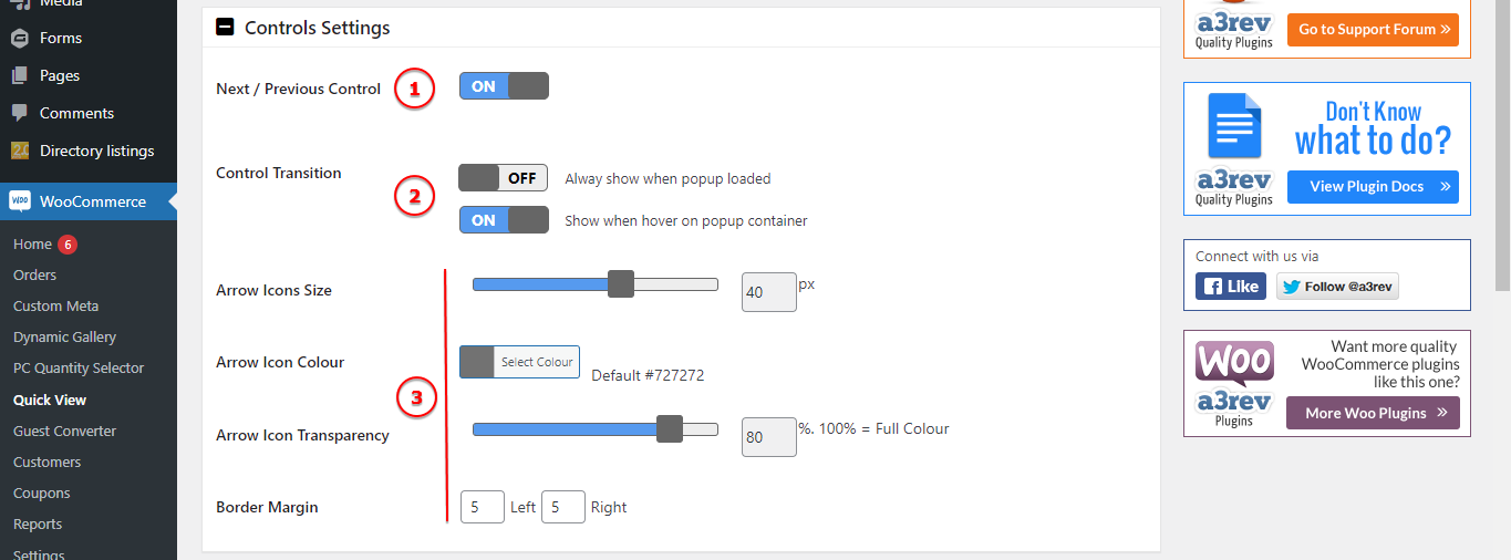
Image Legend:
1. Next / Previous Control – Turn On or Off the Control arrows.
2. Control Transition – Alway show when popup loaded or Show when hover on popup container.
3. Arrows Style – Customize the style of the arrows that show for next and previews product. The style includes: Icon size and colour, transparency or border margin.
Product Title
Now let’s custom the title of our pop-up content.
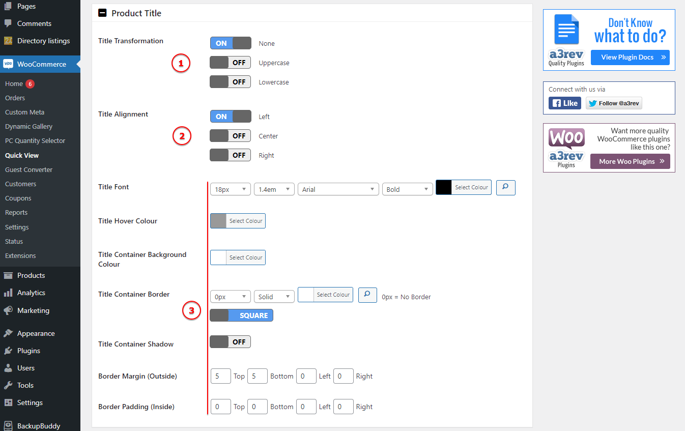
Image Legend:
1. Title Transformation – It can be used to make text appear in all-uppercase or all-lowercase, or with each word capitalized.
2. Title Alignment – Configure the alignment for title position.
3. Title Style – Add a custom font and style the color for normal and hover action. Add a background color for the title container and shadow then adjust the space and margin.
Product Description and Rating
On those two tabs will find the setting to style the description and the rating reviews that will show on pop-up product container. You can have fully control on how those will be display.
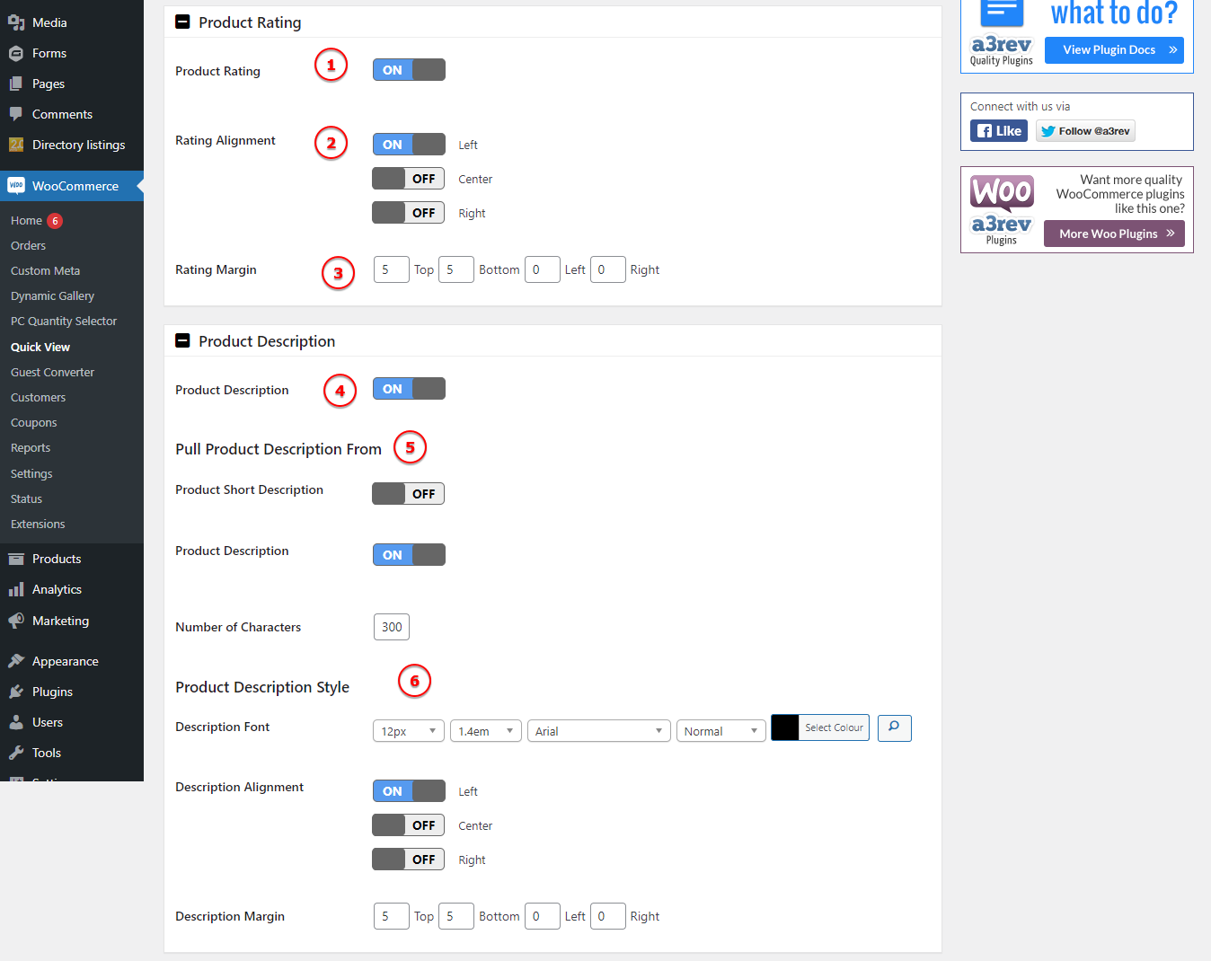
Image Legend:
1. Product Rating – Turn On and the rating will be visible on front end.
2. Rating Alignment – Choose how to align the rating stars: Left, Center or Right.
3. Rating Margin – Space between the stars rating container and rest of elements.
4. Product Description – Turn On or Off the description feature on Quick View pop-up.
5. Pull Product Description From – Choose to show the short description or a limited number of characters from description.
6. Product Description Style – Customize the font, alignment and margin.
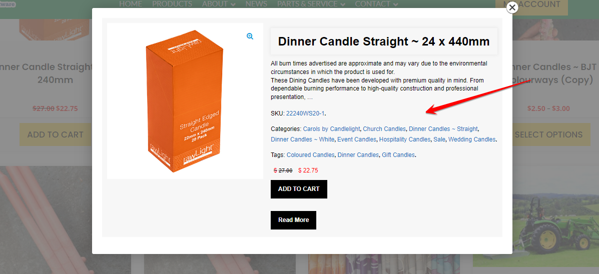
Product Meta
The product meta is referring to categories, tags and sku’s that will show on the Quick View pop-up container. Can have them close or display. Style them to match with your product page style.
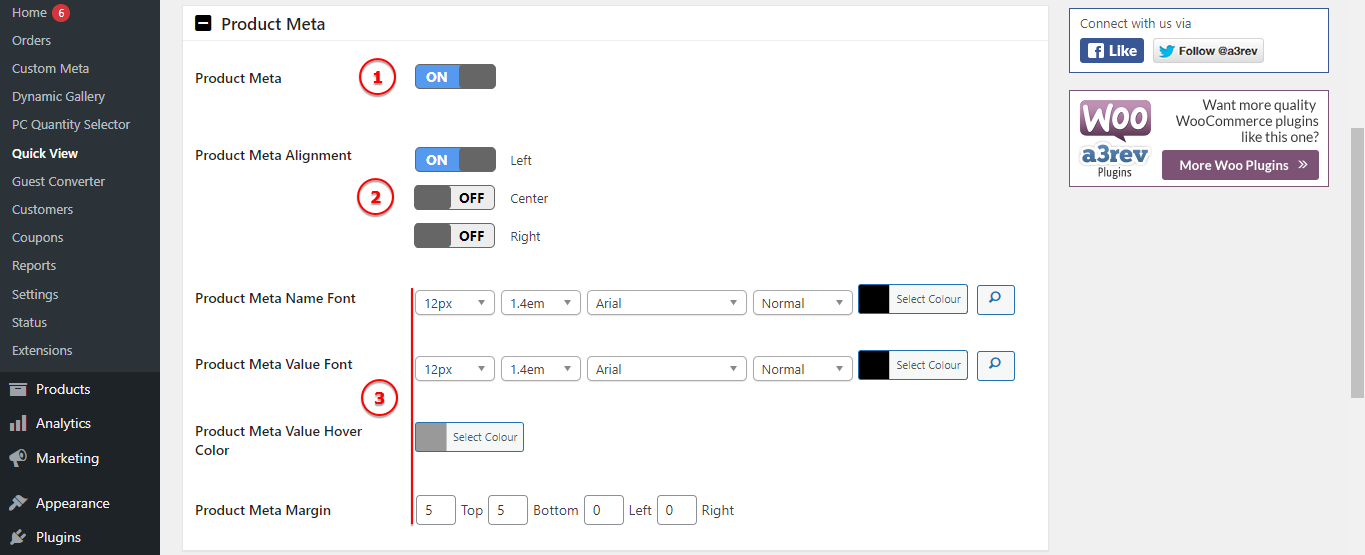
Image Legend:
1. Product Meta – Display or hide the meta posts container ( categories, tags, sku’s etc)
2. Product Meta Alignment – Choose the alignment of the meta text.
3. Product Meta Style – Style the fonts and margin for the name and value meta text.
Product Price
The price is very important to show out from content, so make sure to customize it from here.
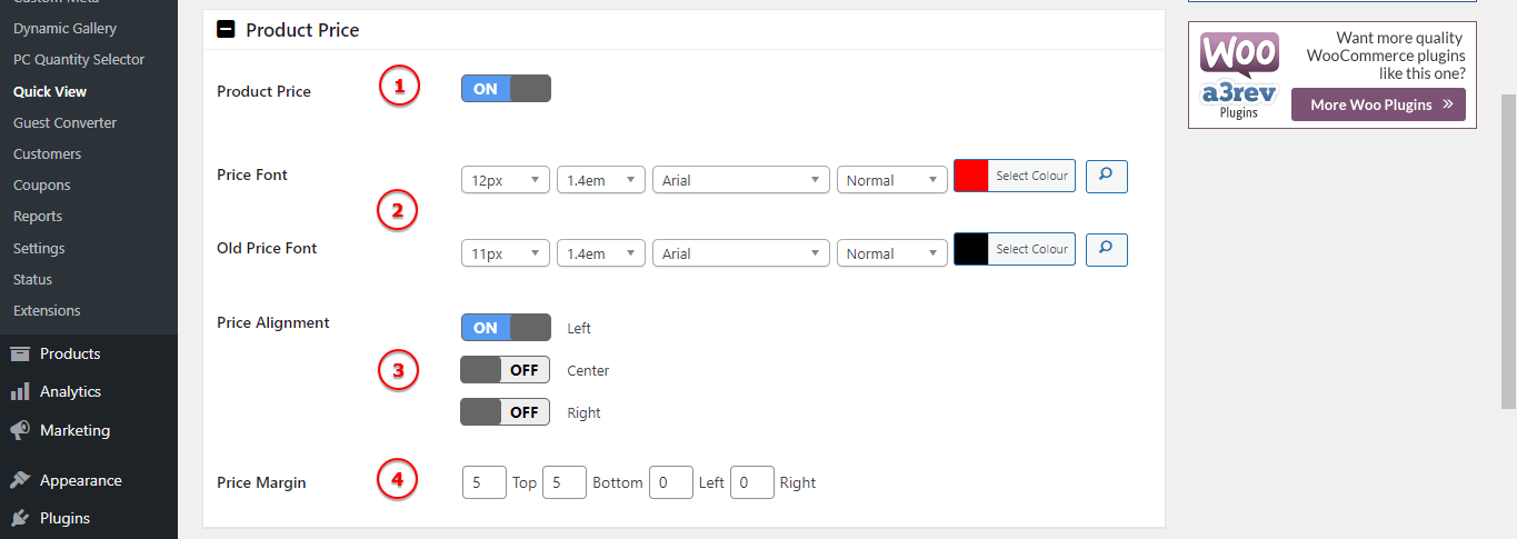
Image Legend:
1. Product Price – You can hide the price from the pop-up.
2. Price Font – Add a custom style font for the New price and a one for the Old price.
3. Price Alignment – Align the price text from Left, Center or Right.
4. Price Margin – Space between the price container and rest of elements.
Quantity Selector
Make it easy for the customer to select the quantity of the products directly from the Quick View pop-up.
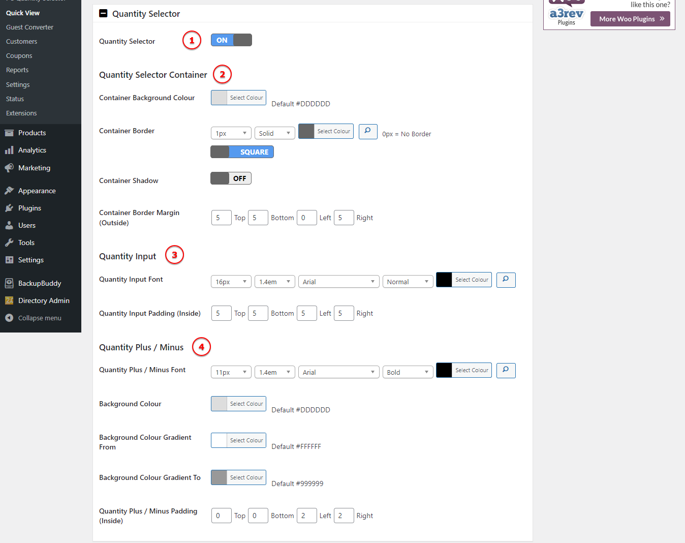
Image Legend:
1. Quantity Selector – Turn On or Off this feature.
2. Quantity Selector Container – Style the container of the quantity selector.
3. Quantity Input – Customize the font and padding for the input text.
4. Quantity Plus / Minus –Customize the + and – icons.
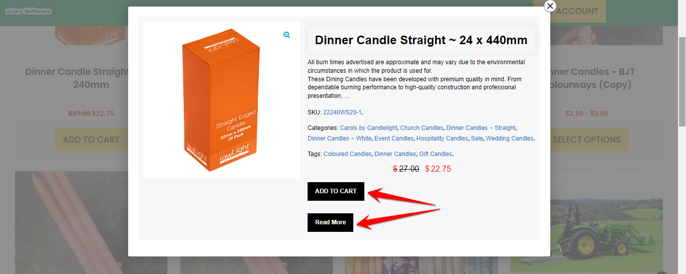
Add to Cart and Read More Buttons
On those two panels will gonna find the settings and style options for the buttons display on pop-up.They come with many options to make sure they will meet your requirements.
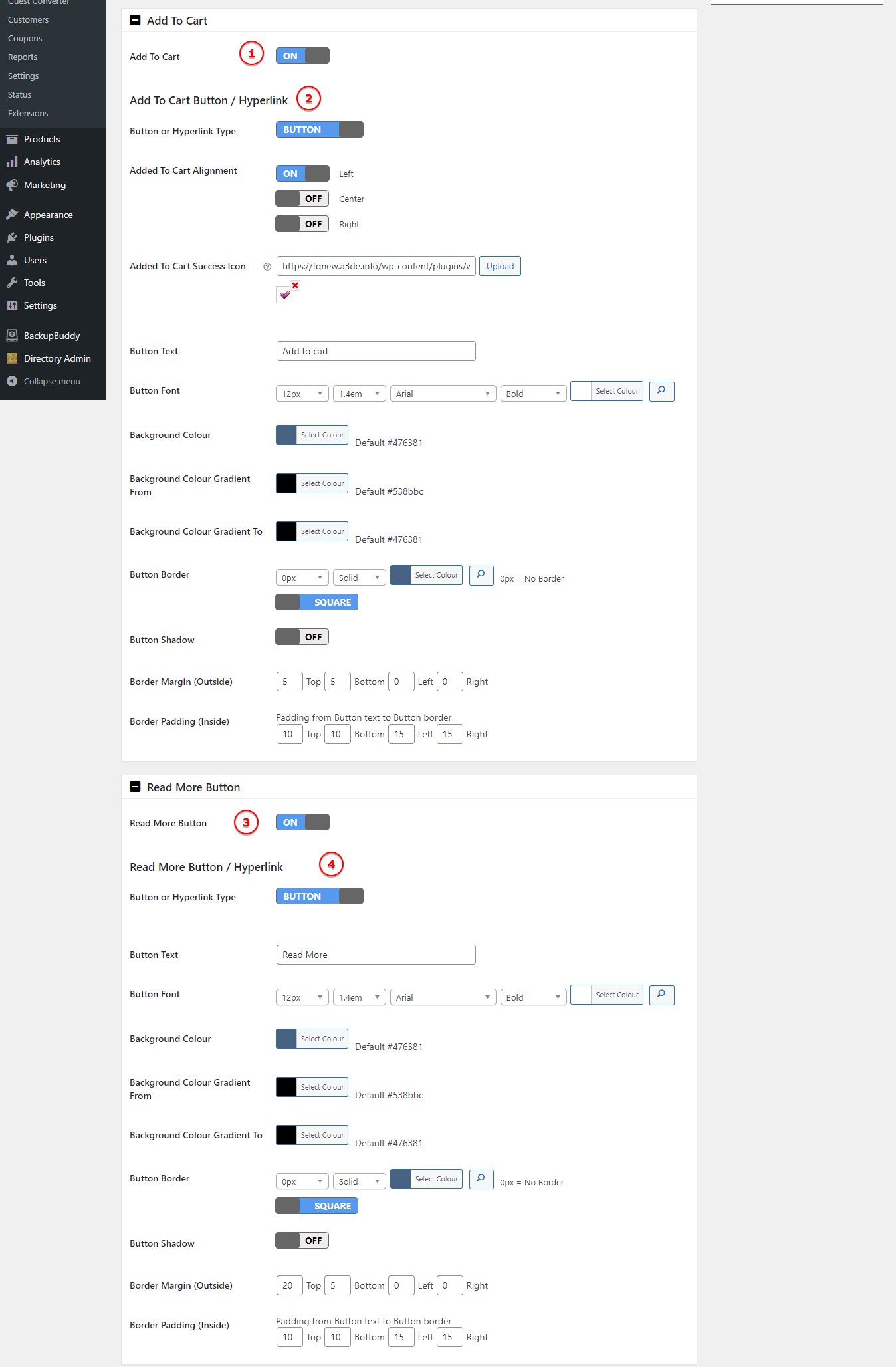
Image Legend:
1. Add To Cart – Turn On or Off the Add to Cart button.
2. Add To Cart Button / Hyperlink – Style the button or the hyperlink text from here. Find options for font style, alignment, add a custom icon for successful add to cart action, style the button with color, border or shadow.
3. Read More Button – Turn On or Off the Read More button.
4. Read More Button / Hyperlink – Style the button or the hyperlink text from here. Find options for font style, alignment, style the button with color, border or shadow.