Navigation
Installing the Plugin
a3 Portfolio is available for download for free from wordpress.org. It can also be installed directly from your a3 dashboard.
Getting Started
After successfully installing and activating the plugin, you’ll notice a new addition to your WordPress admin page menu called ‘a3 Portfolio.’ You can find it by hovering over or clicking on the ‘a3 Portfolio’ menu.
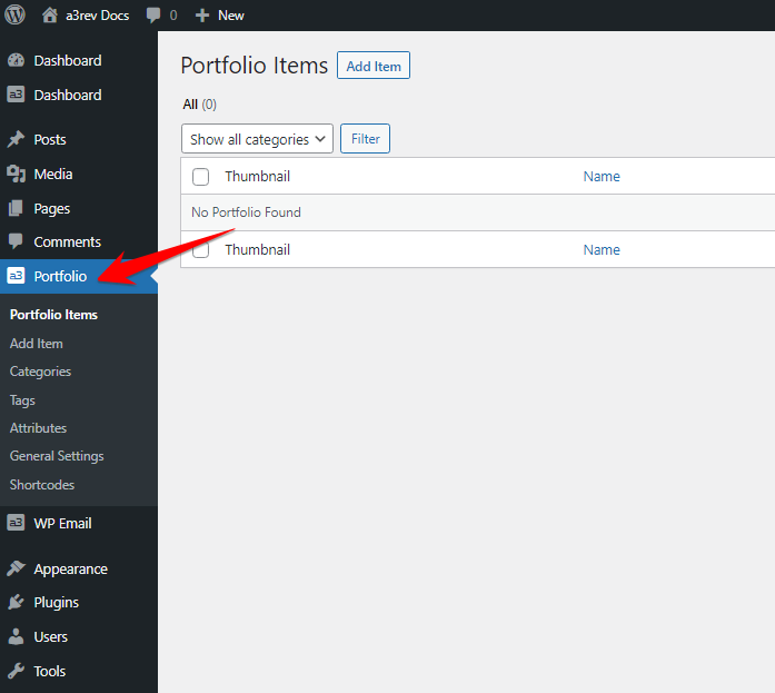
Begin by creating some Portfolio Items. Once you’ve completed this step, we can explore how the Portfolio should be displayed on the front end.
Add a New Item
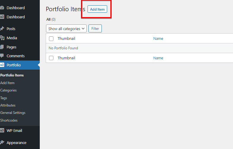
With a3 Portfolio, you can effortlessly create an unlimited number of Portfolio Items. These items are WordPress custom post types, so if you’re familiar with creating a WordPress post, you already know how to create a Portfolio Item—with a few extra features. Notably, you can now leverage Gutenberg blocks for added flexibility.
Single Portfolio Template
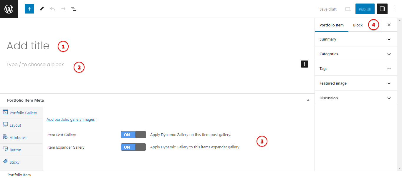
Image Legend
1. Title – This is the post title for the item. It will also serve as the title on the Item Card, appearing either under the card or when a user hovers over the card (depending on the option selected in the General Settings).
2. Description – Utilize the WordPress text editor to add your description, much like creating posts. The description will be visible on the item expander on the front end and also within the post. Note that we now leverage blocks for enhanced flexibility.
3. Portfolio Item Media – In this section, you can enhance your portfolio item by adding images to the gallery, customizing the layout, incorporating buttons, making the post sticky, adding attributes and a custom description for the portfolio cards.
4. Portfolio Sidebar – Here, you’ll find the Portfolio Sidebar, featuring the Summary, Feature Image, Categories, Tags, and Discussion—similar to a typical WordPress sidebar in the backend.
Add Images
Each Portfolio item has its own gallery. You can upload any number of images via the Portfolio Item Meta section, located under the WordPress text editor. Simply click the ‘Add portfolio gallery images’ link, and the WordPress Image uploader will open. Upload images or choose any image from your WordPress media library. After selecting or uploading the images, click the ‘Add to Gallery’ button at the bottom right corner of the WP media uploader pop-up. You will then see the image thumbnails in the Portfolio Gallery meta box.

Item Main Thumbnail: The first image among the thumbnails will automatically be used as the item card image on the front end. It’s important to note that you do not need to set it as the featured image separately.
Sort Image Order: Arrange the order of the images in the Item gallery by dragging and dropping the thumbnails in the Portfolio Gallery meta box. Additionally, you’ll notice a delete ‘X’ icon on each thumbnail when you hover over it. This feature allows you to easily and quickly remove images from the gallery without deleting the image from your media library.
Card Description

You can add a custom card description or leave it blank and it will be pull from the first paragraph from item description.
Remember that you will see this option ONLY if you have turn it On from General Settings.
Post Layout: The second item on the Portfolio Item Meta menu is ‘Layout.’ It’s crucial to note that the layout settings apply to users whose post content width exceeds 762px. When the post width is greater than 762px, the default layout expands with the Main Gallery image on the left and Taxonomy and description on the right. When the width is under 762px, the layout changes to the Main image on top, with thumbnails beneath it, followed by Taxonomy and description.
For users with post content wider than 762px, two elements can be controlled on a post-by-post basis. These elements are configured in the General Settings menu, and although they apply to all Portfolio Item posts, they can be overridden for any individual item post.

Image Legend
Post Display: You can choose between a single-column or two-column display for the post.
Main Image Width: This setting determines the width of the Gallery main image, expressed as a percentage of the Theme post content width.
Gallery Thumbnail Position: You have the option to position the gallery thumbnails to the RIGHT or BELOW the Gallery main image, with both positions being relative to the main image.
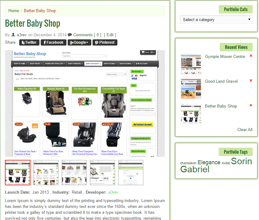
The image below illustrates an Item post on a page without a sidebar and a width of 830px (greater than 762px wide). The layout settings are configured with a Main Image Width of 40%, and the Gallery Thumbnails are positioned below the main image.
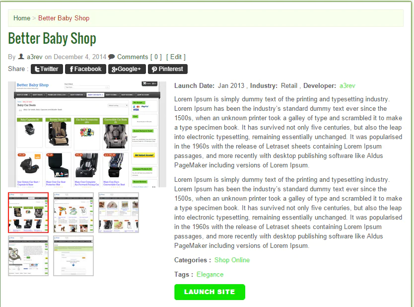
The following image showcases the Portfolio Item Meta > Layout settings on the same post, but this time, the post includes a sidebar. Consequently, the content section of the post is less than 762px wide. Observe how the content automatically wraps below the gallery for an enhanced display, particularly beneficial for tablets in portrait view.
Attributes
Attributes refer to data that is shared among multiple Portfolio items. Values created in the Attribute menu are established in the Portfolio Attribute menu. This setup enables you to add values that are specific to the particular portfolio item being created.

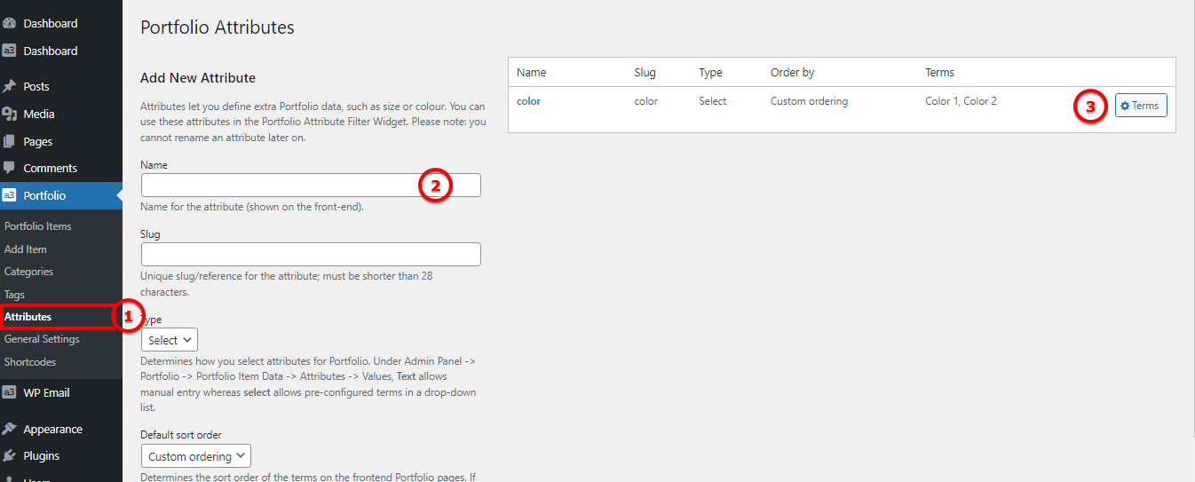
Image Legend
1. Add new attribute by select it from Portfolio menu
2. Give you attribute a name
3. Add new terms for your attribute
Button

Image Legend
1. View More Button: This button appears under the description in the Item Post. It functions to open the item post or expand the portfolio, with the option to set this behavior from General Settings.
2. Launch Button: Displayed beneath the description of the Item Expander, this button allows you to add a link to any URL along with custom button text. If left empty, the button will not be visible on the front end.
3. Open Type: Specify how the link should open; the default is to open in the same window.
Sticky

Toggle the switch to turn on or off the option to display this item as the first. Items with this feature turned on will be showcased at the beginning.
Portfolio Categories
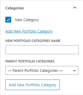
The Portfolio categories meta can be found in the right sidebar of the Item post edit page, akin to WordPress post categories. The meta box functions identically—assign the item post to a category or create new categories as needed.
Portfolio categories serve additional crucial functions. Visit the Portfolio Categories section to learn more about these functionalities.
Portfolio Tags
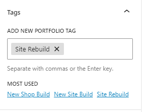
The Portfolio Tags meta can be found in the right sidebar of the Item post edit page, similar to WordPress post Tags. The meta box functions in the same way—add new tags or choose from the most used tags. Refer to the image for a visual guide.
Featured Image
There’s no need to set an image as featured. The first image in the Portfolio Item Meta > Portfolio Gallery will automatically be displayed as the Portfolio Gallery main image and on the item card. If you choose to set a Featured image, the thumbnail won’t appear in the Portfolio gallery meta (it will be visible in the featured image meta—refer to the image below), and the image will be used as the main image, showcased on the item card.

Portfolio Categories
Portfolio categories function as a custom WordPress Taxonomy. This implies that creating categories works just like post categories, but they also incorporate a couple of advanced features.
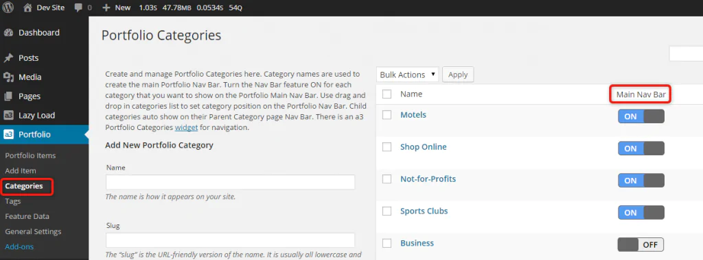
Portfolio Nav Bars
The Portfolio main page Navigation bar is generated from the names of the Portfolio Parent Categories that are created and turned ON to display on the main navigation bar. If a category is turned OFF, then that category and all the Portfolio items assigned to it will not appear on the main Portfolio page. No need to worry—you can utilize your WordPress Menus to showcase a category page on any navigation bar, and alternatively, use the a3 Portfolio Category widget for navigation.
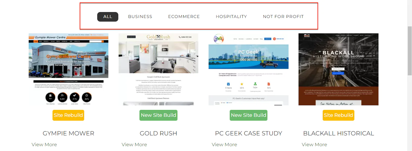
When the Portfolio page initially loads, all the items are displayed under the ‘All’ tab. Clicking on a category name dynamically filters and displays only the items assigned to that category without the need for the page to reload. You can see that here on the demo site.
Nav Bar Sort
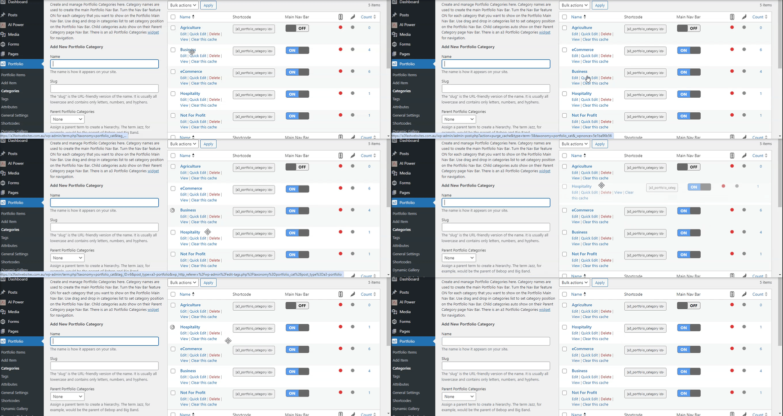
To sort the order in which the Portfolio Navigation bar items appear, simply drag and drop the Categories into your preferred position on the Categories table. Note that any Categories marked as turned OFF for display on the main navigation bar are disregarded in the front-end navigation bar order. To rearrange, hover over a Parent Portfolio category, and you’ll see a 4-way arrow. Click on the category, hold down your left mouse clicker, and while holding it down, move your mouse up or down the page. Once the Parent category is in the desired position, release the left mouse clicker to drop it into place.
Portfolio Tags/Stickers
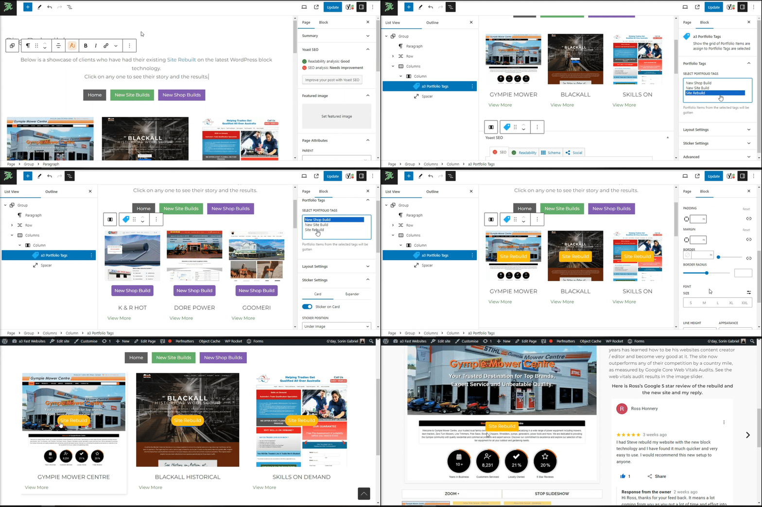
Stickers, now based on Tags, offer a visually engaging element for your portfolio. To make stickers visible, you need to set them. There are two settings available: one for the card and another for the expander. Noteworthy features include a new ‘Portfolio Tags Meta’ block for use in Content or Single Portfolio Block Pages. Additionally, a new sticker is introduced for both the card and expander, providing enhanced customization. To ensure a cohesive visual experience, color settings for tags have been adjusted to seamlessly display as stickers on Portfolio Blocks.
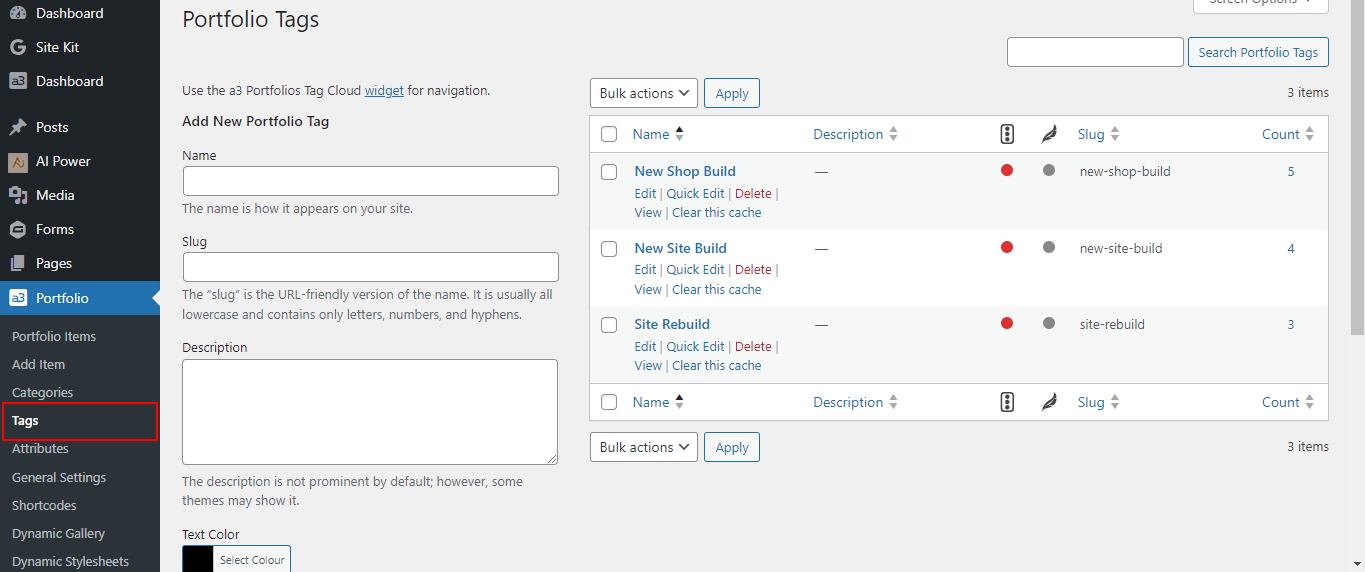
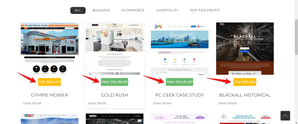
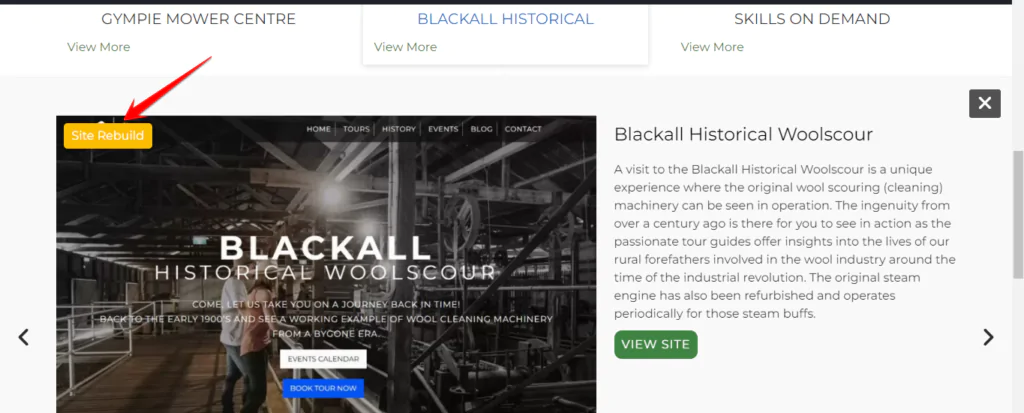
Add a new sticker
Additionally, we now offer support for stickers with settings available for both the card and expander across six of our existing blocks.
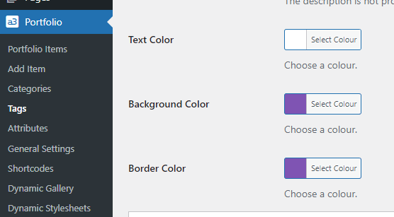
In each tag, you have the ability to define the color of the sticker customizing the Text Color, Background Color, and Border Color, providing comprehensive control over the appearance of your tags/stickers.
General Settings
In the General Settings, you’ll discover all the options to style your item cards, expander, and item posts.
Settings
The general settings for a3 Portfolio plugin.
Plugin Framework Global Settings
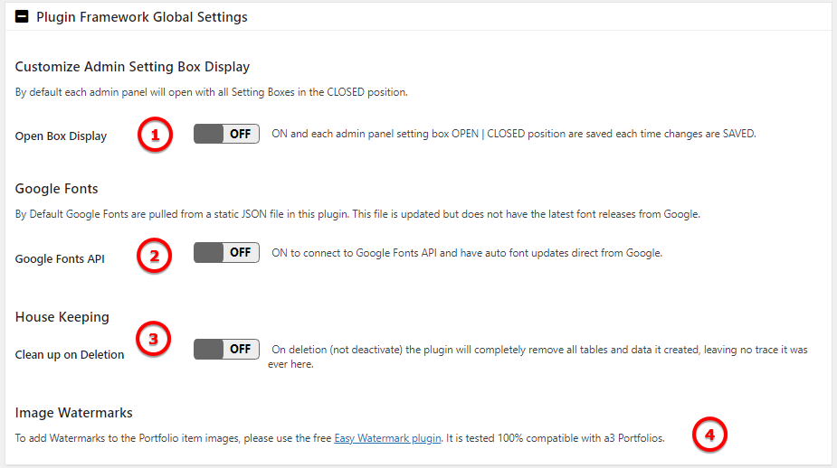
Image Legend:
1. Customize Admin Setting Box Display – ON and each admin panel setting box OPEN | CLOSED position are saved each time changes are SAVED.
2. Google Fonts – By Default Google Fonts are pulled from a static JSON file in this plugin. This file is updated but does not have the latest font releases from Google.
3. House Keeping – On deletion (not deactivate) the plugin will completely remove all tables and data it created, leaving no trace it was ever here.
4. Image Watermarks – To add Watermarks to the Portfolio item images, please use the free Easy Watermark plugin. It is tested 100% compatible with a3 Portfolios.
Portfolio Item Images
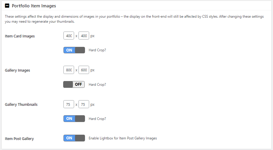
These settings influence the display and dimensions of images in your portfolio. However, it’s important to note that the front-end display can still be influenced by CSS styles. After making changes to these settings, you may need to regenerate your thumbnails for optimal results.
Item Cards
Style your front end item cards
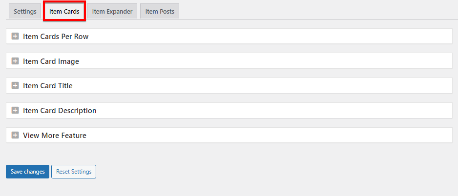
Item Cards Per Row

Specify the maximum number of items to display per row on larger screens.
Item Card Image

Image Legend
1. Image Display Height: Choose between a fixed or dynamic display height for images. In dynamic mode, it will show the image in its original size.
2. Image Height as a % of Width: If ‘Fixed’ is selected, you can set the percentage of the image height in relation to its width.
3. Image Link Opens: Specify whether clicking on the item card image will open the expander or the item post.
Item Card Title

Image Legend
1. Item Title Position: Choose between having the title under the image (as shown in the above example) or having it appear on hover (the title shows when you place your mouse over the image).
2. Title Link Opens: Specify whether clicking on the title should open the expander or the item post.
Item Card Description

Image Legend
1. Item Card Description: Toggle ON to display the description on the Item Card under the image.
2. Description Height: Choose the height of the description, with options up to six rows. You can add a custom card description, or if left blank, it will be pulled from the first paragraph of the item description.
View More Feature

Image Legend
1. Item Card View More – ON to show the view more button on the Item Card under the description
2. View More Link Opens – Clicking on the button you can have open the Item Expander or the Item Post
Item Expander
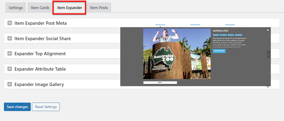
Item Expander Post Meta

Post meta shows under the post name on the expander.
Item Expander Social Share

Turn Off or On the social share icons on the expander.
Expander Top Alignment

By default, the item expander will open at the top if the screen or 0px from top. Use the setting to adjust the distance that the expander opens from the top of the screen to match your requirements in PC’s and mobiles
Expander Attribute Table

Show the attributes position: above or bottom of the expander content
Expander Image Gallery

Set the thumbnail position. In this example it set below main gallery image.
Item Posts

Item Posts Layout

Image Legend
Settings here apply to all Portfolio Item posts. These can be over-ridden from Portfolio Item Meta on each Items edit page.
1. Post Display – It can be set on 1 column or 2 columns like in the example
2. Main Image Width – The Gallery main image container width as a percentage of the full content width
3. Gallery Thumbnail Position – Gallery Thumbnails position in relation to the Gallery main image
Item Post Attributes Table

Set where the attributes will show on Item Post
Item Post Template Reset

Switch this ON and Save Changes if you want all Item Posts to have the same Layout that you have set above in the + Item Post Layout options.
Important! Clear your cache after so that you and visitors see changes
Shortcodes
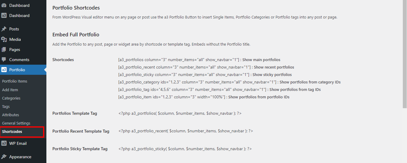
From WordPress Visual editor menu on any page or post use the a3 Portfolio Button to insert Single Items, Portfolio Categories or Portfolio tags into any post or page.
Portfolio Blocks
Adding a portfolio block is a breeze! Simply navigate to the WordPress editor and click on the ‘+’ icon to add a new block. Scroll down ( usually they are firsts on top, depending on others blocks that you have install ) or search for ‘a3 Portfolios’ in the block inserter. Choose the specific portfolio block you want to showcase, whether it’s the full portfolio, selected items, categories, tags, or recent entries. Our user-friendly interface makes it easy to find and insert the perfect portfolio block for your content.
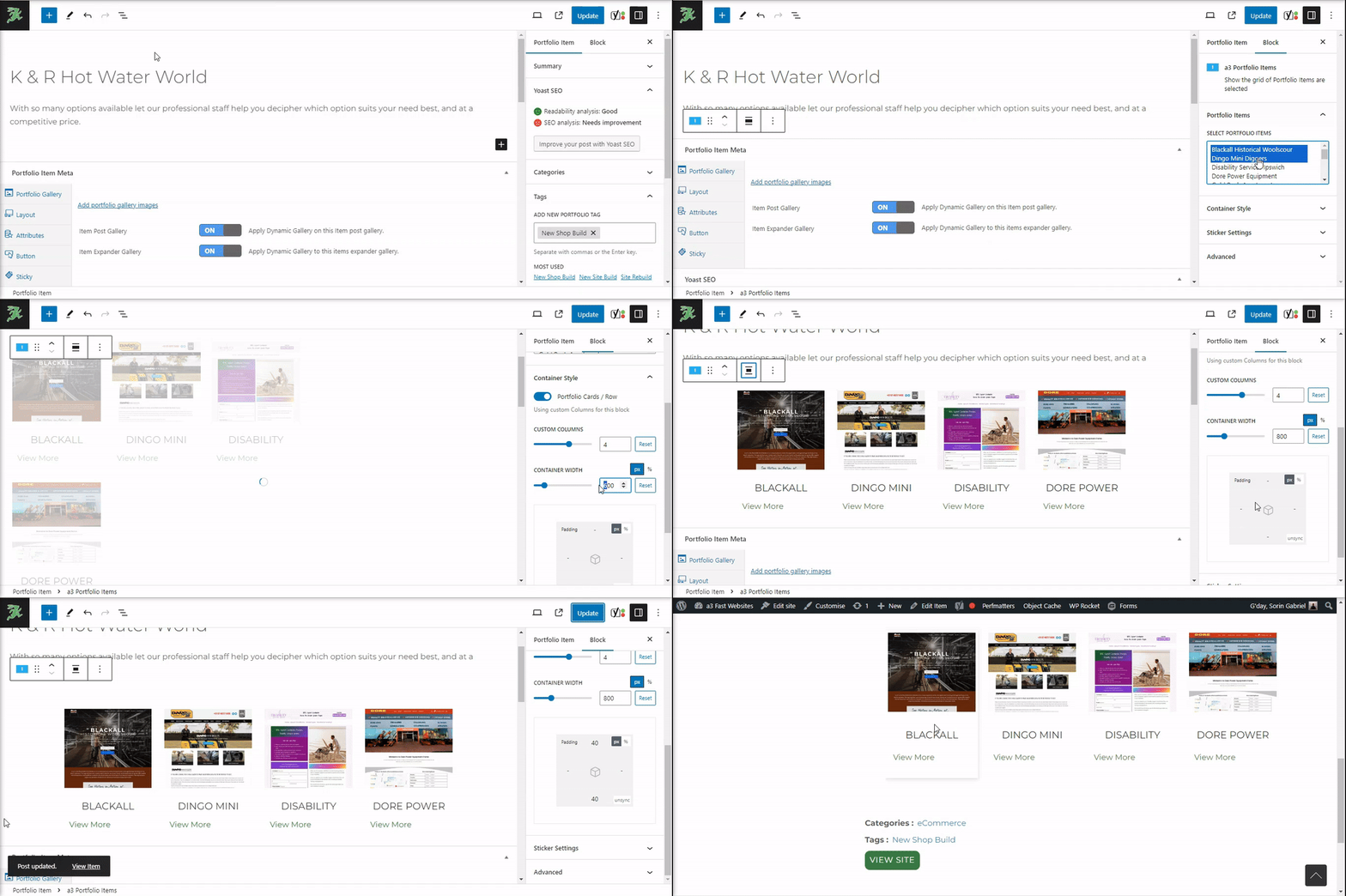
6 Powerful Portfolio Blocks
- a3 Portfolios: Display a grid showcasing all portfolio items.
- a3 Portfolio Categories: Present a grid of portfolio items assigned to selected portfolio categories.
- a3 Portfolio Items: Showcase a grid of selected portfolio items.
- a3 Portfolio Tags/Stickers: Exhibit a grid of portfolio items assigned to selected portfolio tags/stickers.
- a3 Portfolio Sticky: Highlight a grid of portfolio items set as sticky.
- a3 Portfolio Recent: Feature a grid of the latest portfolio items.
- Portfolio Tags Meta: Display the tags associated with portfolio items.
Settings Overview:
Selectors:
- Some blocks offer selectors for specific items, tags/stickers, or categories for customization.
Common Settings:
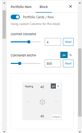
- Portfolio Cards / Row (Using custom columns for this block): Adjust the number of portfolio cards to display in each row, with support for custom columns (up to 6).
- Container Width: Easily select the desired width for the block container, ensuring seamless integration with your overall design.
- Padding: Choose the space between contain and inside border.
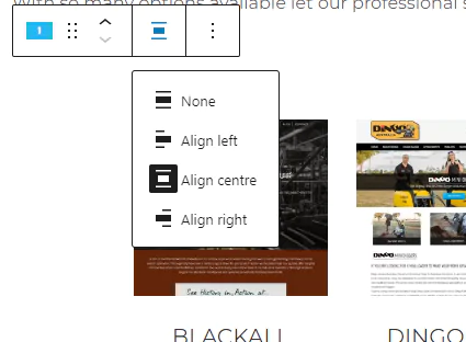
Alignment Toolbar:
- Use the alignment toolbar to effortlessly align and position your portfolio cards for a visually appealing display. Customize the layout to suit your design preferences with just a few clicks.
Tags/Stickers
Explore detailed sticker settings, including padding, sticker position, margin, and typography, across all blocks. Achieve a polished and professional look for your entire portfolio presentation.
Individual Settings: Note that sticker settings also include specific configurations for cards and expanders. Discover the full range of customization possibilities in their respective sections.
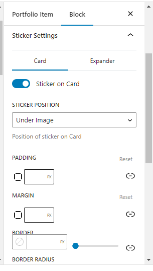
For more details, refer to Stickers Documentation.
