Getting Started
Create fully responsive image sliders. Insert by shortcode, widget or php function. Auto Mobile touch swipe, Ken Burns effect option, supports YouTube video.
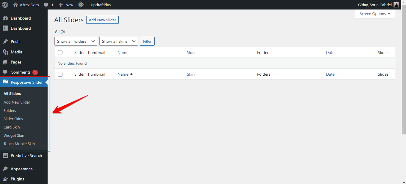
Once you have the plugin installed and activated it’s add the menu to your WordPress admin sidebar navigation.
Add New Slider
In order to create a slider will need to add some images. To do that click on “Add New Slider”.
Settings
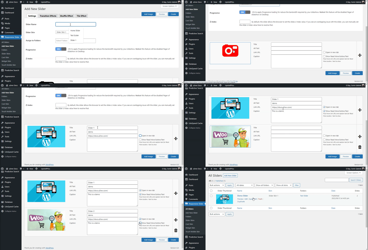
The first panel we see it’s the settings one. From here you can add a new image, add title, description and a Read More button or text to show.
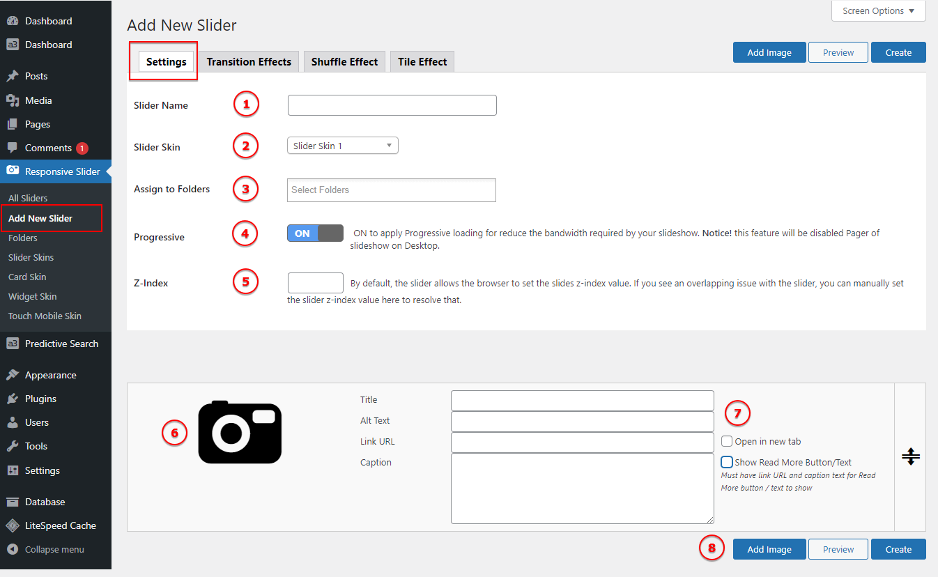
Image Legend:
1. Slider Name – Since you can create a unlimited number of sliders, name them to be easy for difference them.
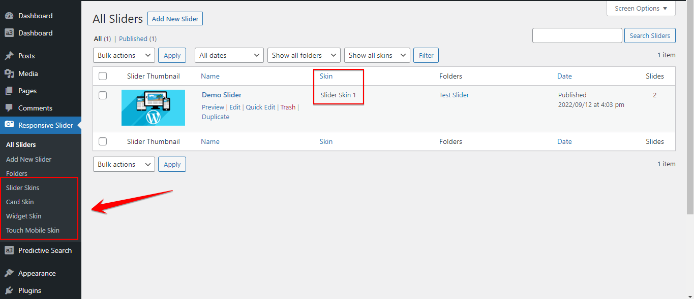
2. Slider Skin – Choose what type of layout to use: Slider Skin 1, Slider Skin 2, Card Skin or Widget Skin. We will see what they do in the bellow section.
3. Assign to Folders – If you create any folders, can select them from here. They work as category.
4. Progressive – ON to apply Progressive loading for reduce the bandwidth required by your slideshow. Notice! this feature will be disabled Pager of slideshow on Desktop.
5. Z-Index – By default, the slider allows the browser to set the slides z-index value. If you see an overlapping issue with the slider, you can manually set the slider z-index value here to resolve that.
6. Add an image – Click on the photo image to add a new image from media gallery or upload one.
7. Image info (title, alt text, link url and caption) – For each image you add to the slider can write a title, alt text, link url and caption. Can be style from the Skin (template) you choose to use.
8. Add another image – To continue adding images to the slider click this button and a new field will show.
9. Create the slider – Clicking Create will make you Slider publish and show on All Slider menu.
Transition Effects
A slide transition is the visual effect that occurs when you move from one slide to the next. You can control the speed and customize the look of transition effects. Choose to use a Youtube video or a image.
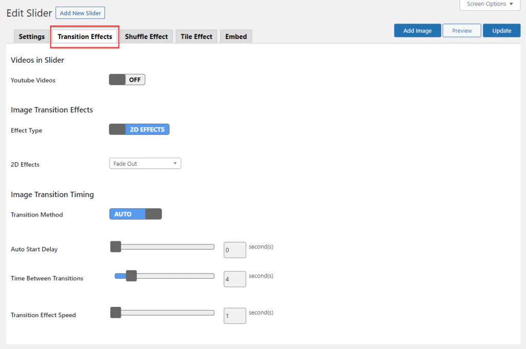
Image Legend:
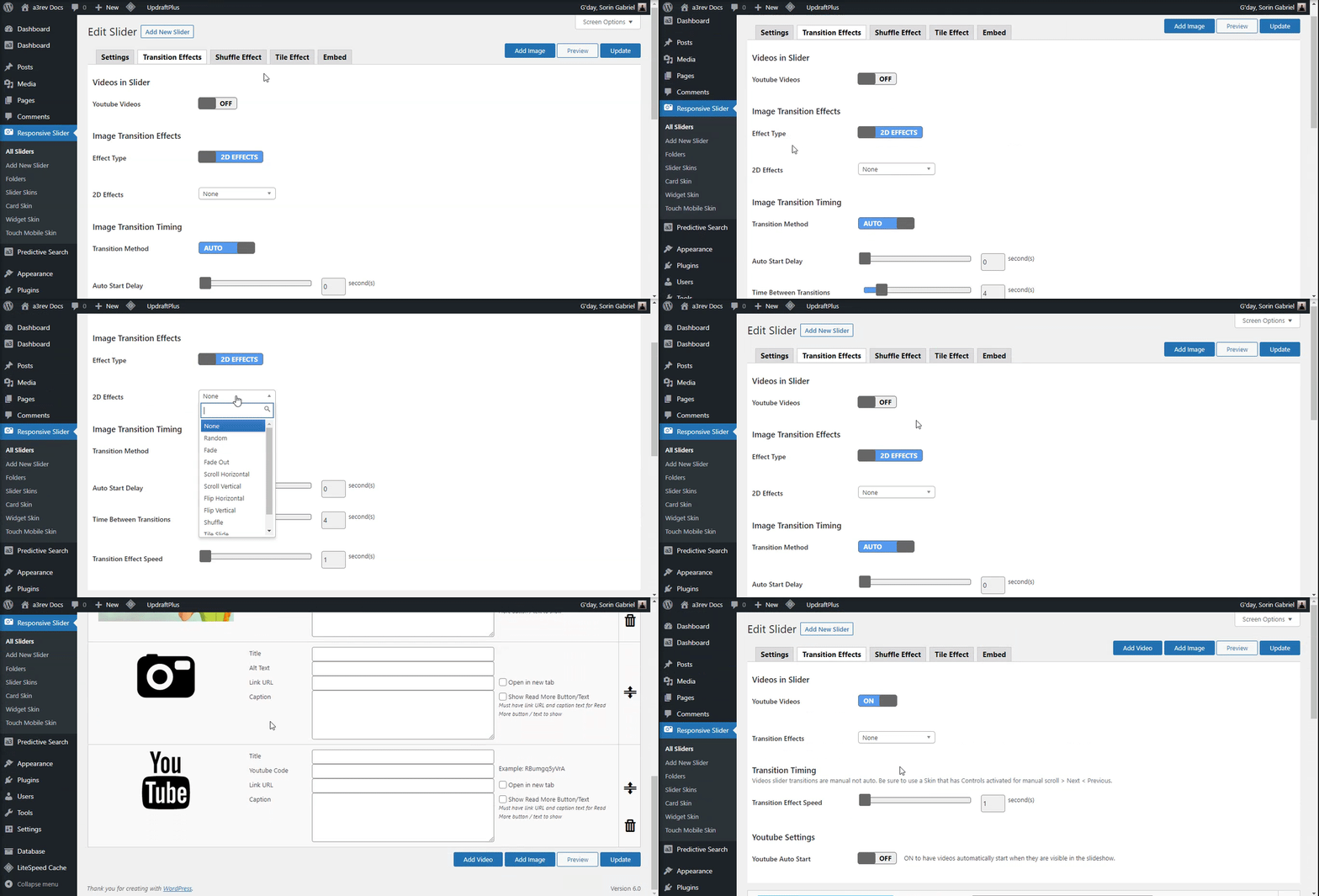
1. Images in Slider – From default the slider will use Images. The images have option for: Transition Effects ( 2D effects or Ken Burns effect ) and Transition Timing ( Transition Method, Auto Start Delay, Time Between Transitions and Transition Effect Speed ).
2. Videos in Slider – Turn On and use a Youtube video instead a image. When it’s On a new button will show on top right corner “Add Video”, clicking it you can add a Title, Video Code, Link url and caption. Can use both images and videos in the same slider. When it’s On it will show custom option for video slider like: Youtube Auto Start, Transition Effects ( 4 effects style ) and Transition Timing ( Videos slider transitions are manual not auto. Be sure to use a Skin that has Controls activated for manual scroll > Next < Previous ).
Shuffle Effect Settings
If you select on the Transition Effect panel the 2D Effects with Shuffle transition from this panel you can control the effect.

Image Legend:
1. Shuffle Left – Pixel position relative to the container’s left edge to move the slide when transitioning. Set to negative to move beyond the container’s left edge.
2. Shuffle Right – Number of pixels beyond right edge of container to move the slide when transitioning
3. Shuffle Top – Number of pixels beyond top edge of container to move the slide when transitioning.
Tile Effect Settings
If you select on the Transition Effect panel the 2D Effects with Tile Slide or Tile Blind transition from this panel you can control the effect.

Image Legend:
1. Tile Count – Select the number of tiles to use in the transition.
2. Tile Delay – The number of seconds to delay each individual tile transition.
3. Tile Vertical – Set to OFF for a horizontal transition.
Slider Embed
You can add the slider by Shortcode or PHP.

Image Legend:
1. Shortcode: [ a3_responsive_slider id=”5264″ ]
2. Template tag: <?php echo a3_responsive_slider( 5264 ); ?>
3. All Posts have this slider is embed into content – With one simple click you can remove this Slider from all the post it been used.
Folders
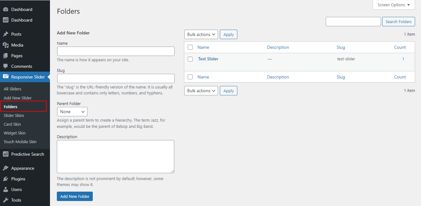
This works exactly like Categories or Tags. It let you organize your sliders thru folders (categories). Add a name, slug and a parent folder if you need. Then select the folder create here in Slider Setting by assign the slider to a folder (category).
Slider Skins (template)
Use these Dynamic Slider Skins settings to edit the style and layout of the skin without touching the Skin CSS.
We have 5 skins (templates) ready to use: Slider Skin 1, Slider Skin 2, Slider Card Skin, Slider Widget Skin and Touch Mobile Skin ( apply only on mobile devices ). Every skin have their own settings and option to be customize. Will see bellow how to style and when to use them.
You just need to style once and then selected from the Slider Settings and assign it to your slider. The skins can be use on unlimited number of slider, but remember you can have one skin for slider that can be change or modify anytime without loosing your work.
Slider Skin 1 and Slider Skin 2
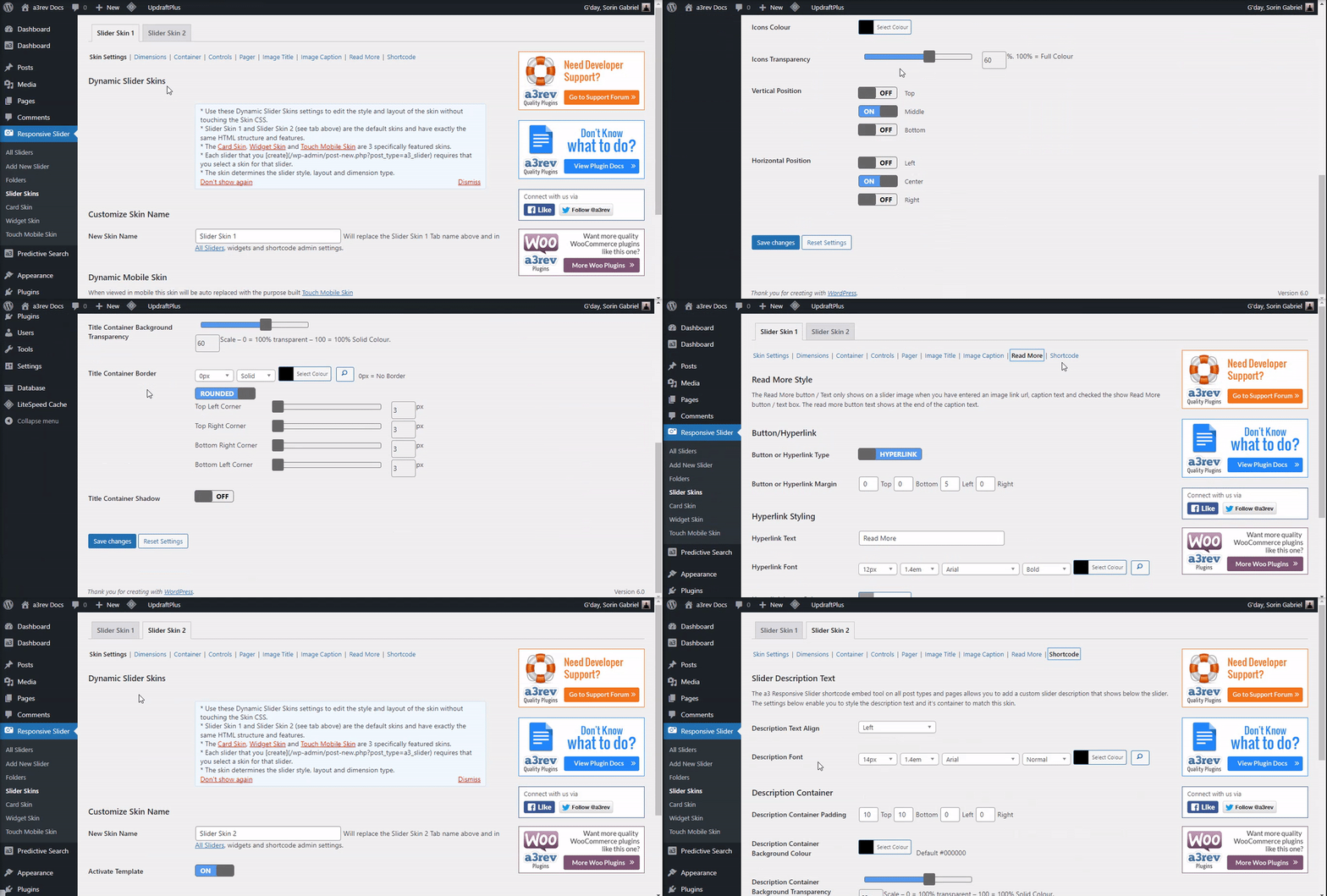
Slider Skin 1 and Slider Skin 2 are the default skins and have exactly the same HTML structure and features.
From here you can customize the Dimension type, width and height of any Slider. Style the container of the slider adding a background colour, border and shadow.
Next style the Controls Icons ( Next / Previous Icons and Pause | Play Icons ) to match with your website design style.
The next tab is the Pager Settings ( footer of the slider ). There are many option to customize the pager section of the slider, such as: Pager Transition, Pager Direction, Container Background Colour, Pager Container Border, Pager Bullet Border and so on…
If you add a Image Title it can be style from here. Chose the Title Position, Direction, Container Maximum Wide, Font, Font color on hover, border and shadow type, size and color.
The next setting is for Caption. If you have add a caption then it’s need to be style to match with the rest of the slider and your website. Set the Caption Position, length, font, container background colour and border.
The Read More button / Text only shows on a slider image when you have entered an image link url, caption text and checked the show Read More button / text box. The read more button text shows at the end of the caption text.
Last setting is for Slider Description Text. The a3 Responsive Slider shortcode embed tool on all post types and pages allows you to add a custom slider description that shows below the slider. The settings below enable you to style the description text and it’s container to match this skin.
Card Skin
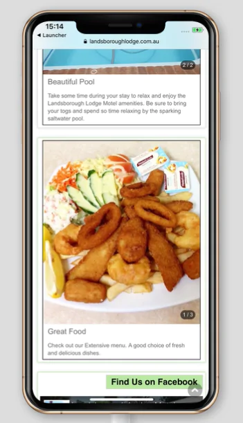
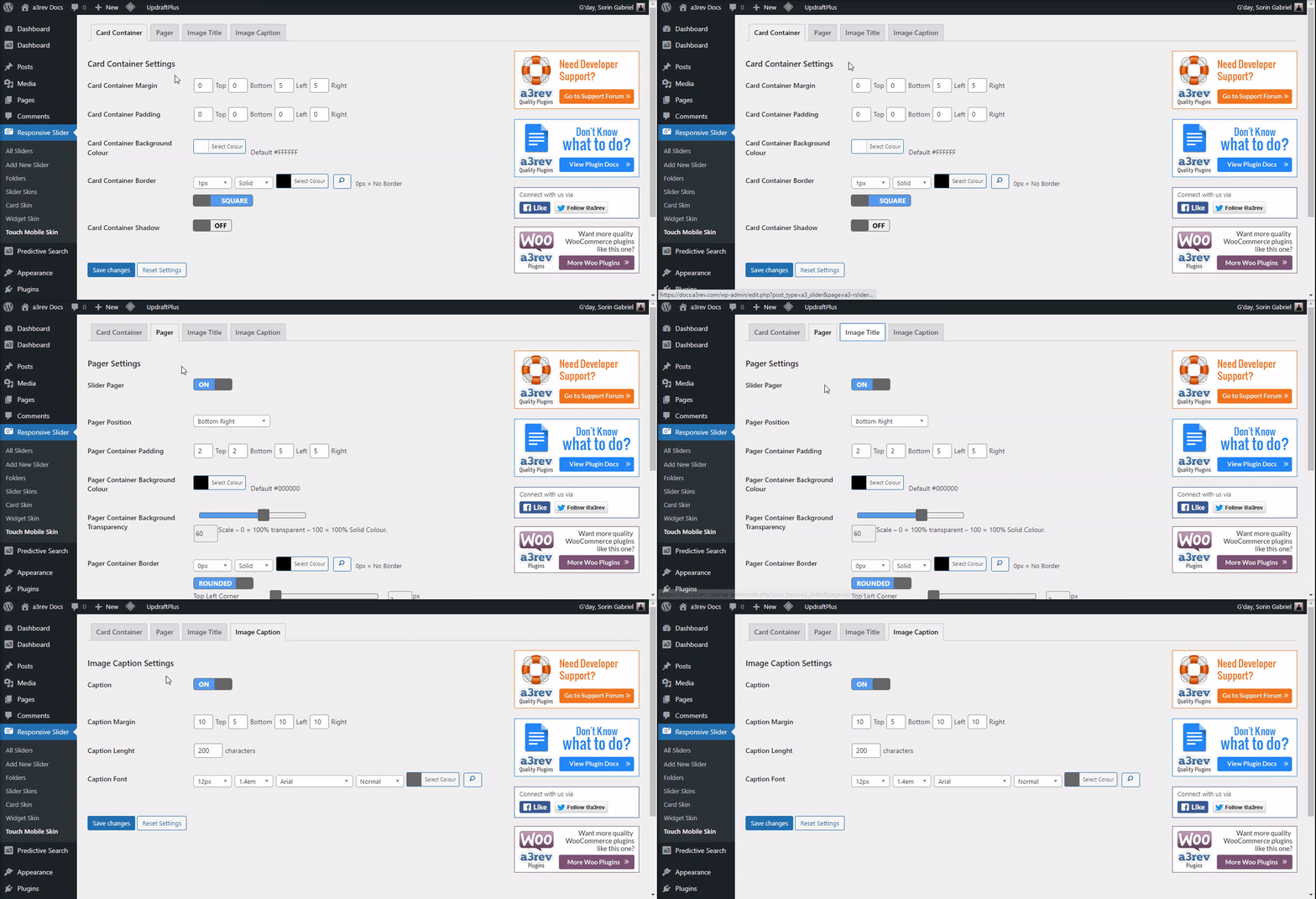
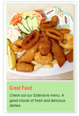
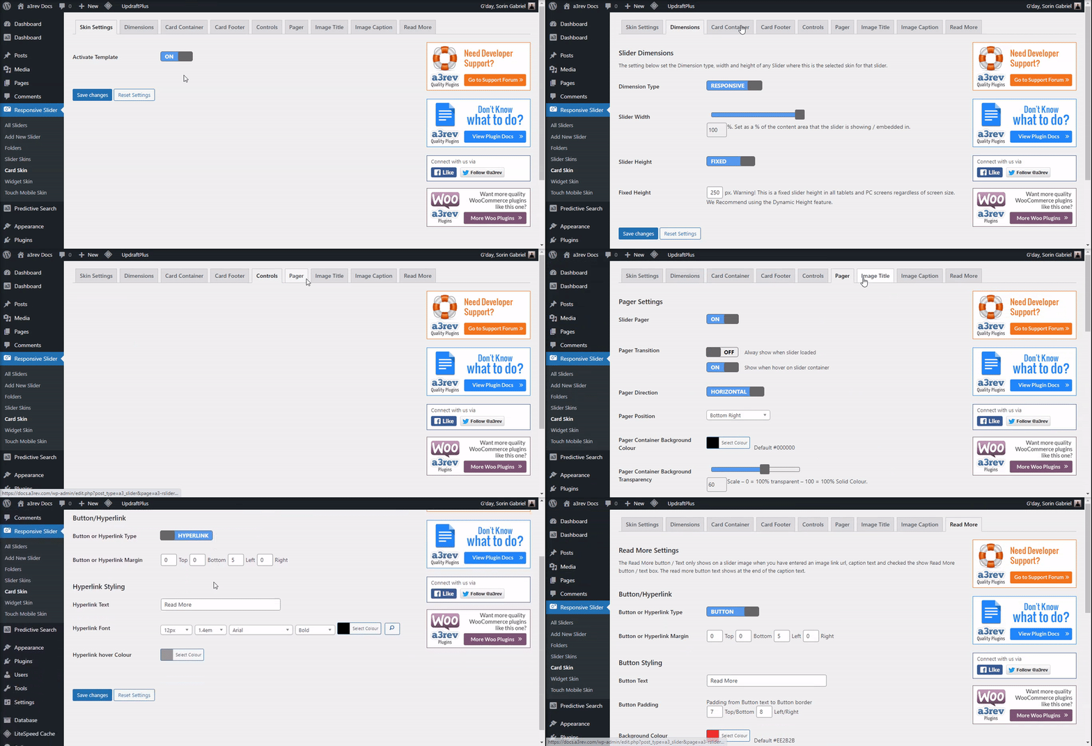
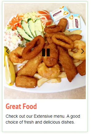
Card Skin allows you to create a Blog Card style for the slider. Images show at the top of the card and Title, caption and read more below it on a Card Footer.
Settings for:
- Dimension
- Card Container
- Card Footer
- Controls
- Pager
- Image Title
- Image Caption
Widget Skin
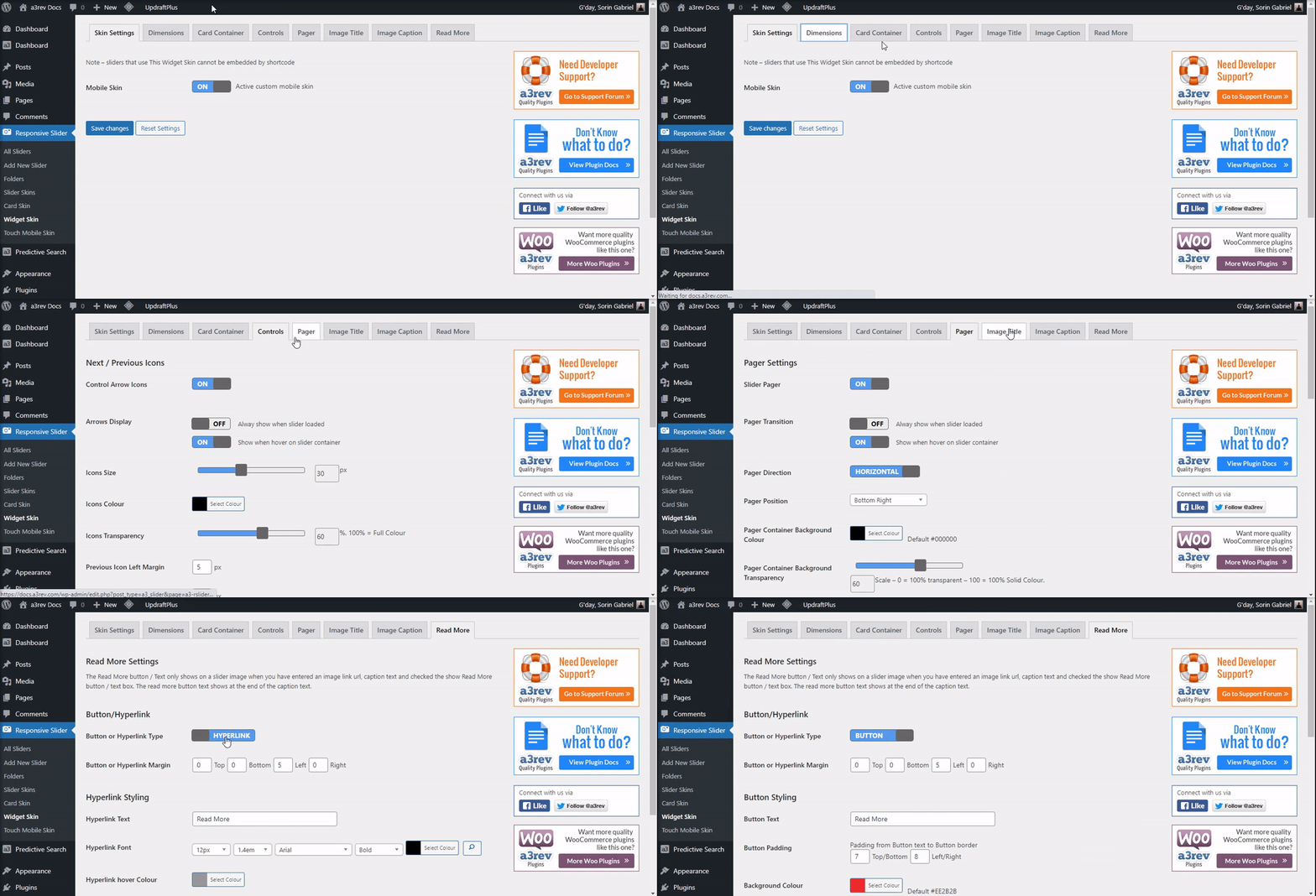
Add a slider to any widget area on your site. Purpose built and fully customizable Widget Skin.
- Note – sliders that use This Widget Skin cannot be embedded by shortcode.
Touch Mobile Skin
The plugin supports Touch Slide in mobile devices by default. The Default touch mobile skin by default removes Titles, caption and Read more from the slider. The Touch Mobile skin shows those under the image in mobile devises.
