Enhance your website’s user experience by organizing your content beautifully within tabbed sections. With its intuitive design and extensive customization options, a3 Tabs allows you to create dynamic, interactive content layouts that are both engaging and informative.
Getting Started
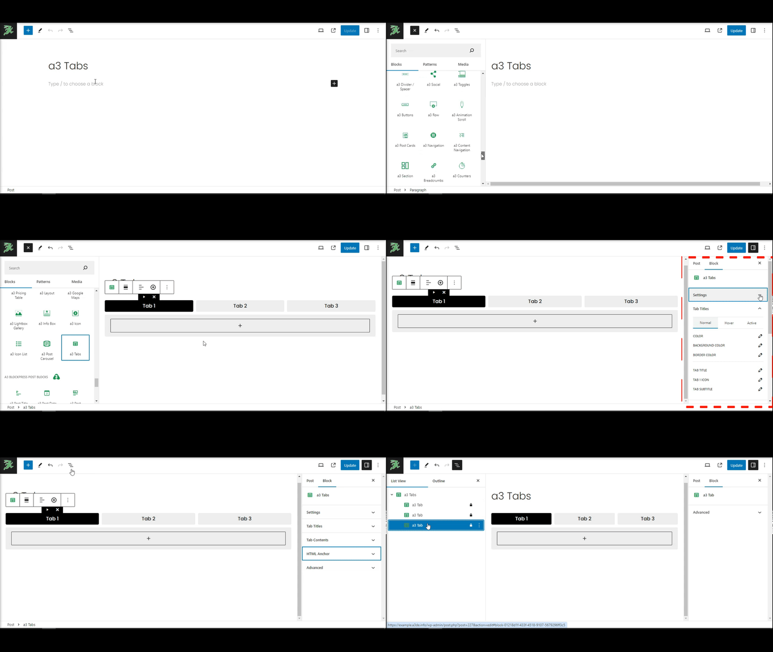
Adding a3 Tabs to Your Page
To incorporate a3 Tabs into your content:
- Click on the Add Block button (the “+” icon) in the Gutenberg editor and search for a3 Tabs. Alternatively, you can quickly add the block by typing
/tabsin the editor. - a3 Tabs will present a pre-made structure for immediate customization.
Tabs: Basics & Examples
a3 Tabs functions similarly to tabbed file folders in a web environment, allowing users to switch between different content sections effortlessly. This interaction model facilitates a clean and organized presentation of information, suitable for FAQs, product features, and more.
Our a3 Tabs Block
Let’s Check a Example

As practice unfolds certain obstacles may appear to the meditator. In week five skilful ways of overcoming obstacles to practise will be discussed. The cycle of conditioning will also be explained to clarify how we get caught in the cycle and how we can get out of it.
Add Your Tabs Content
After you’ve added the a3 Tabs block to your page, you can begin customizing the content within each tab. Here’s how to effectively manage your tabs and their content:
Setting Up Tabs
- Determine the Number of Tabs: Decide how many tabs you’d like to display. You can set this up in the block settings, choosing to display your tabs either horizontally or vertically.
- Adding Content: Within each tab panel, you can add any type of content you desire. This is done by clicking the ‘+’ icon inside a tab to add a new block. You can include text, images, videos, or any other Gutenberg blocks as nested content within each tab.
Navigating Between Tabs
To facilitate easy customization and arrangement of your tabs:
- Switch Between Tabs: Use the left and right arrow icons (
<and>) located at the top of the block editor when a tab is selected. These icons allow you to navigate between your tabs directly in the editor, making it easier to organize and edit the content of each tab sequentially.
Removing Tabs
- Delete a Tab: If you decide that you no longer need a particular tab, you can remove it by clicking the “X” icon on the tab you wish to delete. This action will remove the tab along with its content.
Settings
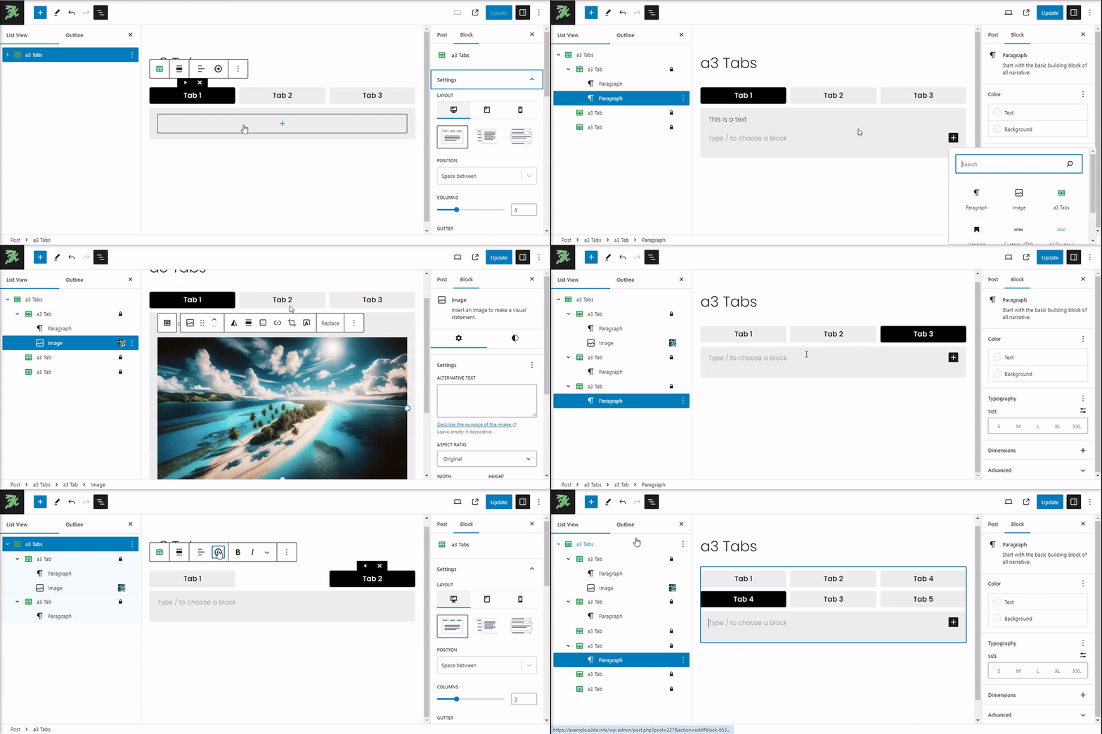
The a3 Tabs block provides a wide array of settings in the Gutenberg editor’s right sidebar, allowing you to fine-tune the appearance and functionality of your tabs. Here, you can adjust the layout and structure of your tabs.
Layout Styles
You can choose from three distinct layout styles to best match your content’s needs:
- Tabs: The standard horizontal tab layout.
- Vertical Tabs: Tabs displayed vertically along the side of the content.
- Accordion: Tabs that expand and collapse, ideal for mobile displays.
Position and Width
Adjust the Position of the gutter (the space between tabs) and set the Max Width of the tab container to ensure your tabs align perfectly with the rest of your content.
Columns Settings
With the Columns settings, you can determine the structure of your tabs layout by specifying the number of tabs to be displayed:
- Select the number of tabs you wish to display, up to a maximum of 8 tabs.
This setting is particularly useful for organizing larger amounts of content into a more manageable format, making it easier for users to navigate and interact with your content.
Initial Open Tab
The Set Initial Open Tab feature allows you to designate which tab is open by default when the page loads, guiding your audience’s attention to where you want it from the start.
Responsive Design
Don’t forget to adjust the layout for different screen sizes using the Responsive Settings. This ensures that your tabs look just as good on mobile and tablet devices as they do on desktop screens.
Tab Titles
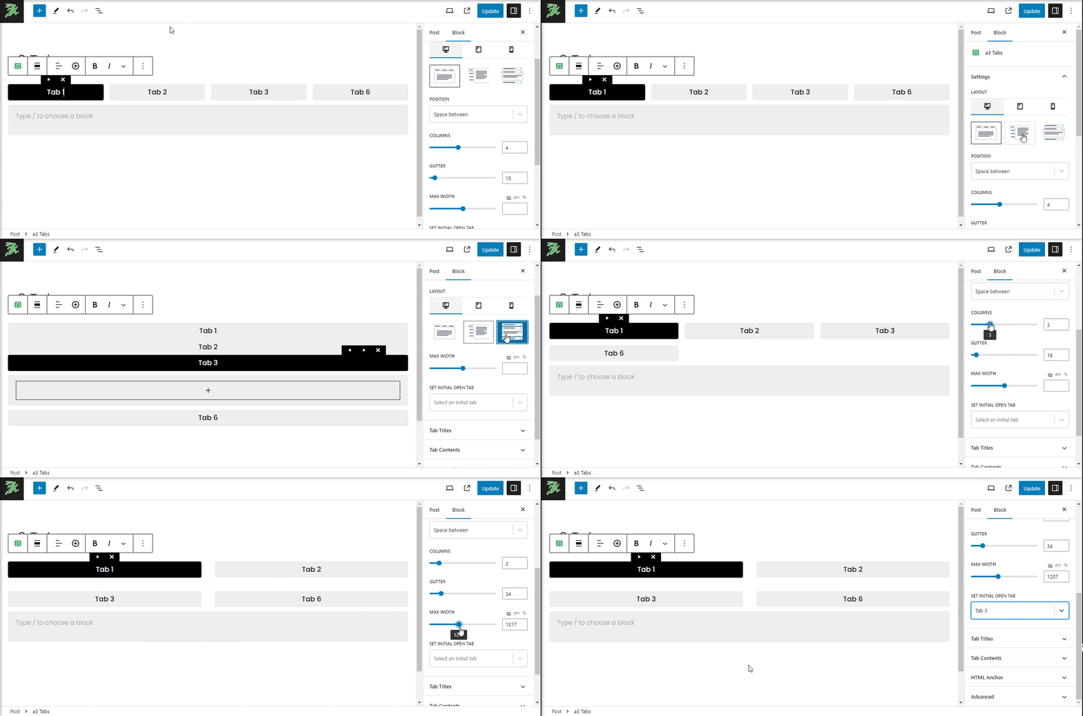
Customizing the appearance of your tab titles is crucial for creating an engaging and visually appealing interface. The a3 Tabs block offers extensive options to style your tab titles, ensuring they align perfectly with your site’s design and branding. Here’s how you can customize your tab titles:
Color Settings
- Color: Set the text color of your tab titles. You can define different colors for normal, hover, and active states to enhance user interaction and visual feedback.
- Background Color: Choose a background color for your tab titles for all states — normal, hover, and active. This setting is vital for making your tabs stand out or blend in with your site’s theme.
- Border Color: Customize the border color of your tab titles. You can set distinct border colors for normal, hover, and active states, adding a subtle or bold visual cue to the tab’s interactivity.
Tab Title Font Settings
Dive deep into typography settings to adjust the font size, family, line height, and letter spacing of your tab titles. Tailoring these aspects lets you match the tab titles’ style to your overall site design, ensuring consistency and readability.
Tab Icons and Subtitles
- Tab Icon: Enhance your tab titles by adding an icon to each individual tab. This feature allows for a more graphical representation of the tab content, making it easier for users to navigate your tabs intuitively.
- Tab Subtitle: Display a subtitle on each tab to provide more context or information about the tab’s content. You can style the subtitle to fit the overall design of your tabs, including adjustments for font size, color, and positioning.
By leveraging these customization options, you can create tabs that are not only functional but also a visual extension of your site’s theme and user experience. Remember, the key to effective tab design lies in maintaining a balance between aesthetics and usability, ensuring that your tabs are both attractive and easy to navigate.
Tab Content
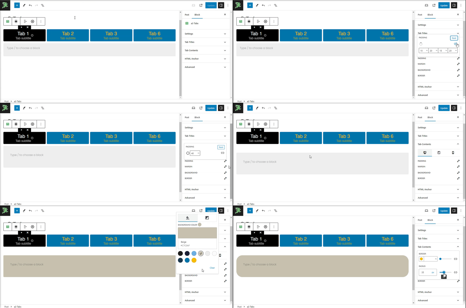
For the tab content within the a3 Tabs block, adjusting the padding, margin, background, and border settings is essential for achieving a tailored look and feel that complements your overall website design. Here’s how to customize these aspects for the content area of each tab.
HTML Anchor & Additional CSS
Enhance the functionality and style of your a3 Tabs block by adding an HTML anchor for direct linking or custom CSS classes for further stylistic adjustments. You also have the option to save your configured block as the default setup for future use.

