Navigation
Dynamic Stylesheet Overview:
The Dynamic Stylesheet add-on is a powerful tool that empowers you to customize various elements of your portfolio without the need for coding knowledge. This add-on provides control over essential components like Item Cards, Item Expander, Button Style, Nav Bar, Image Caption, and Portfolio Attributes.
- Item Cards: Adjust the appearance and layout of your portfolio item cards.
- Item Expander: Fine-tune the details displayed when an item is expanded.
- Button Style: Tailor the look and feel of buttons within your portfolio.
- Nav Bar: Customize the navigation bar for seamless user experience.
- Image Caption: Control how image captions are presented.
- Portfolio Attributes: Modify the appearance and arrangement of portfolio attributes.
Benefits:
- No Coding Required: Dynamic Stylesheet simplifies customization for users with no coding experience.
- Personalize Each Element: Tweak individual elements to suit your unique preferences.
Installing the add-on
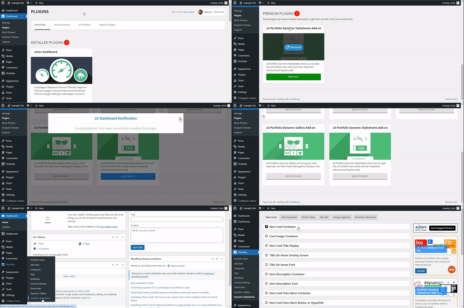
a3 Portfolio Dynamic Stylesheet Add-on is available directly from your a3 dashboard.
Getting Started
Once you have the Dynamic Stylesheet add-on installed and activated, a new menu will appear in the a3 Portfolio section named “Dynamic Stylesheet.” To access the settings, follow these steps:
- Navigate to a3 Portfolio > Dynamic Stylesheet.
- Click on the “Dynamic Stylesheet” link to open the settings.
Upon clicking, you will be directed to the first tab of settings, allowing you to configure various customization options for your portfolio style.
Item Cards Style
Each Portfolio item shows as a Card on the Portfolio main page, Portfolio Category and Portfolio Tag pages and when embed by shortcode or add by blocks.
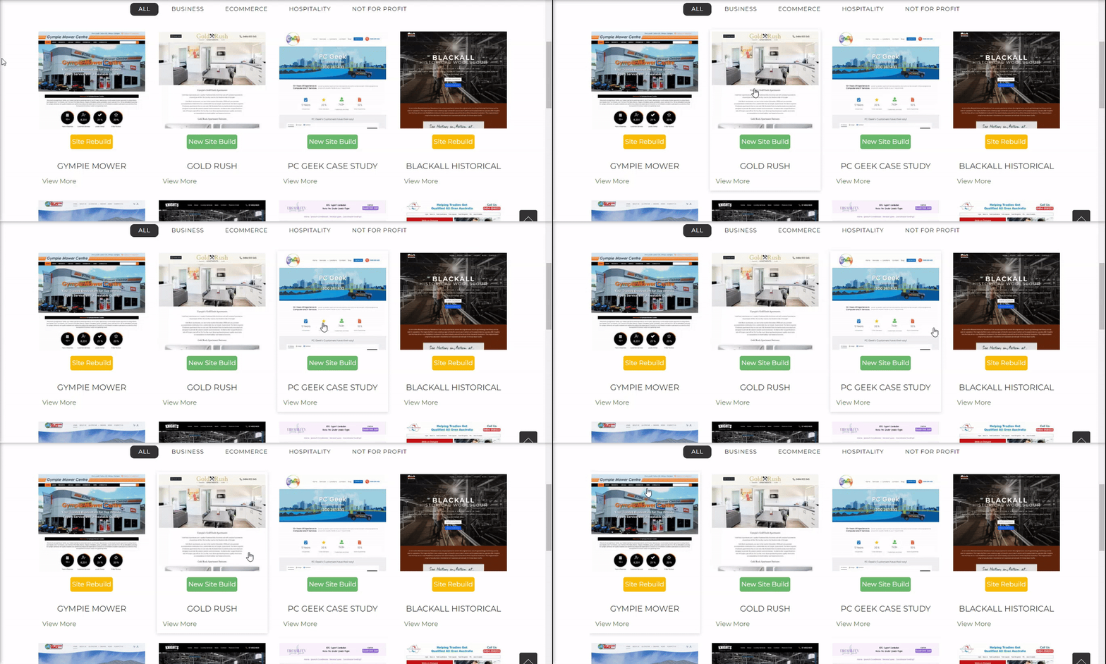
After accessing the Dynamic Stylesheet settings by navigating to a3 Portfolio > Dynamic Stylesheet > Item Cards, you gain control over the design of your portfolio item cards. Customize the appearance and layout of these cards with the following options:
- Item Card Container: Choose from various layout options to suit your preference.
- Image Overlay: Control the overlay style for images on the cards.
- Title Effect: Define the hover effect for the image overlay.
- Card Description: Set the desired height for your portfolio item cards.
- Se More Button Style: Adjust border properties for a polished look.
Explore these settings to tailor the design of your item cards and create a visually engaging portfolio presentation.
Item Card Container
Within the Dynamic Stylesheet settings under a3 Portfolio > Dynamic Stylesheet > Item Cards > Item Card Container, you have control over the container aspects of your portfolio item cards. Customize the following options:
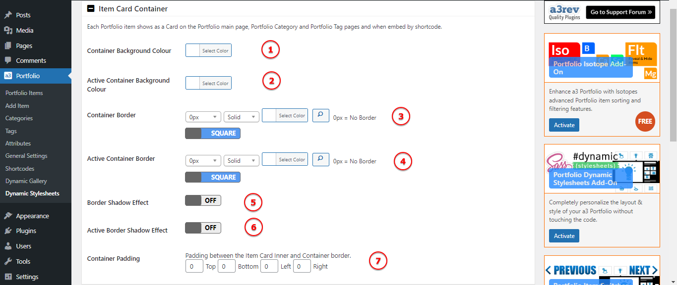
Image Legend
1. Container Background Colour – Choose a color to define the background of the item card container.
2. Active Container Background Colour – Specify a color for the background when the item card is active or selected.
3. Container Border – Adjust properties such as style, color, and thickness for the border of the item card container.
4. Active Container Border – Define the border properties when the item card is active or selected.
5. Border Shadow Effect – Enable or disable a shadow effect to add a subtle depth to the item card container.
6. Active Border Shadow Effect – Configure the shadow effect specifically for when the item card is active or selected.
7. Container Padding – Padding between the Item Card Inner and Container border
Card Image Container
Customize the appearance of the container housing your item card images. Adjust the following settings:

Image Legend
1. Container Padding – Set the padding within the container to control the spacing around your item card images.
2. Container Background Colour – Choose a background color for the container housing your item card images.
3. Active Container Background Colour – Specify a color for the background when the item card is active or selected.
Item Card Title Display
Customize how the title is displayed on your portfolio item cards. Choose between two options: “Show on Hover” and “Under Image,” each with its own set of settings. They have similar options so on our example we choose Under Image.


Image Legend
1. Container Padding – Set the padding within the container to control the spacing around your item titles.
2. Background Colour – Choose a background color for the container housing your item titles.
3. Active Background Colour – Specify a color for the background when the item card is active or selected.
Item Title Font
These settings allow you to further fine-tune the appearance of your item titles, providing you with the flexibility to create a visually appealing and well-styled presentation in your portfolio.. Adjust the following settings:

Image Legend
1. Title Font – Set the font size for your item titles.
2. Title Text Transform – Define the text transformation for your item titles (e.g., uppercase, lowercase).
3. Active Title Font Colour – Specify the color for the title font when the item card is active or selected.
4. Title Font Alignment -Choose the alignment for your item titles (e.g., left, center, right).
5. Title Font Height – Adjust the line height for your item titles.
Item Description Container
These settings provide flexibility in styling the container around your item descriptions, allowing for a polished and visually appealing presentation in your portfolio.

Image Legend
1. Container Padding – Set the padding within the container to control the spacing around your item descriptions.
2. Background Colour – Choose a background color for the container housing your item descriptions.
3. Active Background Colour – Specify a color for the background when the item card is active or selected.
Item Description Font
These settings give you control over the typography of your item descriptions.

Image Legend
1. Description Font – Set the font size for your item descriptions.
2. Description Text Transform – Define the text transformation for your item descriptions (e.g., uppercase, lowercase).
3. Active Description Font Colour – Specify the color for the description font when the item card is active or selected.
4. Description Font Alignment – Choose the alignment for your item descriptions (e.g., left, center, right).
Item Card View More Container
Customize the appearance of the container surrounding the “View More” button on your portfolio cards. Adjust the following settings:

Image Legend
1. Container Padding: Set the padding within the container to control the spacing around your “View More” button.
2. Background Colour: Choose a background color for the container housing your “View More” button.
3. Active Background Colour: Specify a color for the background when the item card is active or selected.
Item Card View More Button or Hyperlink
Button or Hyperlink to customize the appearance of the “View More” button or hyperlink on your portfolio cards. In our example we used Button. Adjust the following settings:

Image Legend
1. Button or Hyperlink Type: Specify whether the “View More” element should be a button or a hyperlink.
2. Button or Hyperlink Alignment: Choose the alignment for the “View More” button or hyperlink (e.g., left, center, right).
Item Card View More Button Styling
These settings allow you to fine-tune the visual aspects of the “View More” button

Image Legend
1. Button Text: Customize the text displayed on the “View More” button.
2. Button Padding: Set the padding within the button to control spacing.
3. Background Colour: Choose a background color for the button.
4. Active Background Colour: Set the background color when the item card is active or selected.
5. Button Border: Define the border style for the “View More” button.
6. Active Button Border Colour: Specify the border color when the item card is active.
7. Button Font: Set the font style for the text within the button.
8. Active Button Font Colour: Specify the font color when the item card is active.
9. Button Shadow: Define a shadow effect for the “View More” button.
Item Expander
Navigate to a3 Portfolio > Dynamic Stylesheet > Item Expander to customize the appearance of the Item Expander.
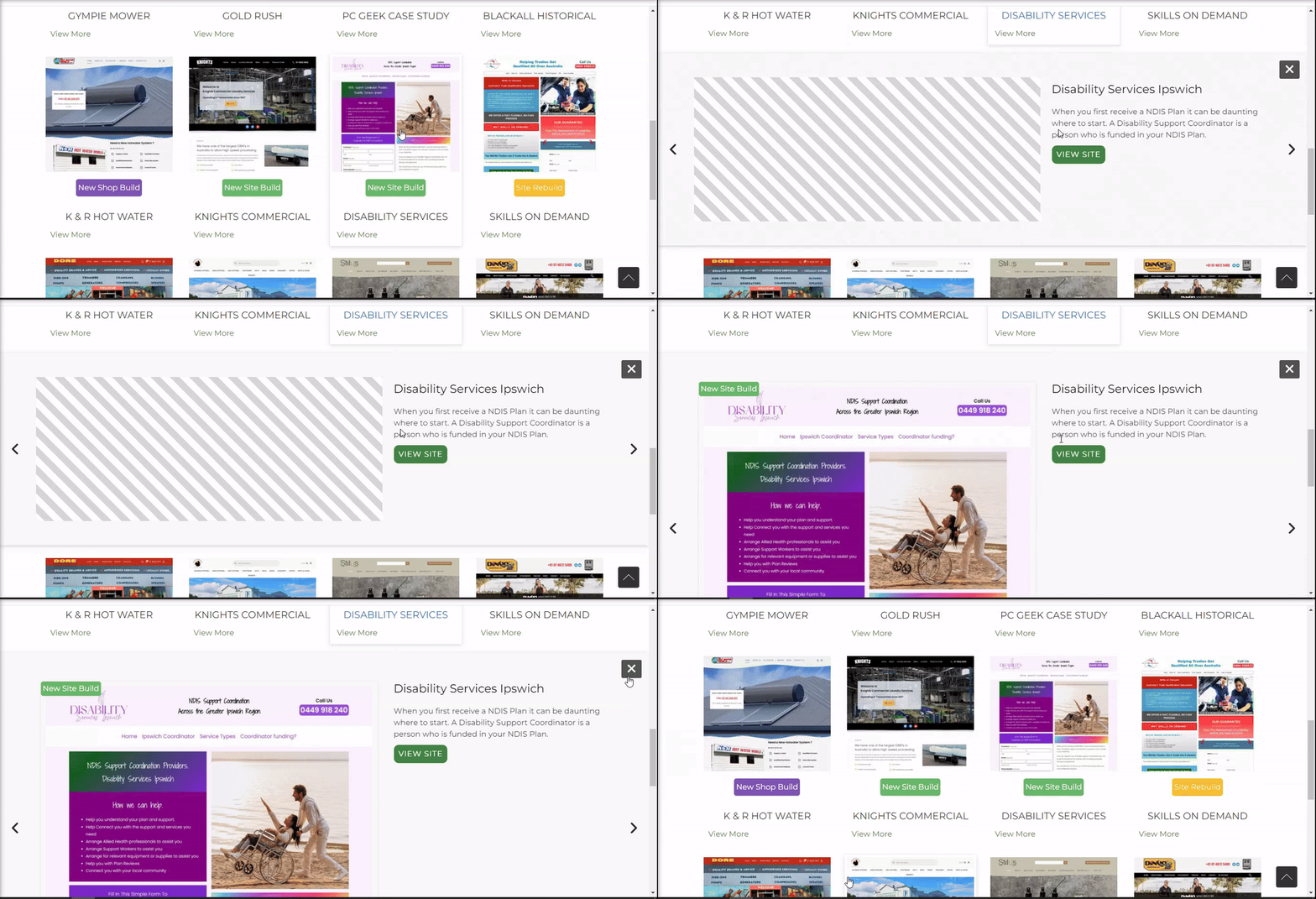
The Item Expander is what you see when you click on any item thumbnail on the Portfolio. The Main Expander Container which is always 100% wide of the screen.
Adjust the following settings:

Image Legend
1. Container Padding: Adjust the padding within the Main Expander Container to control spacing and create a well-defined layout.
2. Container Background Colour: Choose a background color for the Main Expander Container to set the overall color scheme.
3. Container Border: Define the border style for the Main Expander Container, allowing you to add a border around the container for visual distinction.
4. Border Shadow Effect: Create a shadow effect for the Main Expander Container, adding depth and a sense of elevation to the expanded view.
Inner Container Width
These settings provide flexibility in managing the width of the inner container and the main image within the item expander, allowing you to tailor the visual presentation according to your design preferences and requirements. Choose a percentage value or fixed width to control how the main image is displayed.


Image Legend
Container Width Type: Define how the width of the inner container should be calculated. Choose between percentage or fixed width.
Maximum Width in Pixels – px: Set the maximum width for the inner container in pixels. This ensures that the content inside the expander will not exceed a specified width, maintaining a visually appealing layout.
Expander Fonts
These settings offer comprehensive control over the fonts used in the item expander, allowing you to create a consistent and visually appealing typography style for your portfolio items.
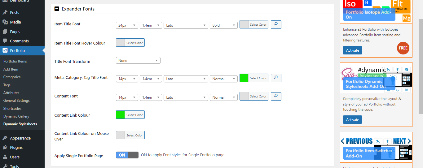
Image Legend
1. Item Title Font: Specify the font style for the item title.
2. Item Title Font Hover Colour: Define the font color for the item title when hovering.
3. Title Font Transform: Choose a text transformation effect for titles, such as uppercase or lowercase.
4. Meta, Category, Tag Title Font: Adjust the font style for meta information, category titles, and tag titles in the item expander.
5. Content Font: Specify the font style for the content text.
6. Content Link Colour: Set the color for content links.
7. Content Link Colour on Mouse Over: Define the color when hovering over content links.
8. Apply Single Portfolio Page: Control the styling for a single portfolio page. Adjust as needed.
Gallery Thumbnail Container
These settings give you control over the visual aspects of the gallery thumbnail container, allowing you to customize its appearance to match your desired design.
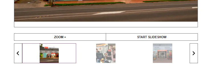

Image Legend
1. Container Background Colour: Set the background color for the gallery thumbnail container. Choose a color that complements your overall design.
2. Container Border: Specify the border settings for the gallery thumbnail container. This includes options for border style, color, and width.
3. Active Thumbnail Border Colour: Define the border color when a thumbnail is active. This color will be applied when a user interacts with or selects a specific thumbnail.
Item Expander Close Icon
The X Close item expander icon is an @fontface icon inside a container.
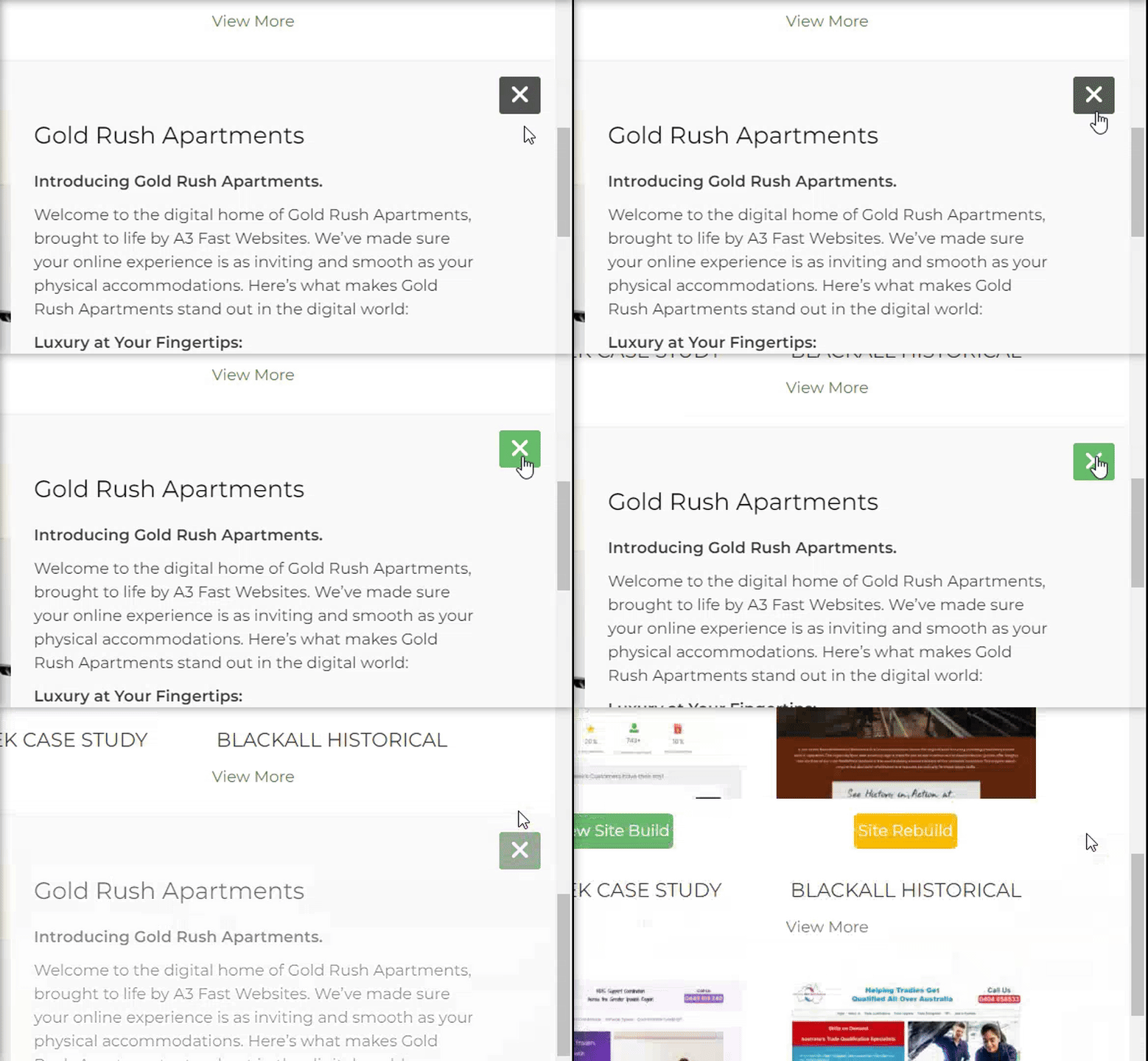

Image Legend
1. Container Colour: Set the background color for the container of the close icon.
2. Container Colour on Mouse Over: Define the background color when the mouse hovers over the close icon container.
3. X Icon Colour: Choose the color for the X icon within the close icon.
4. X Colour on Mouse Over: Specify the color of the X icon when the mouse hovers over it.
Button Style
Each Portfolio Item has a Button / Hyperlink text feature. Use these settings to select which to use. From each item edit page add the link and edit the link text. If link url is not added the button or linked text does not show.
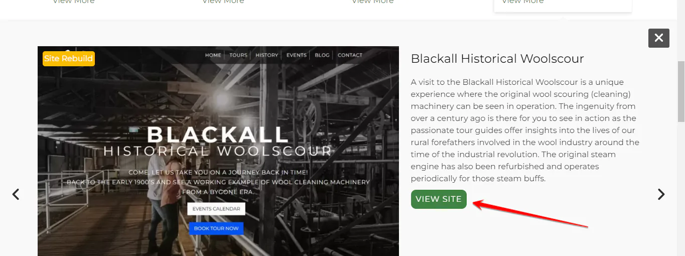
Launch Button or Hyperlink
In our example we choose the settings for hyperlink. Choosing the Button will give you the button style options.
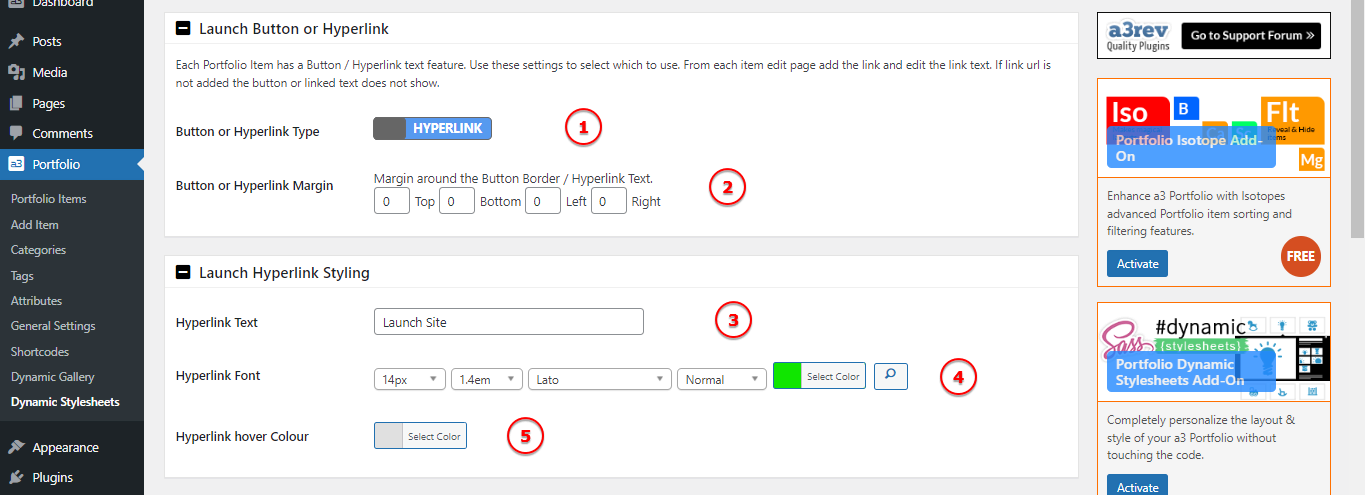
Image Legend
1. Button or Hyperlink Type: Choose between displaying a button or hyperlink for each portfolio item.
2. Button or Hyperlink Margin: Define the margin around the button or hyperlink. Adjusting this setting can impact the spacing between the button or hyperlink and surrounding elements.
3. Hyperlink Text: Customize the text for the hyperlink associated with each portfolio item.
4. Hyperlink Font: Choose the font style for the hyperlink text.
5. Hyperlink Hover Colour: Define the color that the hyperlink text should change to when a user hovers over it.
Nav Bar
The Portfolio Categories you have created and set as ON will show as the main Nav Bar above the Portfolio Items. There is also a Portfolios Categories Widget, Portfolio Recently Viewed Widget and Portfolio Tags Widget for navigation in Widgets menu.


Image Legend
1. Nav Bar Alignment: Choose the alignment for the main navigation bar. Options may include left, center, or right alignment.
2. Nav Bar Margin: Set the margin around the navigation bar. This defines the space between the navigation bar and other elements on the page.
Nav Bar Font
Choose the font style for the text within the navigation bar.

Image Legend
1. Category Items Font: Choose the font style for the text representing each category in the navigation bar.
2. Active Category Font: Set the font style for the text of the active category, i.e., the category that is currently selected or being viewed.
Nav Bar Tab Container Style
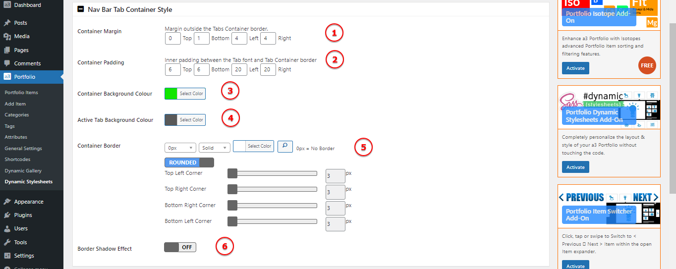
Image Legend
1. Container Margin: Set the margin around the entire container, controlling the space between the container and its surroundings.
2. Container Padding: Adjust the padding inside the container, controlling the space between the content and the container’s edges.
3. Container Background Colour: Set the background color for the button container.
4. Active Tab Background Colour: Choose the background color for the tab that represents the currently active category.
5. Container Border: Set up a border for the button.
6. Border Shadow Effect: Apply a shadow effect to the container’s border, enhancing its visual appearance.
Image Captions
Navigate to a3 Portfolio > Dynamic Stylesheet > Image Caption to find settings related to the Image Caption Container:
Add caption text to images from the WordPress media uploader – select image and add description to the image “caption text”
Caption Text Font
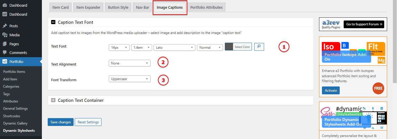
Image Legend
1. Text Font: Choose the font style for the text within the image caption.
2. Text Alignment: Set the alignment of the text within the image caption. Options include left, center, right, or justified.
3. Font Transform: Transform the text in terms of uppercase, lowercase, or capitalize for a stylistic effect.
Caption Text Container
Caption text shows in a container under the main image in the item expander. The container has the same width as the main image less any Outer Container Left and Right Margin.
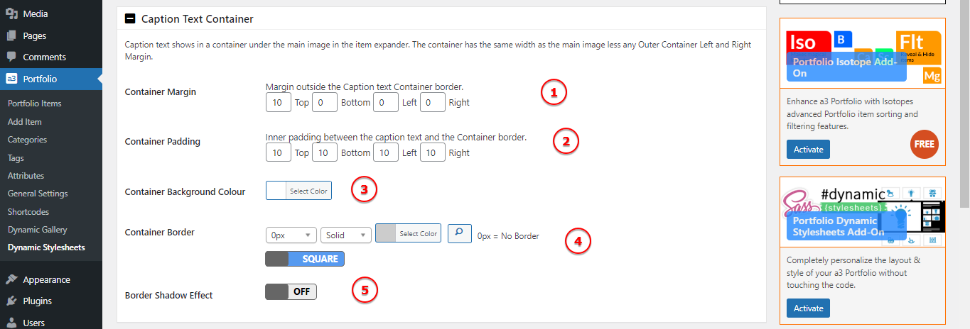
Image Legend
1. Container Margin: Set the margin of the container, determining the space between the container and surrounding elements.
2. Container Padding: Adjust the padding of the container, influencing the space between the container’s content and its borders.
3. Container Background Colour: Choose a background color for the container to enhance its appearance.
4. Container Border: Define the border properties of the container, including style, color, and thickness.
5. Border Shadow Effect: Apply a shadow effect to the container’s border for a visually appealing result.
Portfolio Attributes
The Portfolio Attributes section in the Dynamic Stylesheet addon empowers you to control the presentation of attributes associated with your portfolio items.
Filter Widget Items
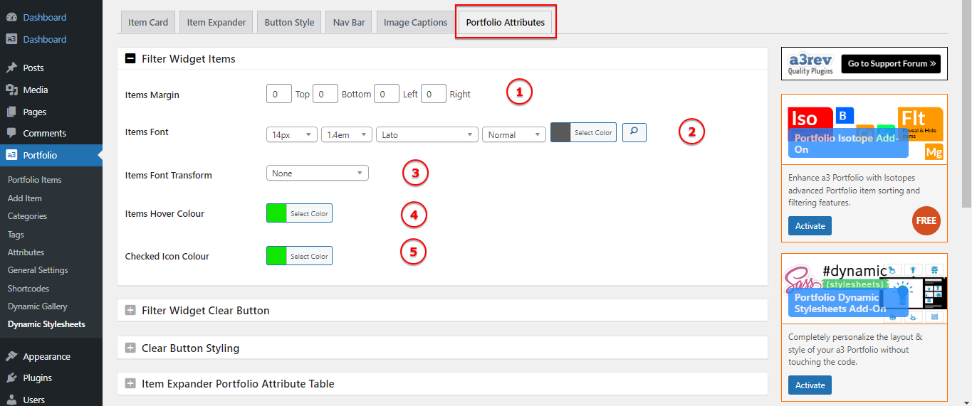
Image Legend
1. Items Margin: Set the margin for the individual items within the attributes section, determining the spacing between each attribute.
2. Items Font: Customize the font settings for the text of each attribute, allowing you to define the typeface, size, and style.
3. Items Font Transform: Apply a text transformation to the attribute items, such as uppercase or lowercase, for stylistic variations.
4. Items Hover Colour: Choose a color for the text of attribute items when hovered over, providing a visual cue to users.
5. Checked Icon Colour: Specify the color of the icon or indicator used to denote a selected or checked attribute.
Filter Widget Clear Button
In the Filter Widget Clear Button section of the Dynamic Stylesheet addon, you have the ability to customize the appearance of the clear button associated with the filter widget. Here are the available settings:
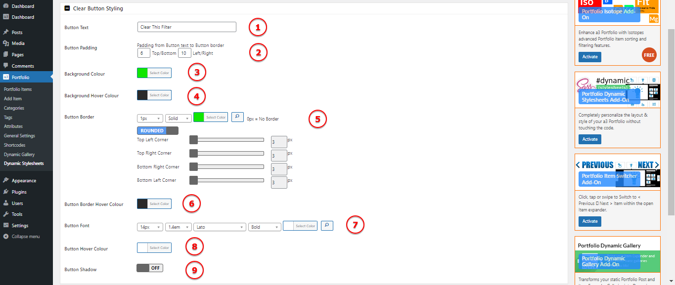
Image Legend
1. Button Text: Customize the text displayed on the “View More” button.
2. Button Padding: Set the padding within the button to control spacing.
3. Background Colour: Choose a background color for the button.
4. Active Background Colour: Set the background color when the item card is active or selected.
5. Button Border: Define the border style for the “View More” button.
6. Active Button Border Colour: Specify the border color when the item card is active.
7. Button Font: Set the font style for the text within the button.
8. Active Button Font Colour: Specify the font color when the item card is active.
9. Button Shadow: Define a shadow effect for the “View More” button.
Item Expander/Post Portfolio Attribute Table
In the Item Expander/Post Portfolio Attribute Table Style section of the Dynamic Stylesheet addon, you have the ability to customize the appearance of the attribute table within the item expander and in the item post. Here are the available settings:
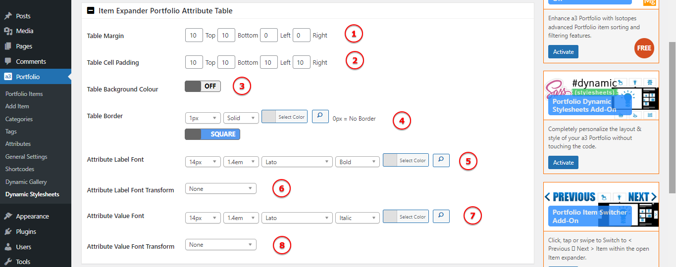
Image Legend
1. Table Margin: Set the overall spacing or margin around the attribute table.
2. Table Cell Padding: Specify the padding within each cell of the attribute table.
3. Table Background Colour: Define the background color for the entire attribute table.
4. Table Border: Customize the border of the attribute table, including style, color, and thickness.
5. Attribute Label Font: Customize the font properties for the labels within the attribute table.
6. Attribute Label Font Transform: Apply additional text transformations to the attribute labels.
7. Attribute Value Font: Customize the font properties for the values within the attribute table.
8. Attribute Value Font Transform: Apply additional text transformations to the attribute values.
