Navigation
Installing the add-on
a3 Portfolio Dynamic Gallery will transform your static Item Expander Gallery and or Item post image gallery into a beautiful slider in PC, tablets and mobile devices.
a3 Portfolio Dynamic Gallery Add-on is available directly from your a3 dashboard.
Getting Started
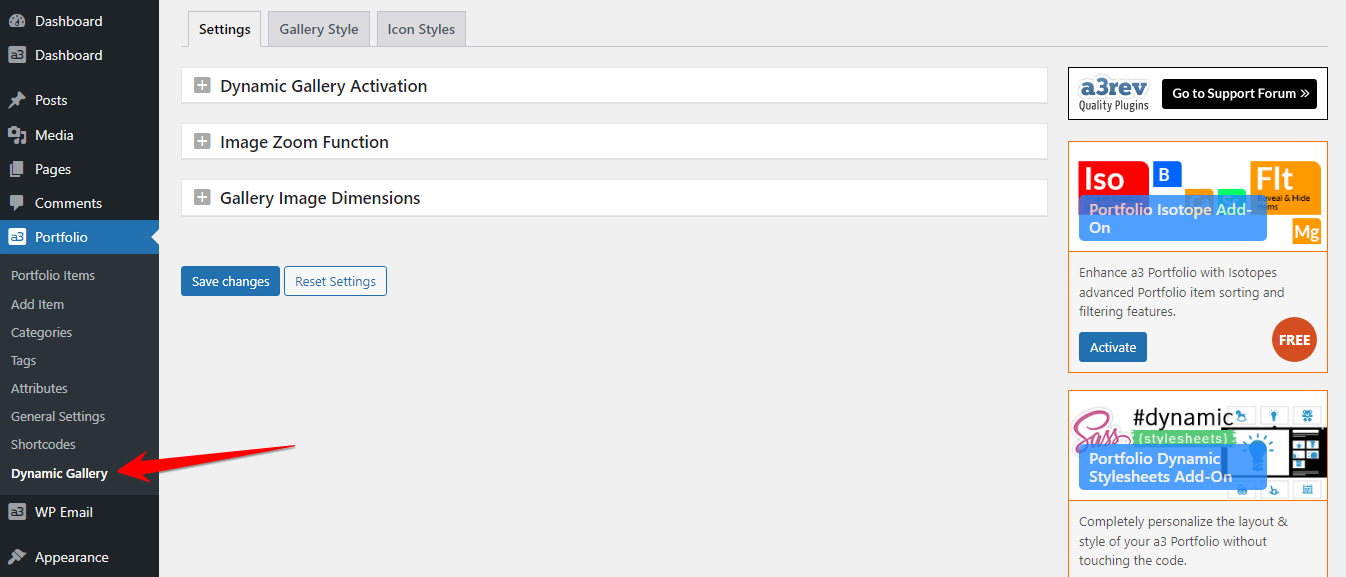
Once you have the addon installed and activated it adds the menu into a3 Portfolio > Dynamic Gallery. When clicking on Dynamic Gallery link you will see open the first tab of settings.
Settings
The general settings for a3 Portfolio Dynamic Gallery
Dynamic Gallery Activation
When activated Dynamic Gallery function is applied to each portfolios Default gallery images. Dynamic Gallery menu is added to each portfolio pages Data menu.
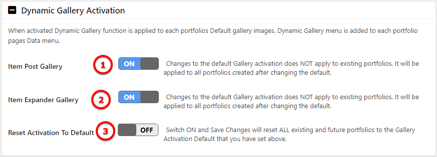
Image Legend
1. Item Post Gallery – Changes to the default Gallery activation does NOT apply to existing portfolios. It will be applied to all portfolios created after changing the default.
2. Item Expander Gallery – Changes to the default Gallery activation does NOT apply to existing portfolios. It will be applied to all portfolios created after changing the default.
3. Reset Activation To Default – Switch ON and Save Changes will reset ALL existing and future portfolios to the Gallery Activation Default that you have set above.
Image Zoom Function

Image Legend
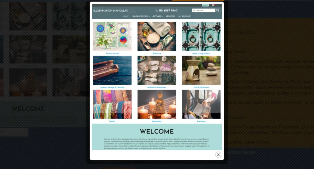
Allows you to open a pop-up from where you can see the image in the full size. See image bellow.
Gallery Image Dimensions

Image Legend
Set gallery image and thumbnails dimensions. You can set them from General Settings.
Gallery Style
Gallery Dimensions

Image Legend
Gallery Container Height – From here you can set up the height of the gallery. It can be Fixed or Dynamic. Set Dynamic and Gallery Container height will auto adjust to the scaled height of each image.
Gallery Image Transition Effects
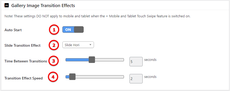
Image Legend
1. Auto Start – Set On to start the images from gallery in a slideshow.
2. Slide Transition Effect – There are 5 effects from to choose: None, Fade, Slide Vertical, Slide Horizontal, Resize. Those are the effects when images are changing between them.
3. Time Between Transitions – How many second the transition will gonna last.
4. Transition Effect Speed – Set the second for the effect to last.
Note! These settings DO NOT apply to mobile and tablet when the + Mobile and Tablet Touch Swipe feature is switched on.
Mobile and Tablet Touch Swipe

Image Legend
1. Touch Swipe Effect – Turn On touch gestures to swipe between images easily on mobile devices.
2. Time Between Transitions – How long will take for the images to change.
3. Swipe Speed – How long the gesture should be in order the swipe to have effect.
Gallery Container
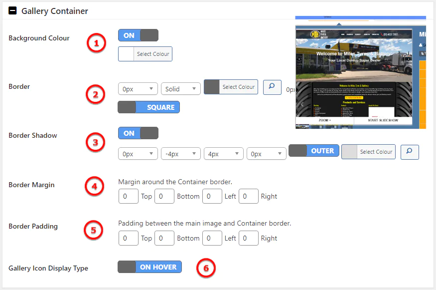
Image Legend
1. Background Colour – Turn Off or choose a color for the background image.
2. Border – Add a border around the image container. The border have option for weight, color, type and corners style.
3. Border Shadow – Add a shadow to the container
Nav Bar Control Container
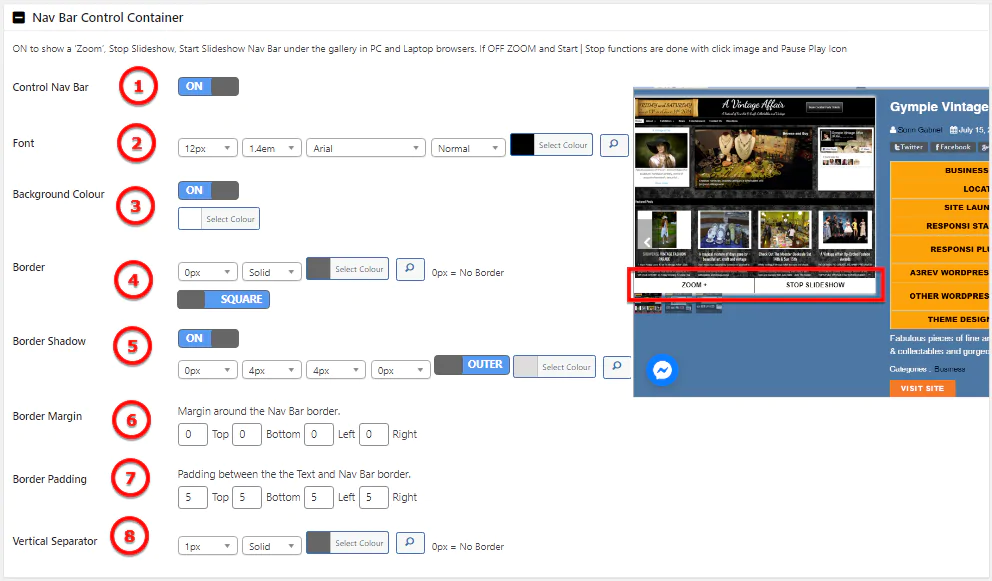
Image Legend
1. Control Nav Bar – ON to show a ‘Zoom’, Stop Slideshow, Start Slideshow Nav Bar under the gallery in PC and Laptop browsers. If OFF ZOOM and Start | Stop functions are done with click image and Pause Play Icon.
2. Font – You can have a custom font with weight, line height, font style and color.
3. Background Color – Set a color for the container background.
4. Border – Add a border around the image container. The border have option for weight, color, type and corners style.
5. Border Shadow – Add a shadow to the container
6. Border Margin – Margin around the Nav Bar border.
7. Border Padding – Padding between the the Text and Nav Bar border.
8. Vertical Separator – The line that splits those 2 buttons ( Zoom and Start/Stop Slideshow )
Caption Text Container
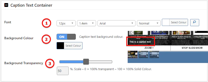
Image Legend
1. Font – Choose a custom font for caption
2. Background color – Add a background color for the item container
3. Background Transparency – Set the transparency of the container
Lazy Load Scroll Bar Container

Image Legend
1. Scroll Bar – Turn On to have a bar that is scrolling showing the time between transitions.
2. Scroll Bar Color – Pick up a color for the bar.
Image Thumbnails
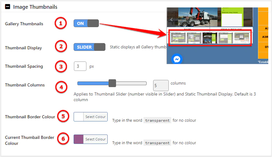
Image Legend
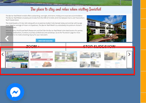
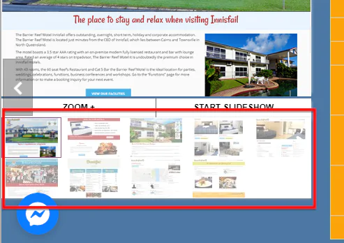
1. Gallery Thumbnails – Turn On gallery thumbnails. They are shown bellow Gallery.
2. Thumbnail Display – They can be Slider or Static ( see image above ).
3. Thumbnail Spacing – Set the space between thumbnails.
4. Thumbnail Columns – Applies to Thumbnail Slider (number visible in Slider) and Static Thumbnail Display. Default is 3 column.
5. Thumbnail Border Colour – Select a border color for thumbnail
6. Current Thumbnail Border Colour – Select a color for the thumbnail border of the current image show in gallery
Thumbnail Slider Container
* Note : This settings will show only if the Thumbnail display is set to Slider.
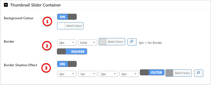
Image Legend
1. Background Color – Turn On to pick a color for the thumbnails container.
2. Border – Add a border around the thumbnails container. The border have option for weight, color, type and corners style.
3. Border Shadow Effect – Add a shadow to the container

Icon Style
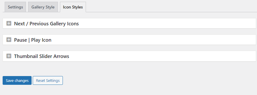
Next / Previous Gallery Icons
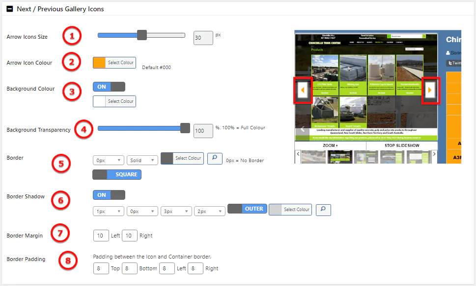
Image Legend
1. Arrow Icons Size – Select in px the size of the arrows
2. Arrow Icon Colour – Pick a colour for the arrow icon
3. Background Colour – Turn On to pick a colour for the arrow container
4. Background Transparency – Set the transparency of the background container. * 100% = Full Colour
5. Border – Add a border around the icon container. The border have option for weight, color, type and corners style.
6. Shadow – Add a shadow to the container
7. Border Margin – Margin between container border and gallery container
8. Border Padding – Padding between the Icon and Container border.
Pause | Play Icon
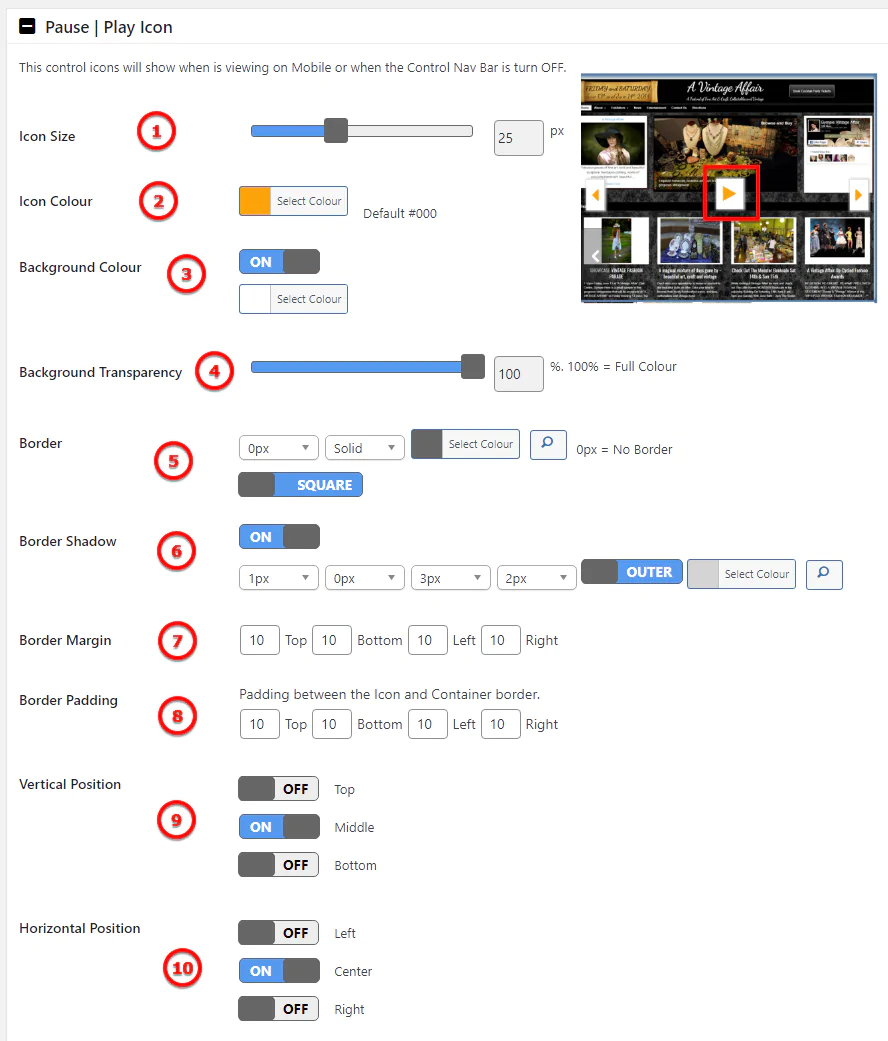
Image Legend
1. Icon Size – Select in px the size of the play/pause icon
2. Icon Color – Pick a colour for the icon
3. Background Colour – Turn On to pick a colour for the icon container
4. Background Transparency – Set the transparency of the background container. * 100% = Full Colour
5. Border – Add a border around the icon container. The border have option for weight, color, type and corners style.
6. Shadow – Add a shadow to the container
7. Border Margin – Margin between container border and gallery container
8. Border Padding – Padding between the Icon and Container border.
9. Vertical Position – Easily align the icon on Top Center or Bottom
10. Horizontal Position – Align the icon in horizontal position with Left Center Right options
Thumbnail Slider Arrows
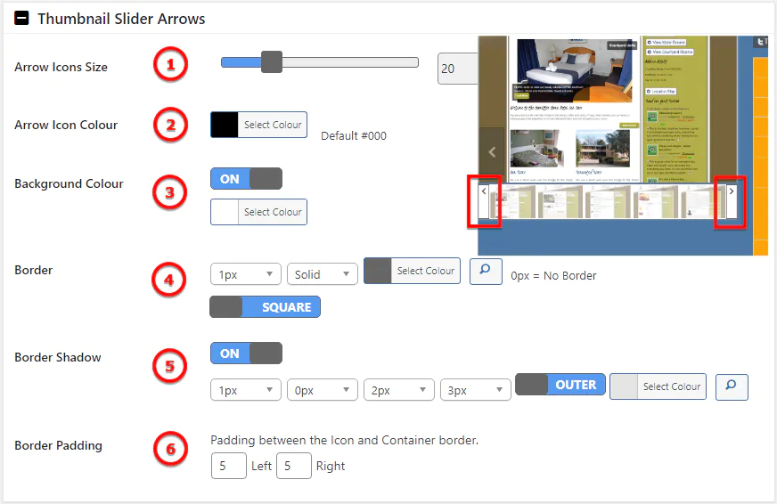
Image Legend
1. Arrow Icon Size – Set the size of the arrows.
2. Arrow Icon Color – Pick a color for the arrow icons
3. Background Color – Set the color for the container background of the arrow icons
4. Border – Add a border around the icon container. The border have option for weight, color, type and corners style.
5. Border Shadow – Add a shadow to the container
6. Border Padding – Padding between the Icon and Container border.
