Getting Started
a3 Buttons is a much better version of core Gutenberg button block, with many extra options including advanced styling such as hover, margin, border, padding, shadows, icons, color styles, animation, advanced typography and more.
The a3 Buttons block allows you to add one or more buttons to any section of your site. Each button have individual settings and you can insert as many as you want.
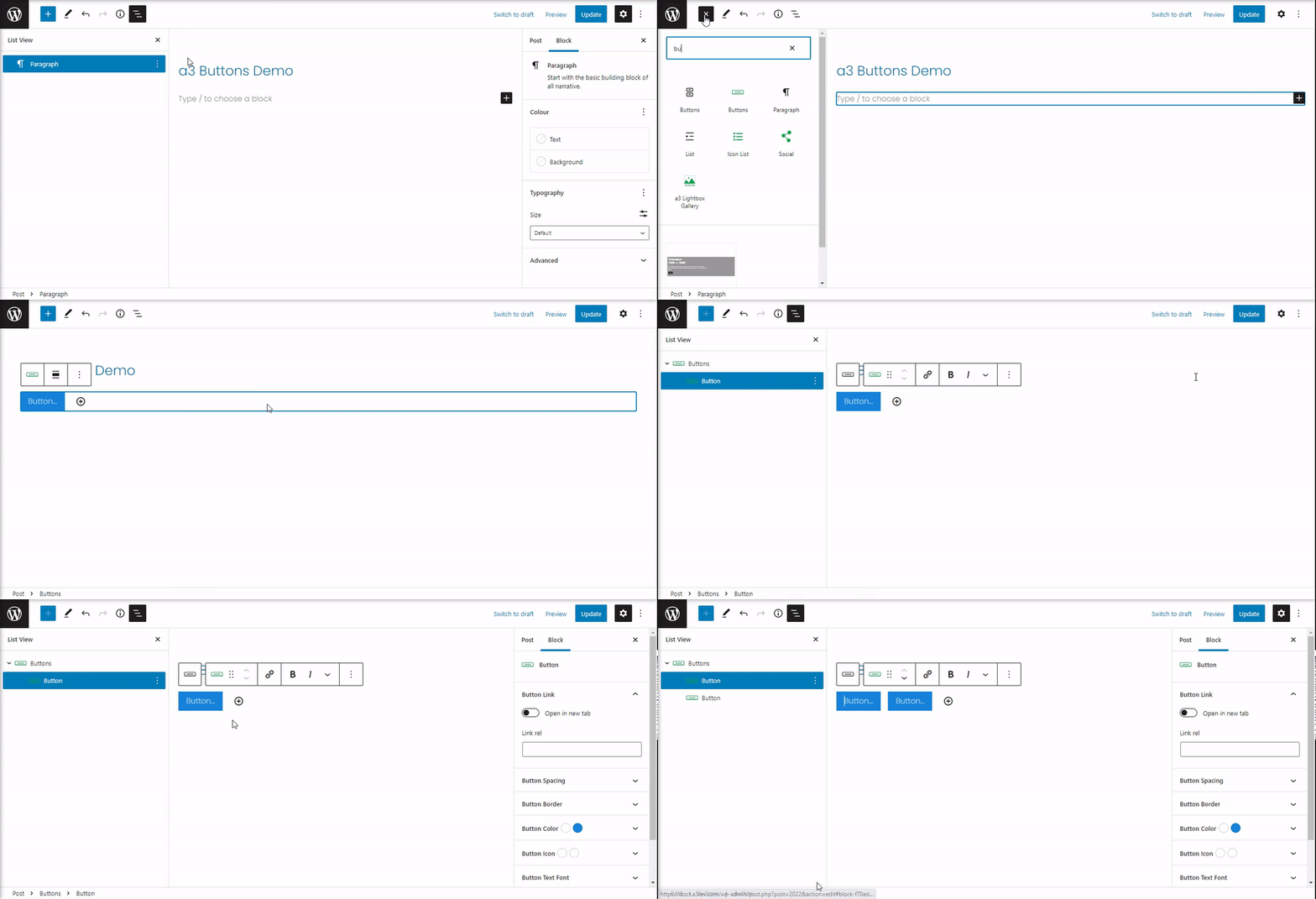
So to get started chose the Buttons block from a3 BlockPress list or type the name of the block. Click on the + Block Inserter icon and search for “Buttons”. Click it to add the block to the post or page.
Buttons Toolbar
Every block comes with unique toolbar icons and blocks specific user controls that allow you to manipulate the block right in the editor.
The buttons block has a toolbar for the individual button as well as a toolbar for the entire block.
The toolbar for the entire block contain the alignment of the buttons and the More options.
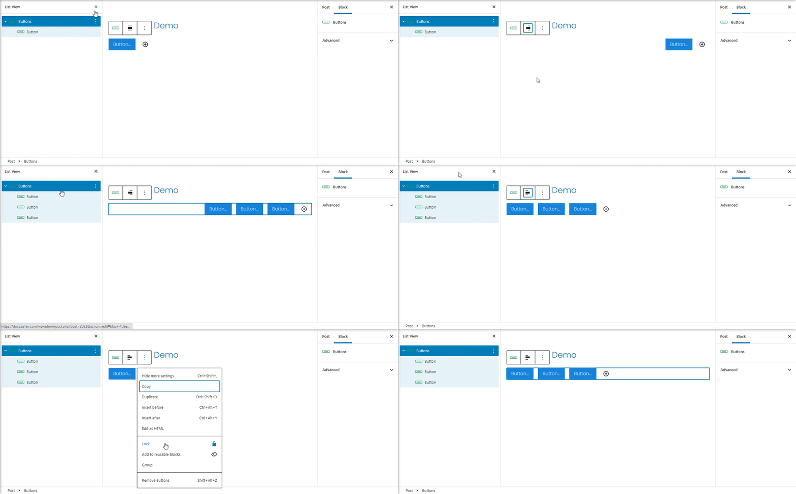
The toolbar for the individual buttons has the following options:
- Drag and drop the button
- Moving handles
- Link
- Text editing options
- More options
Buttons Links and Text
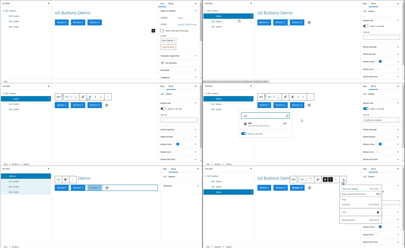
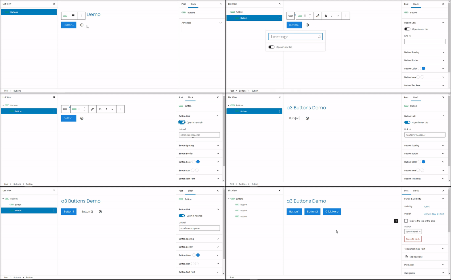
Your button’s text & URL can be customized right within the editor. Just type your text within the button, and include your URL next to the chain link icon directly below the button. . Select if to open a new tab or stay in current one. Also have a box where you can type relationship between the current page and the linked url.
Button Space and Margin
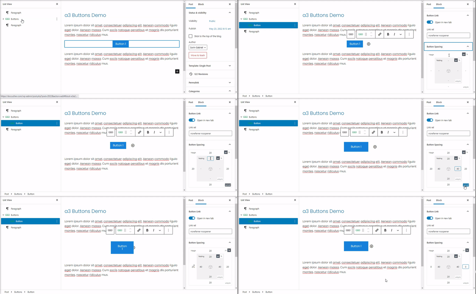
You can control the margin and padding for all four sides of your button. The values can be in percent or pixel units.
Button Border
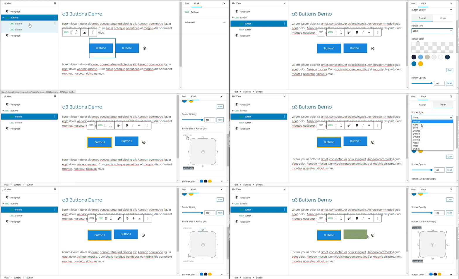
Border settings offer defining custom Style, Color, Opacity, Size & Radius value for each button. Values for Normal and Hover are separate giving you a unique button style.
Button Color
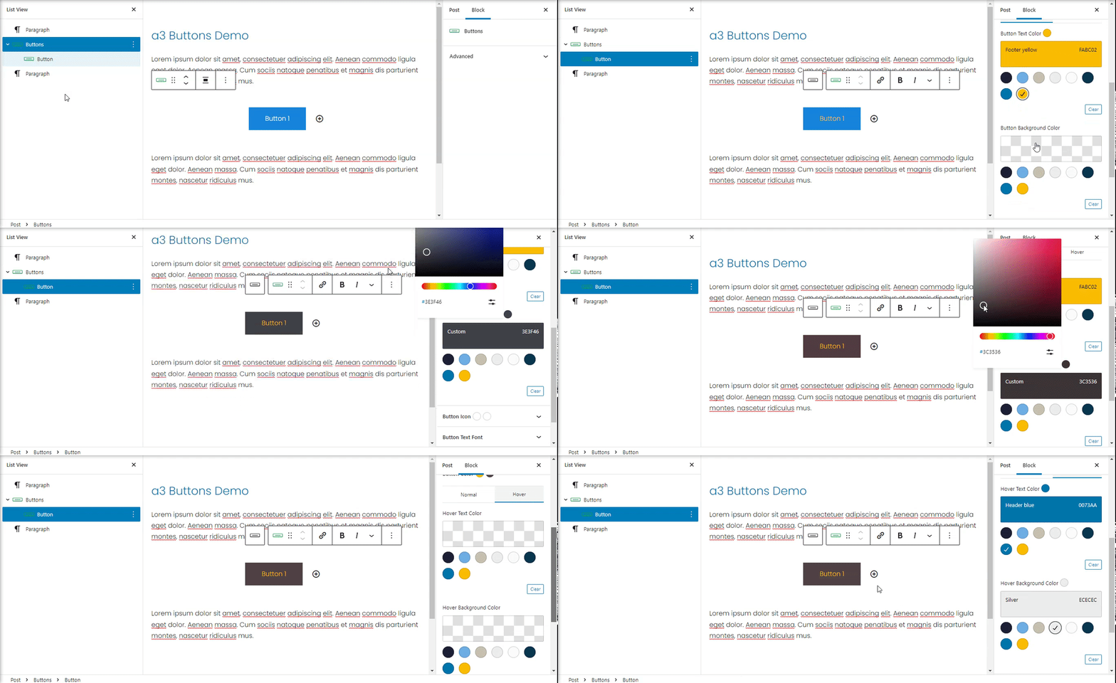
You can set the text and background colors for the button when they are Normal or Hover. Choose from a preexisting color that has been chosen by your theme, or click the multi-colored box to choose a custom color.
Reminder: In order to stay on brand and show a consistent design, I recommend sticking to the same one or two styles for all of your buttons.
Button Icon
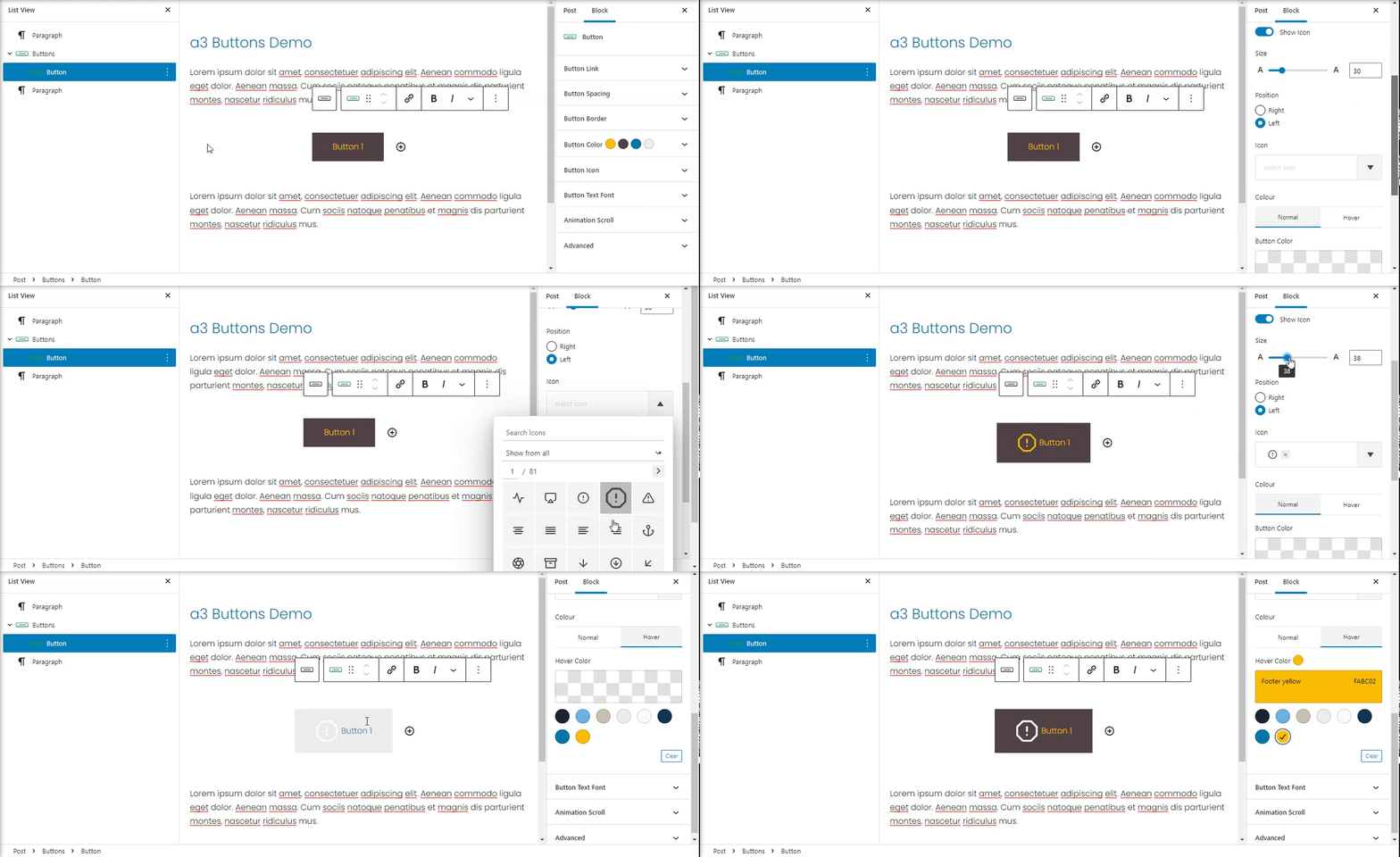
You can add icons to your a3 Buttons Block. The settings are in Button Icon panel in the sidebar. The Icons option come with many settings like Icon Size, Position and Color.
Button Custom Font
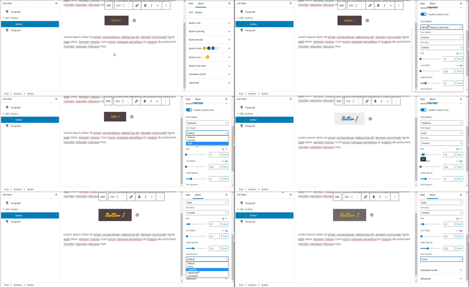
Choose from a list of full Google Fonts with custom letter spacing, weight, size and subsets.
Animation Scroll
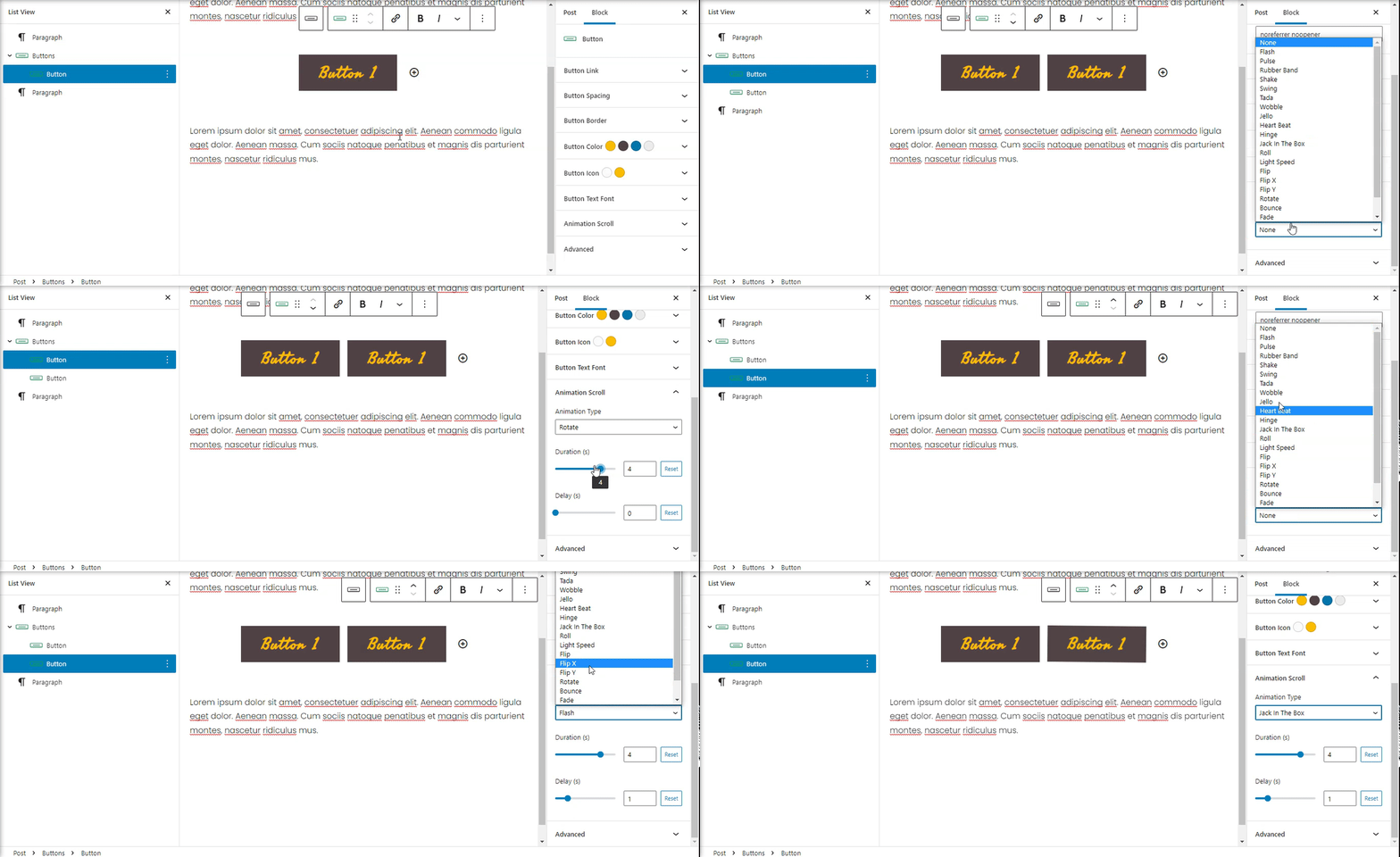
Add amazing scrolling animation for Buttons. Each button can have individual animation. Has 21 animation styles with option for Duration and Delay.
Advanced
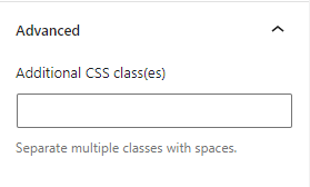
The advanced tab lets you add a CSS class to your block, allowing you to write custom CSS and style the block as you see fit.
Tips and Tricks
Here are some tips that will help you in using our block more usefully.
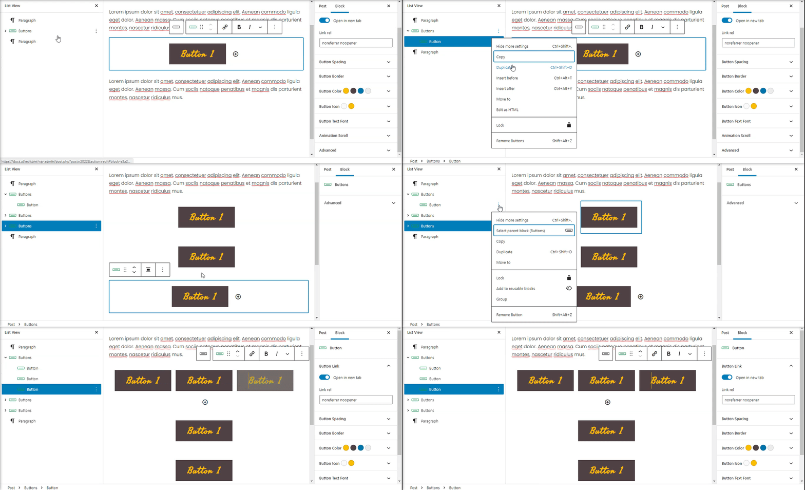
Duplicate a button
In order to duplicate button just use the block settings and select duplicate.
If you duplicate the main button block a new row will be add. The new row contain the duplicated button with same settings like the original one.
Duplicating the individual ones will be add a new button to the same row. You can use also the + sign to add a new button.
Delete a button
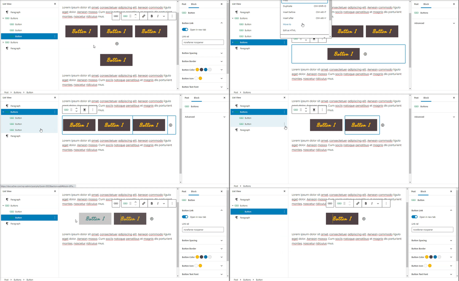
You can delete a button by pressing the three dots.
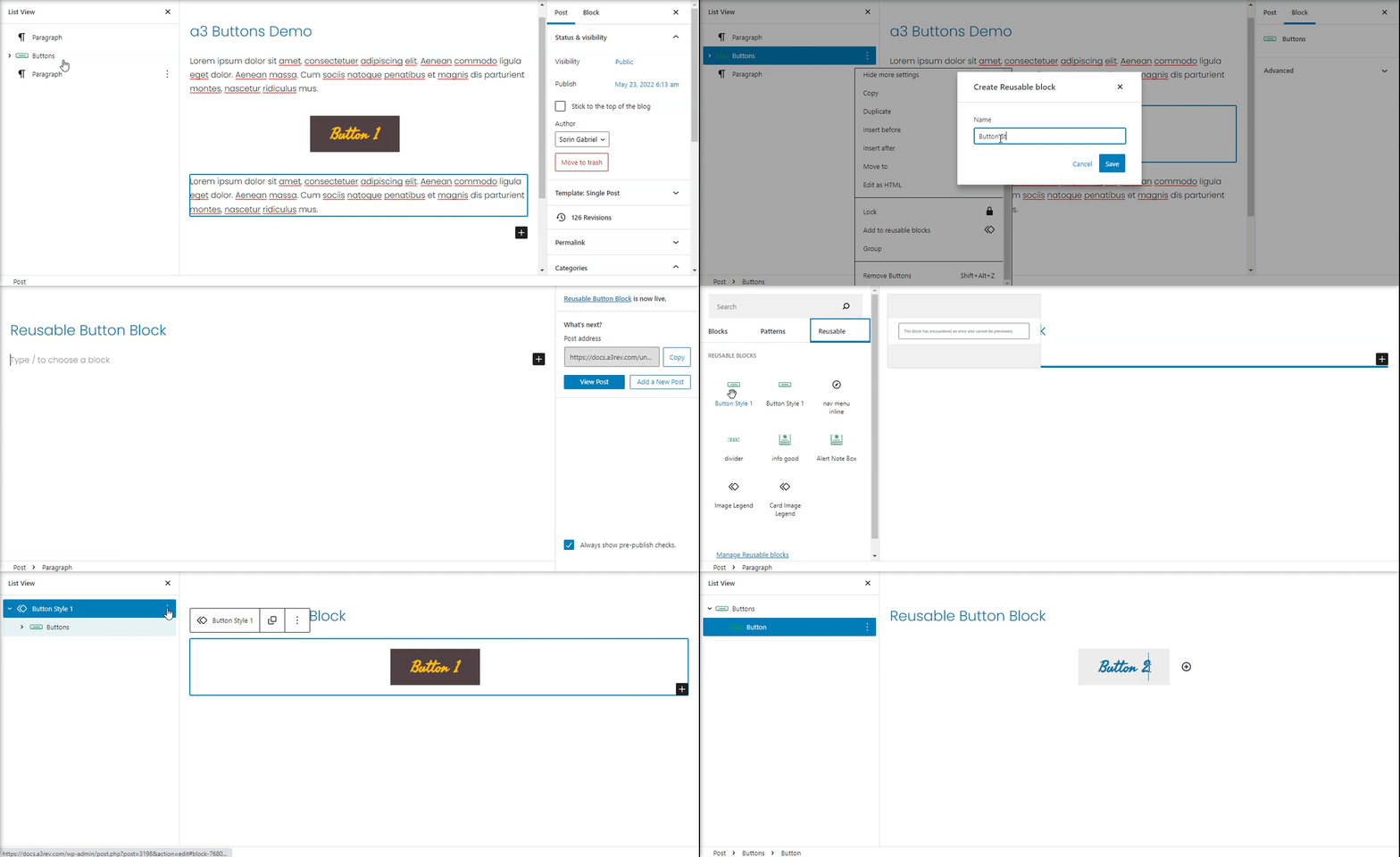
Reuse same button style
Reminder: In order to stay on brand and show a consistent design, I recommend sticking to the same one or two styles for all of your buttons. So to not set all the time the style for a button you can easy use the Reusable option. That way with couple of clicks you can have same button style all over your website.
