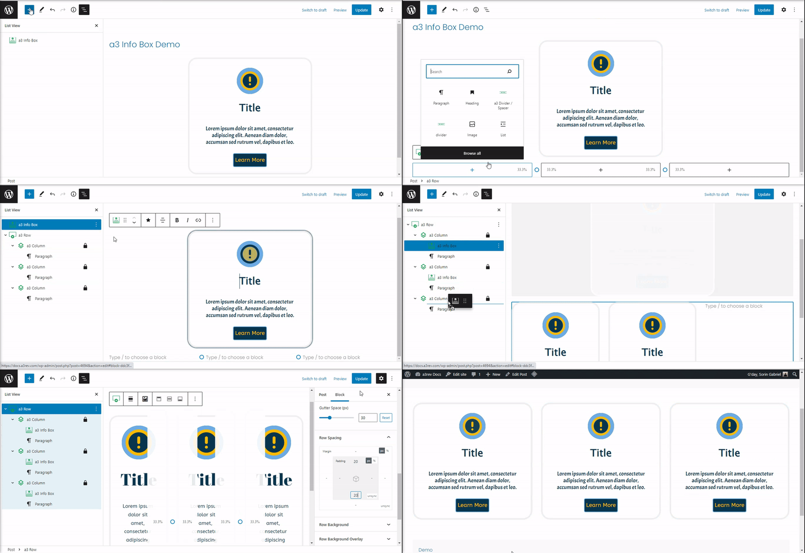
Getting Started
The a3 Info Box block for WordPress is like a customizable card for your website. You can use it to highlight features, key points, or any important content.
With this block, you can display text and media to share crucial information with your visitors. Customize it by choosing static and hover colors, changing fonts, borders, adding a box-shadow, and more.
To start using it, select the a3 Info Box block from the a3 BlockPress list or type its name. Click the + Block Inserter icon, search for ‘Info Box,’ and add the block to your post or page.
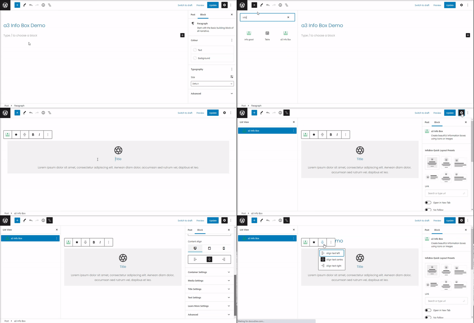
Info Box Settings
Our Gutenberg block offers various settings and options to style the box and its content.
Let’s begin by selecting the layout and setting up the block.
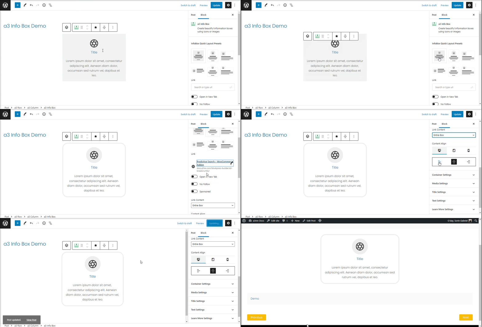
- Info Box Quick Layout Presets: Pick from 6 preset layouts.
- Link: Add a link to your info box.
- Link Content: Decide whether to link the entire box or just the ‘read more’ link/button.
- Content Align: Align the box content as you like – left, right, or center. You can set the content alignment separately for Desktop, Tablet, and Mobile.
Container Settings
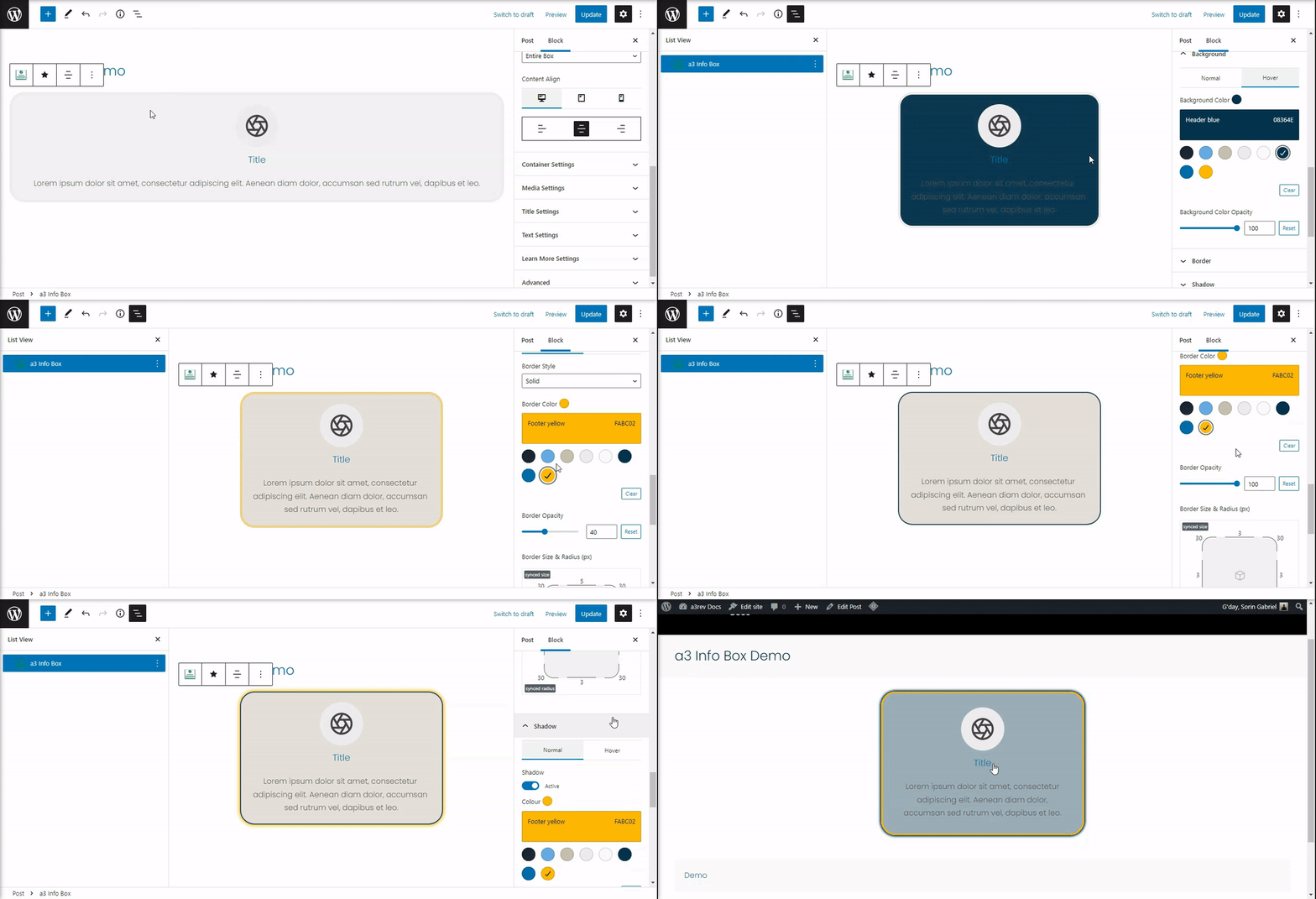
Now that we’ve set up the box, let’s style the container to make it stand out and match your website design. In this panel, you can set the maximum width of the box, choose a background color, add a border and shadow, and include space or padding for the container.
- Max Width: Adjust the slider to set the width of the container box. Values can be in pixels, percentages, or viewport widths (vw).
- Background: Choose a background color for the box container. Optionally, add a hover color for a dynamic effect.
- Border: Configure borders for normal and hover positions. Choose the style, color, opacity, size, and radius.
- Shadow: Enhance the appeal by activating a shadow. Customize the shadow with options like color, opacity, blur, spread (both vertically and horizontally) for normal and hover states.
- Spacing: Set the margin and padding for Desktop, Tablet, and Mobile with values in pixels or percentages.
Media Settings
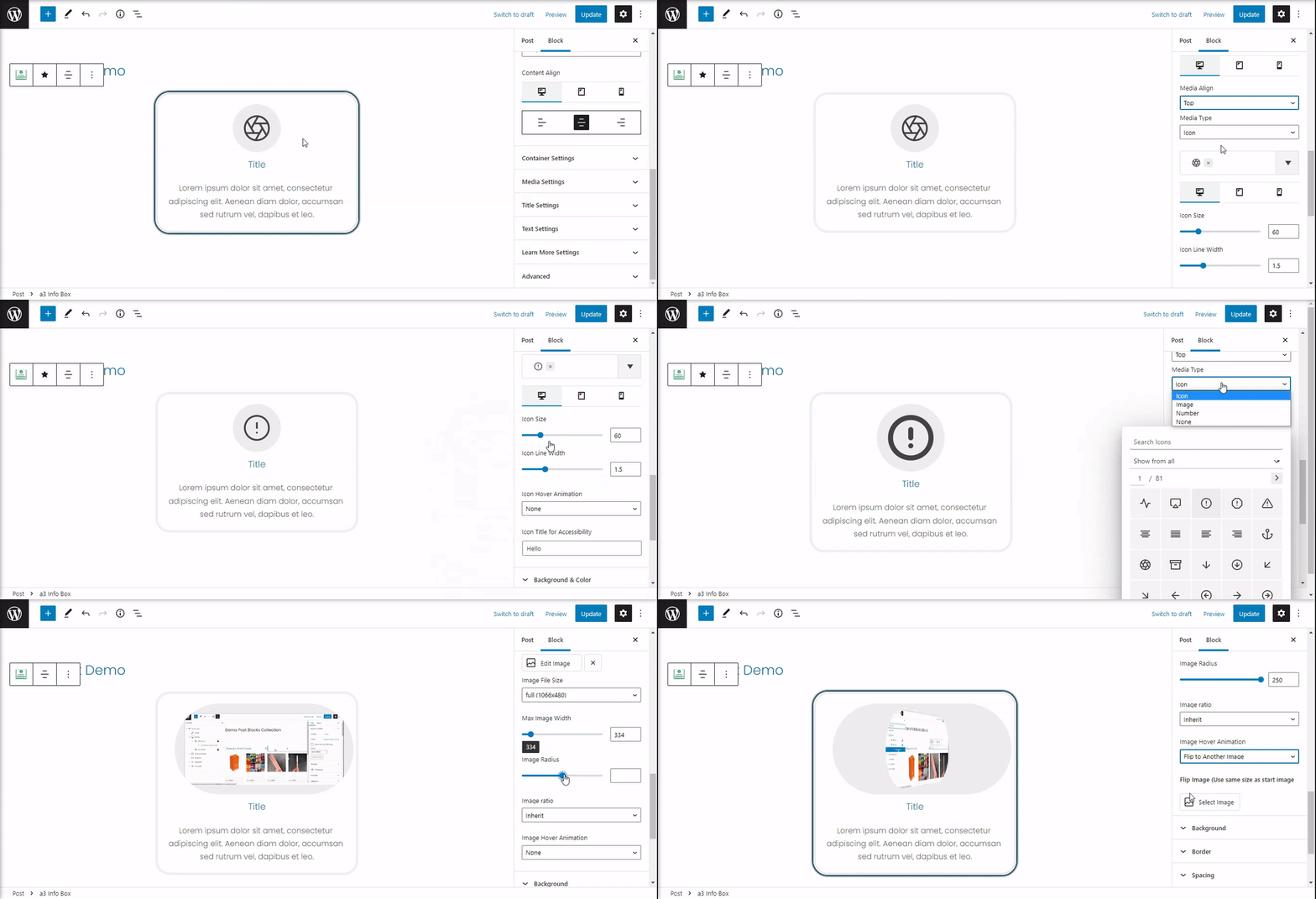
In this tab, you’ll find settings for the media displayed in our box block. The media appearance is determined by the layout chosen earlier, and changing the layout or content position won’t affect it. Let’s quickly go through the settings.
Each setting has three icons at the top for Desktop, Tablet, and Mobile options, ensuring your content looks good on all devices.
- Media Align: Align the media to the top, left, or right.
- Media Type: Choose the type of media you want to use—Icon, Image, Numbers, or None. Each type has its own settings. For example, icons offer options like size, line width, hover animation, and more. If you choose an image as media, you’ll have options such as Max Image Width, Image Radius, Image Ratio, and more.
Media Style
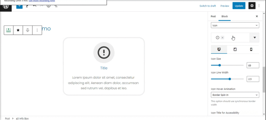
Now, let’s customize the container of the media. The options in this panel are influenced by the Media Type you choose. For example, if you select ‘Image,’ you’ll see options only for the background. If it’s ‘Icon,’ you can choose the background color as well as the color for the icon itself. If ‘Number’ is selected, a new option will appear: Typography. In the demo below, we’ll style the icon type of media.
- Background and Color: Add a color to the icon/number and the background container.
- Typography: This option appears only if ‘Number’ media is selected. Choose the font family, size, and style.
- Border: Set a border for the media container in normal or hover positions. The border options include style, color, opacity, and more.
- Spacing: Define the margin and space for the media container as well as the content inside.
Title Settings
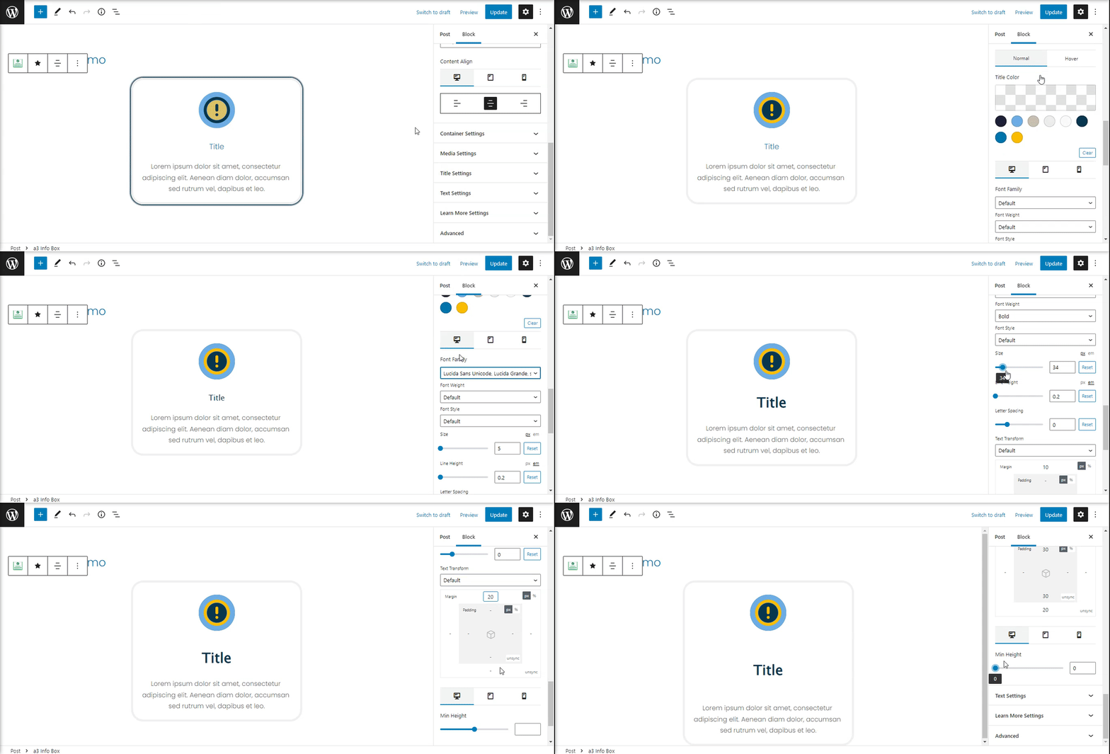
Decide if your Info Box will have a title and customize its style as needed.
- Turn On/Off Title Section: Toggle this option based on whether a title is needed or not.
- Choose HTML Tag: Select a tag for the title easily, ranging from H1 to H6.
- Title Color: Set a color for the title text in normal or hover states.
- Font Settings: Customize font settings for Desktop, Tablet, or Mobile. Adjust the title with a custom font family, size, and style.
- Space and Margin: Configure the distance between the text title and the container border, as well as the container and other elements inside the Info Box.
- Min Height: Use the slider to set a custom minimum height.
Text Settings
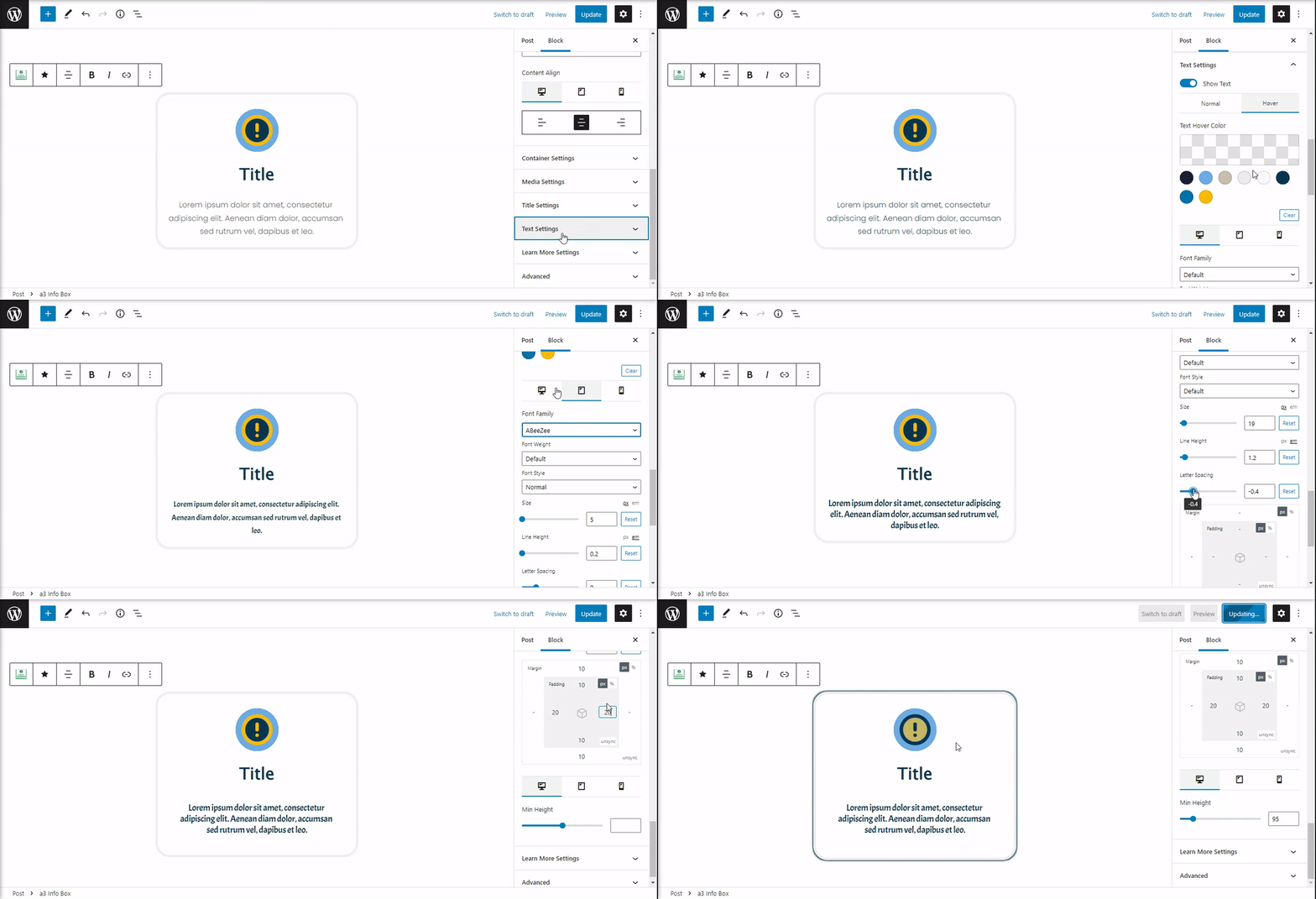
If you have text to add into your Info Box, you can easily style it using the Text Settings tab. It offers various options such as custom font, spacing, and minimum height.
- Show Text: Activate the description section by dragging the button. It’s ON by default.
- Text Color: Select a color for the text in normal and hover positions.
- Font Family: Enhance your box’s style by adding a custom font family.
- Space and Padding: Configure the distance between the text description and the container border, as well as the container and other elements inside the Info Box.
- Min Height: Use the slider to set a custom minimum height.
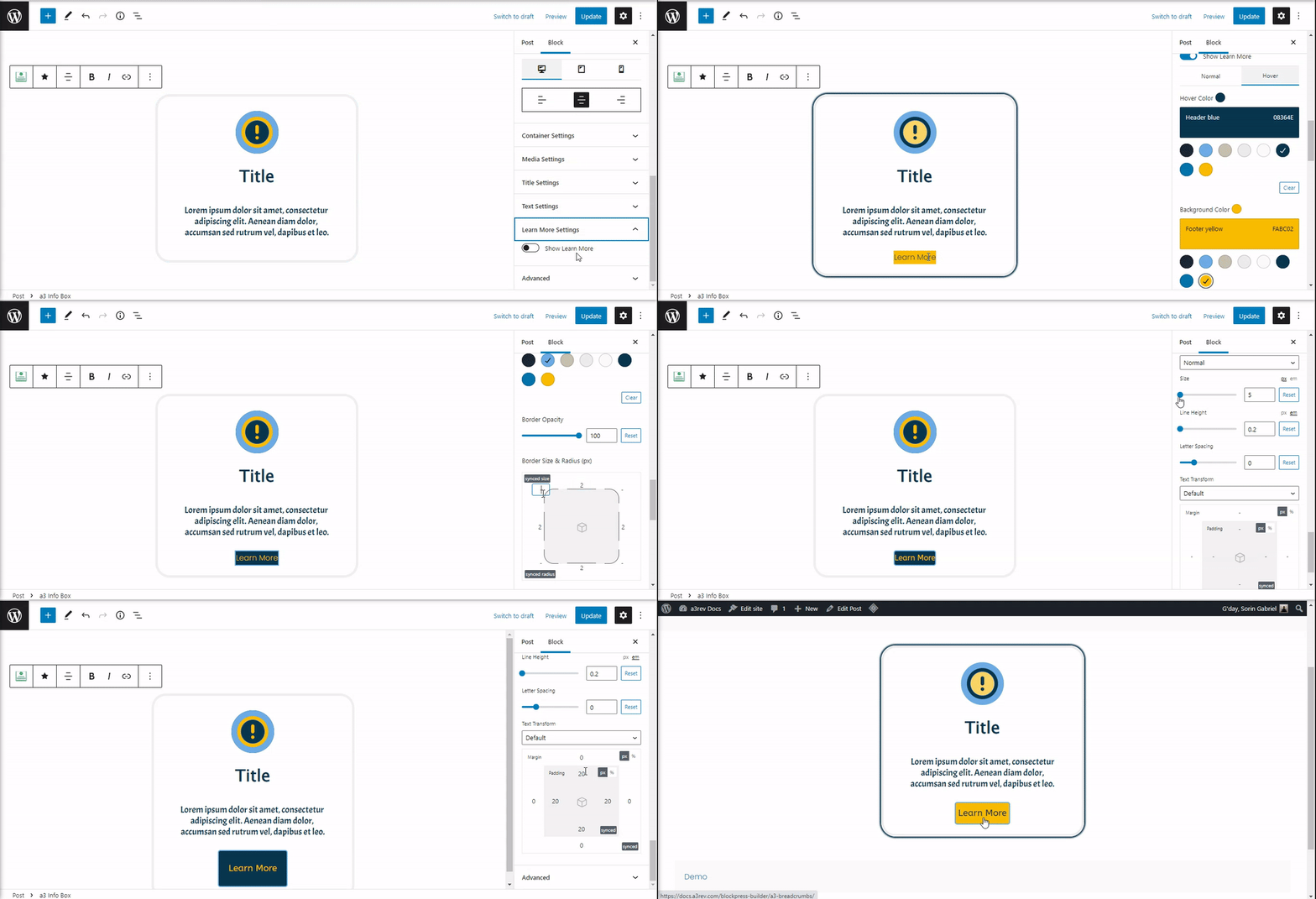
Learn More Settings
Add a text link or a button to the Info Box. By default, this option is OFF.
- Show Learn More: Toggle the Learn More section on or off.
- Color: Choose a color for the text.
- Background Color: Transform the link text into a button by adding a background color.
- Border: Enhance appeal by setting up a border for the button container.
- Font Family: Set a custom font for the Learn More text.
- Space and Padding: Adjust spacing between text and border container, as well as for the container and the surrounding elements around the button/text.
Advanced
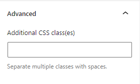
The Advanced tab allows you to add a CSS class to your block, enabling you to write custom CSS and style the block according to your preferences.
Tips & Tricks
Above, we demonstrated how to customize a single info box. If you wish to use multiple with the same design, simply duplicate and use them with a container block, such as the a3 Row Block.
