Navigation
Getting Started
The a3 Toggle block is a great UI element for WordPress Gutenberg Editor. Make any content more readable and structured reducing scrolling time and improve the site engagement. Create really content-rich toggle tabs, since it’s a nested block (allows you to insert any kind of block into the content area of each tab).
Toggle block is usually used to display text heavy content such as FAQs or to manage the display of different content in your pages or posts. It’s a valuable asset for organizing any website content. a3 Toggle block offers a wide range of customization options, flexible styling, and many more.
So to get started chose the Toggle block from a3 BlockPress list. Click on the + Block Inserter icon and search for “Toggle”. Click it to add the block to the post or page.
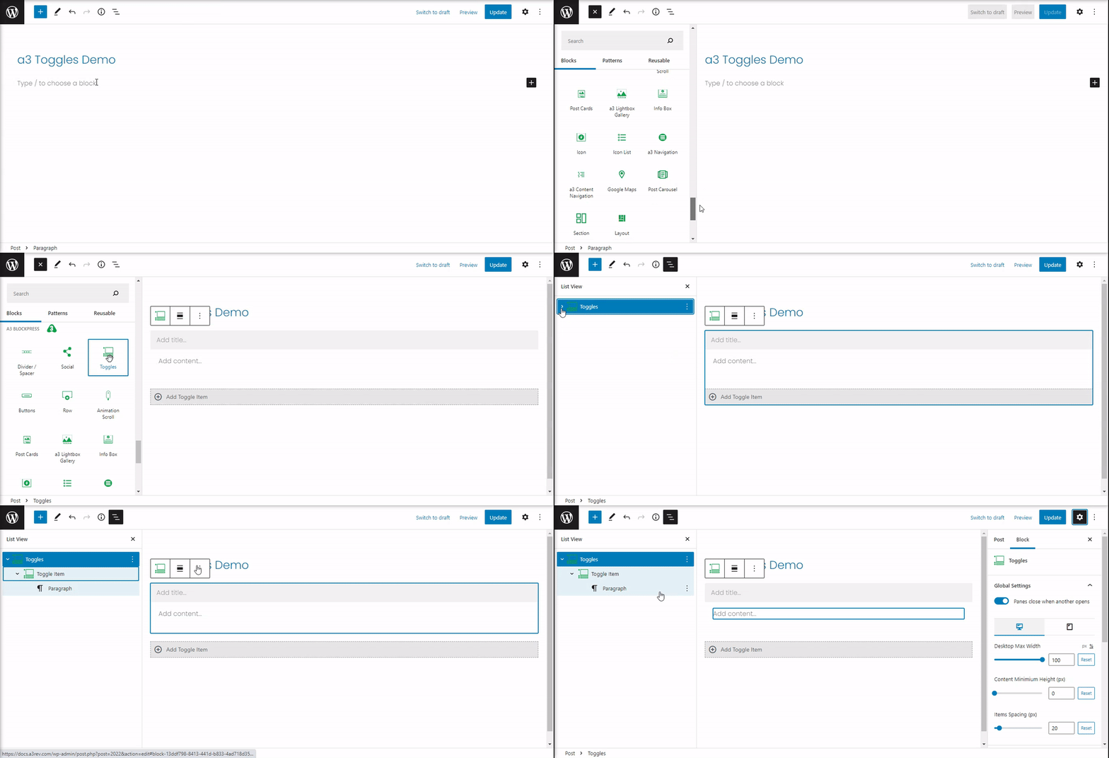
Now that the block is insert will gonna explore the settings and the style. If you open the List View we gonna see the Toggle Block and under, nested is the Toggles Items. You can have unlimited items. The toggles settings and style is for entire container and it have general options for it. Each toggles items have individual settings like panel color, box border, fonts styles and many more.
Toggles
The toggles is the main block that have options for the entire container of the items. Also you can set up a general style for all the items.
Global Settings
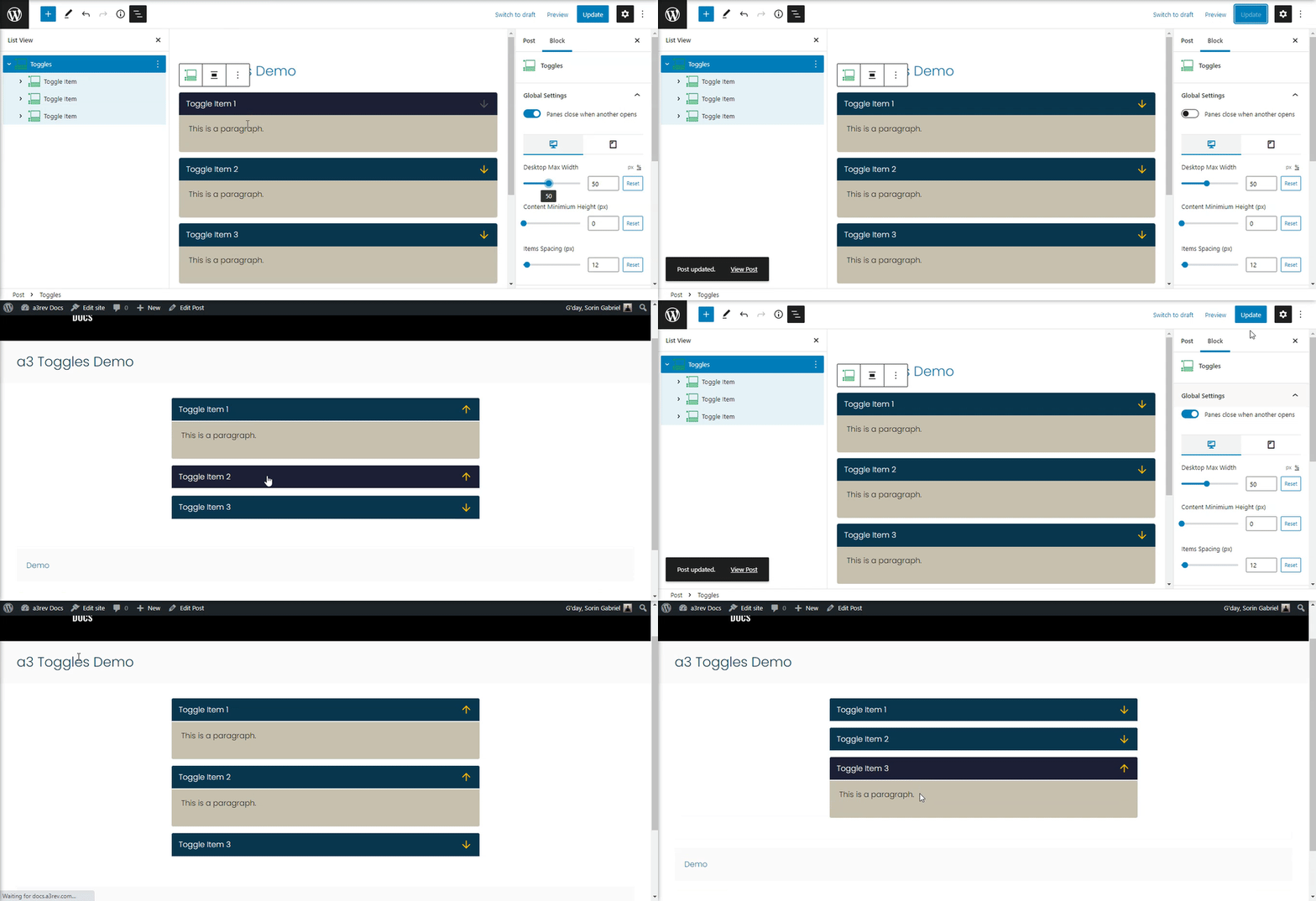
The first option we see is to close panes when another opens. If it’s turn On when a panel will be open the prevision will be close, turn Off and all the panels can be open.
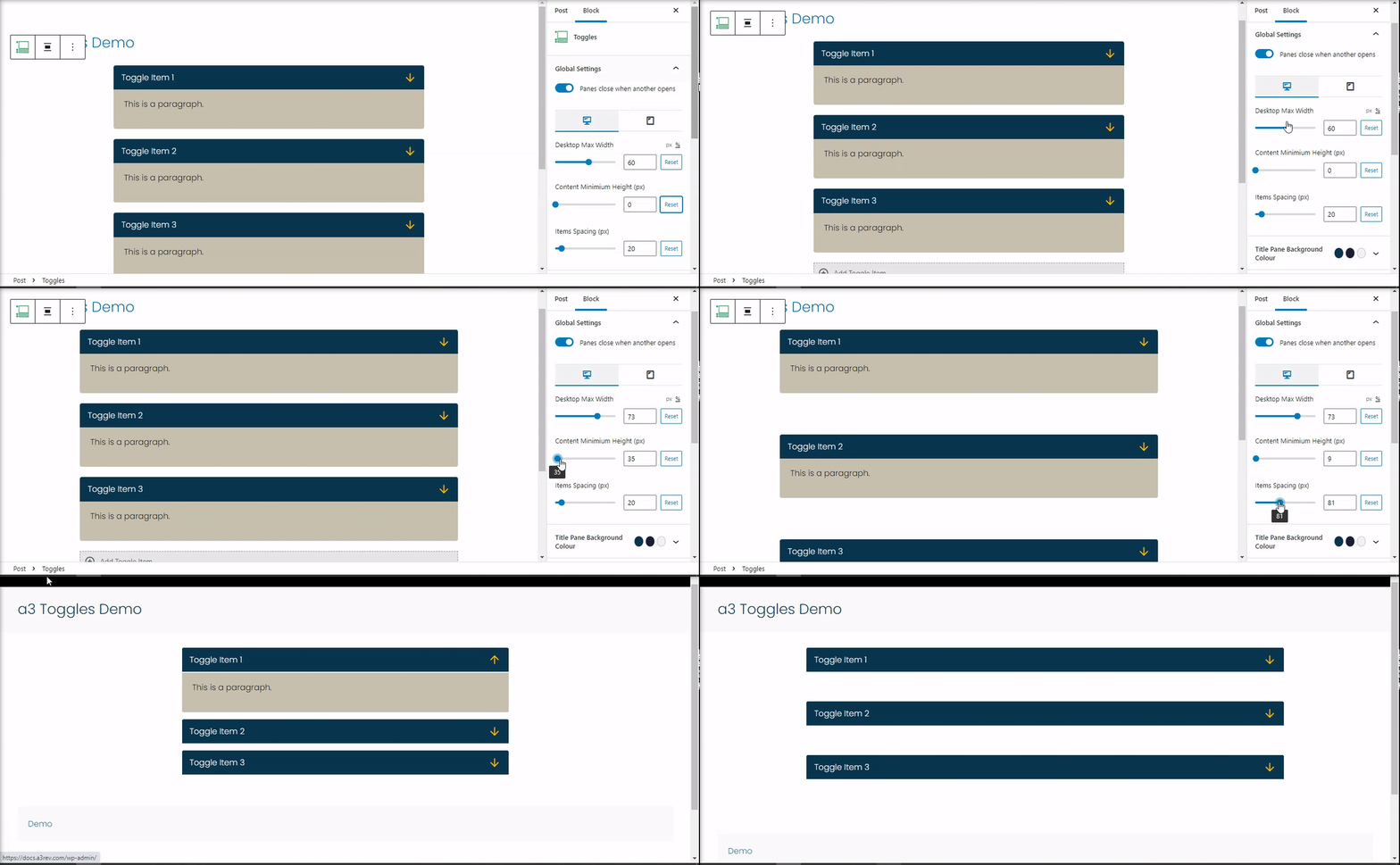
Next we can set Desktop Max Width for Desktop and Tablet on percent or pixels. The Content Minimium Height (px) will create a space around the content and border top and bottom. And the Items Spacing (px) is to add a spacing between the items.
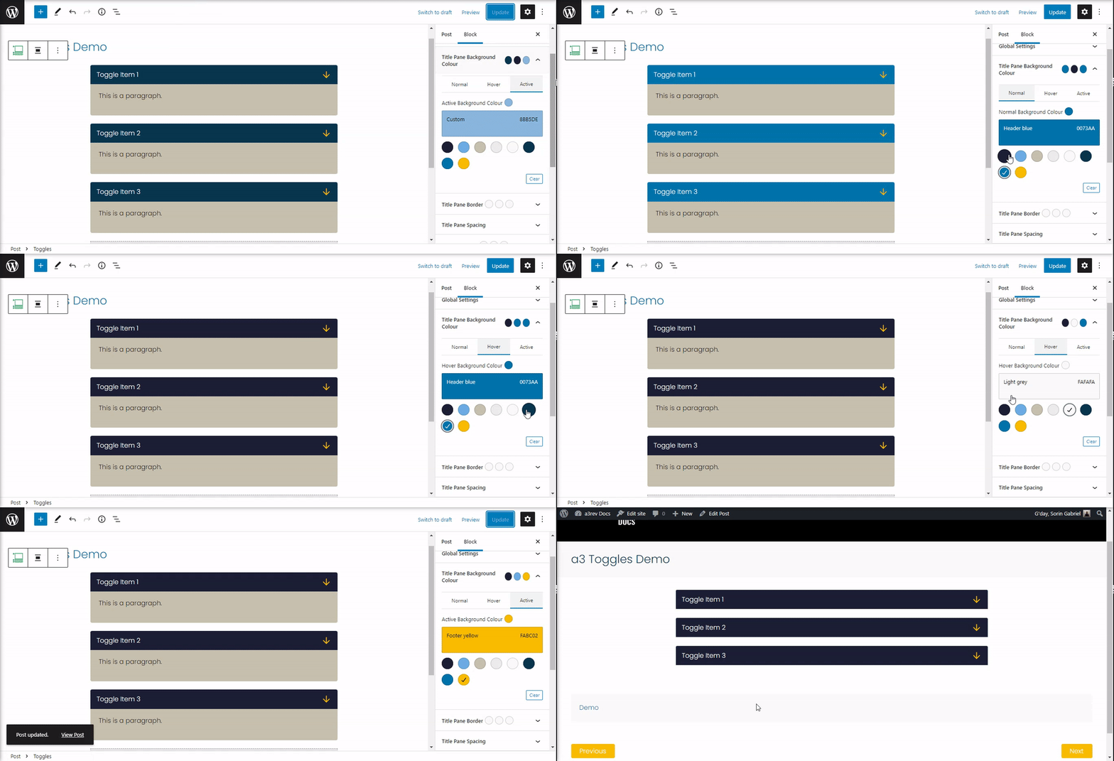
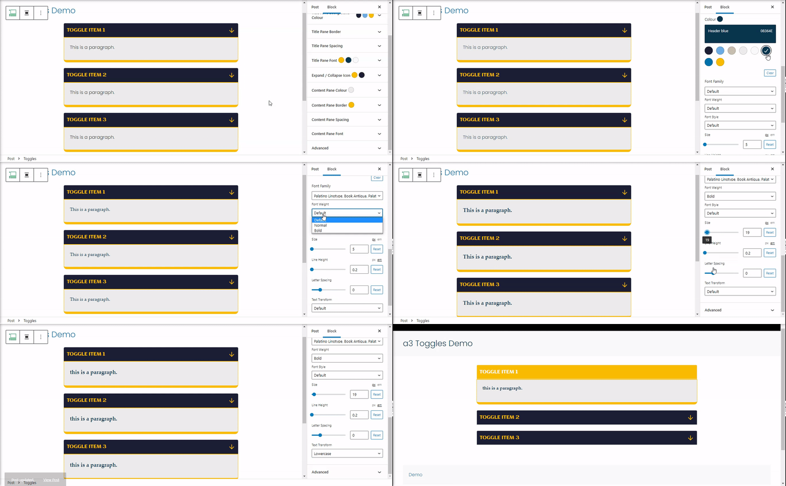
Title Panel Background Colour
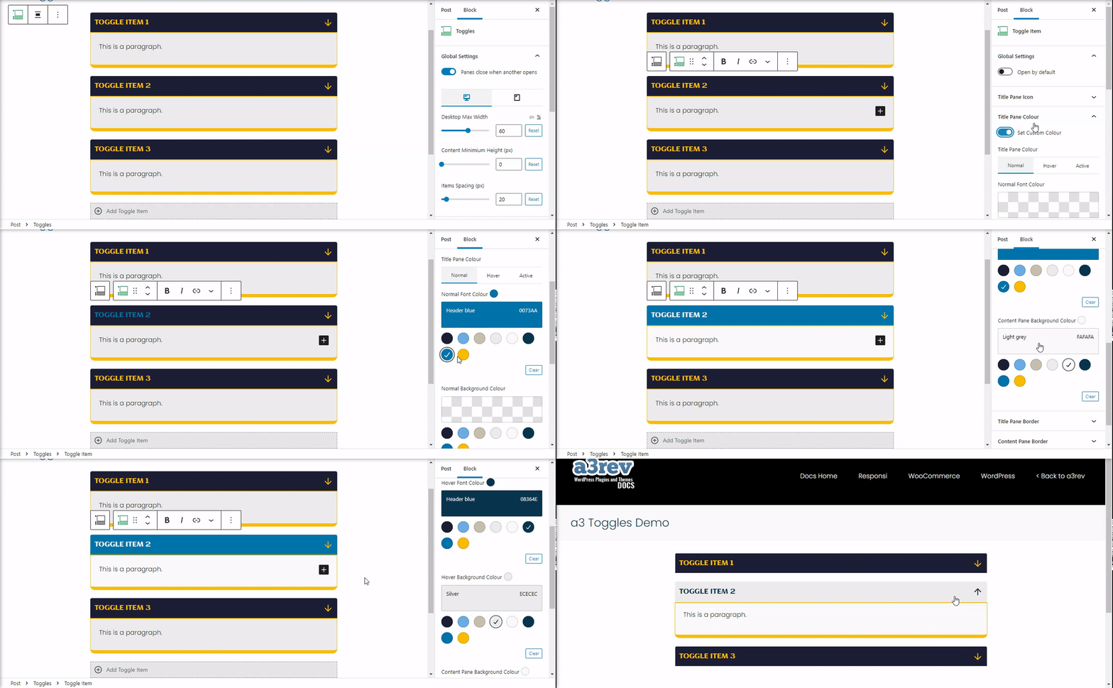
Style the background color of the panel title. Setup a color for the Normal, Hover or when the panel is active (open).
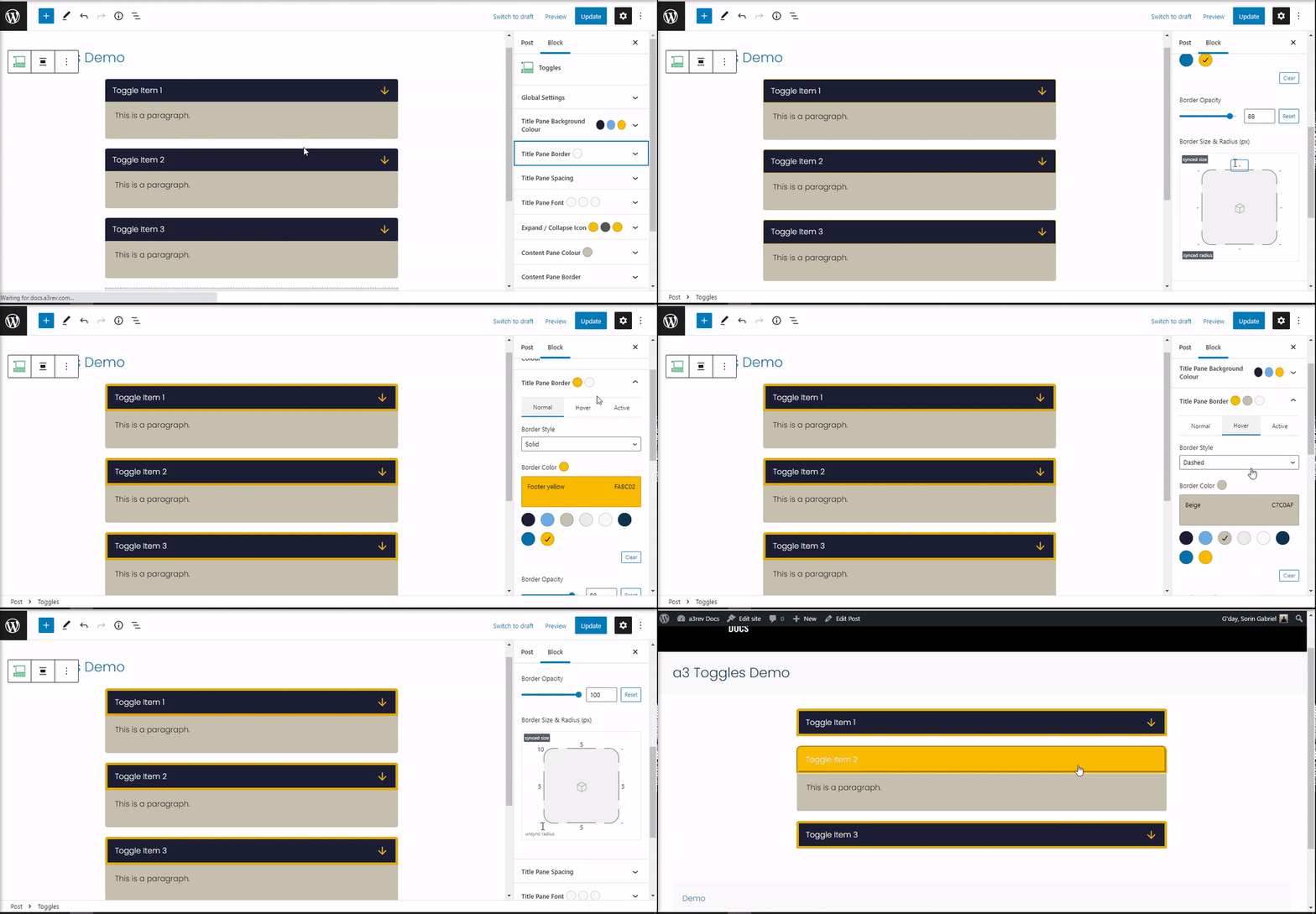
Title Pane Border
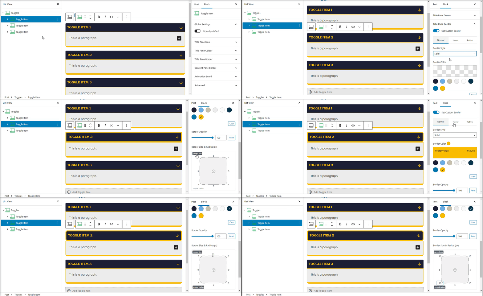
Setup and style a border for the items pane. The border can be for Normal, Hover or active items. Note* all the items can have individual borders that will override these settings. Not set any border for individual items than these settings will be used.
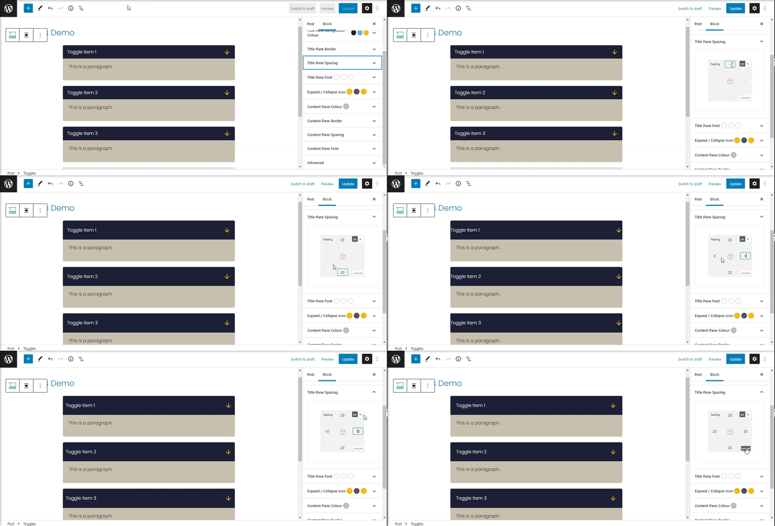
Title Pane Spacing
Add a space between the title and the container border. Select from percent or pixel units.
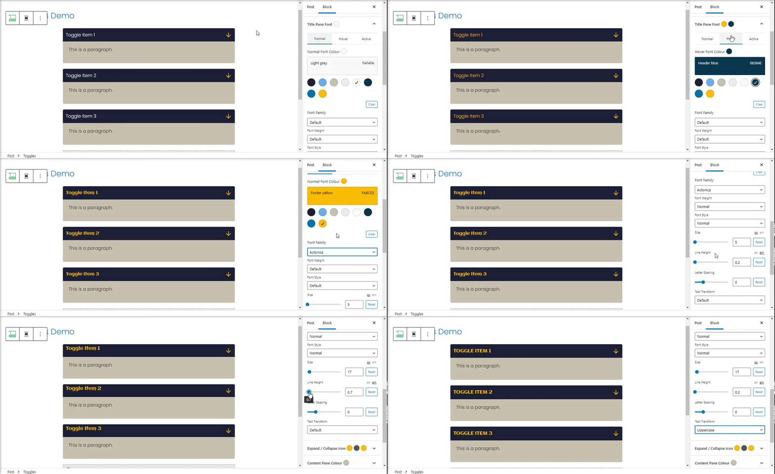
Title Pane Font
Set up a custom font for the pane titles.
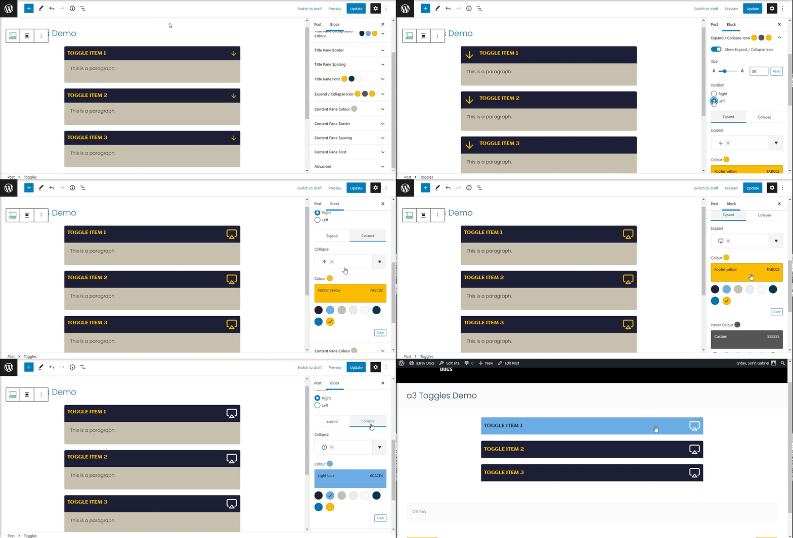
Expand / Collapse Icon
Customize the icon that show on panes title container. The expand and the collapse can have differed icons with ones style.
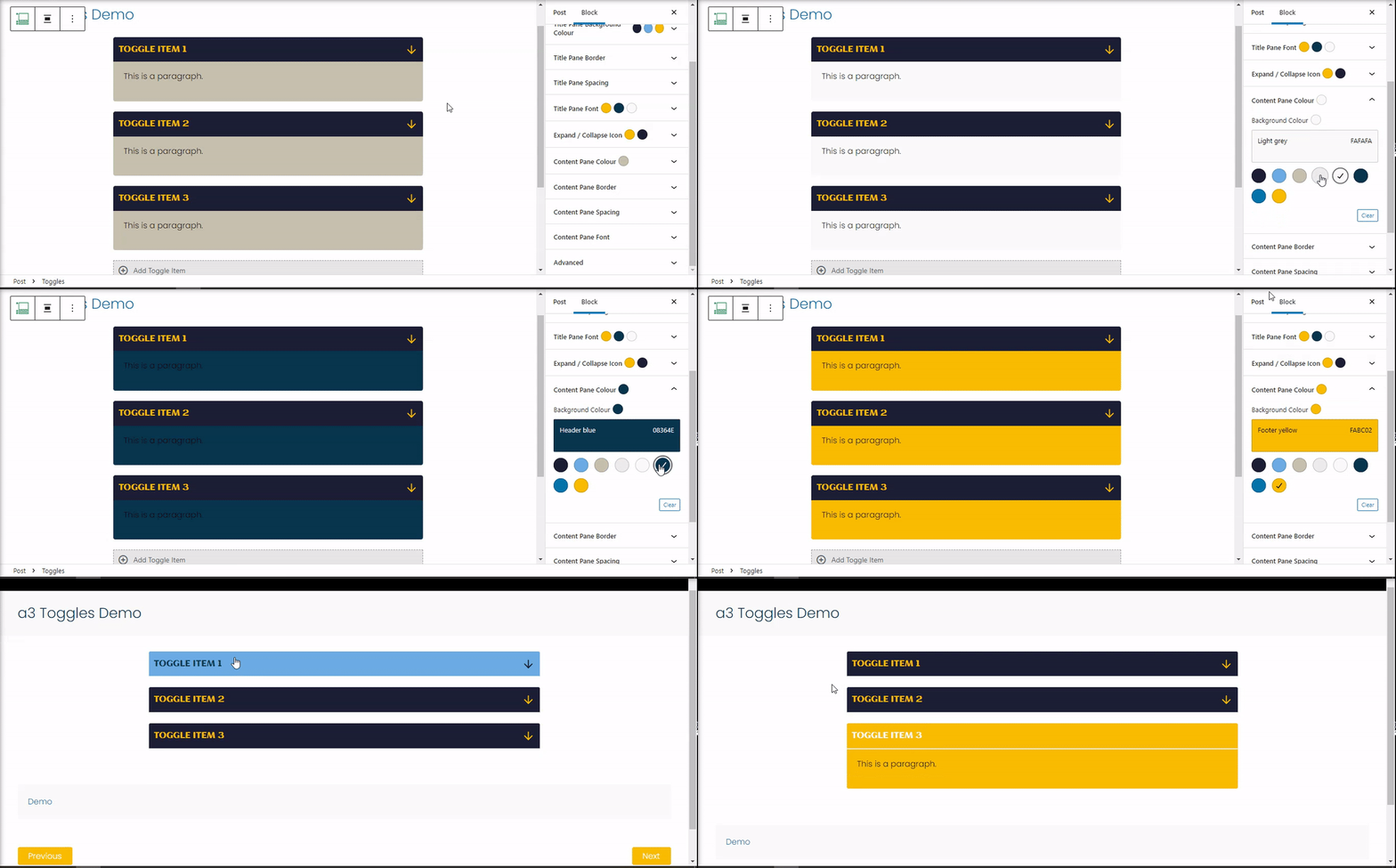
Content Pane Color
Choose a color for the content pane background.
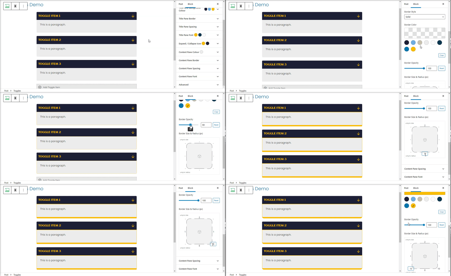
Content Pane Border
Add borders to the content pane container.
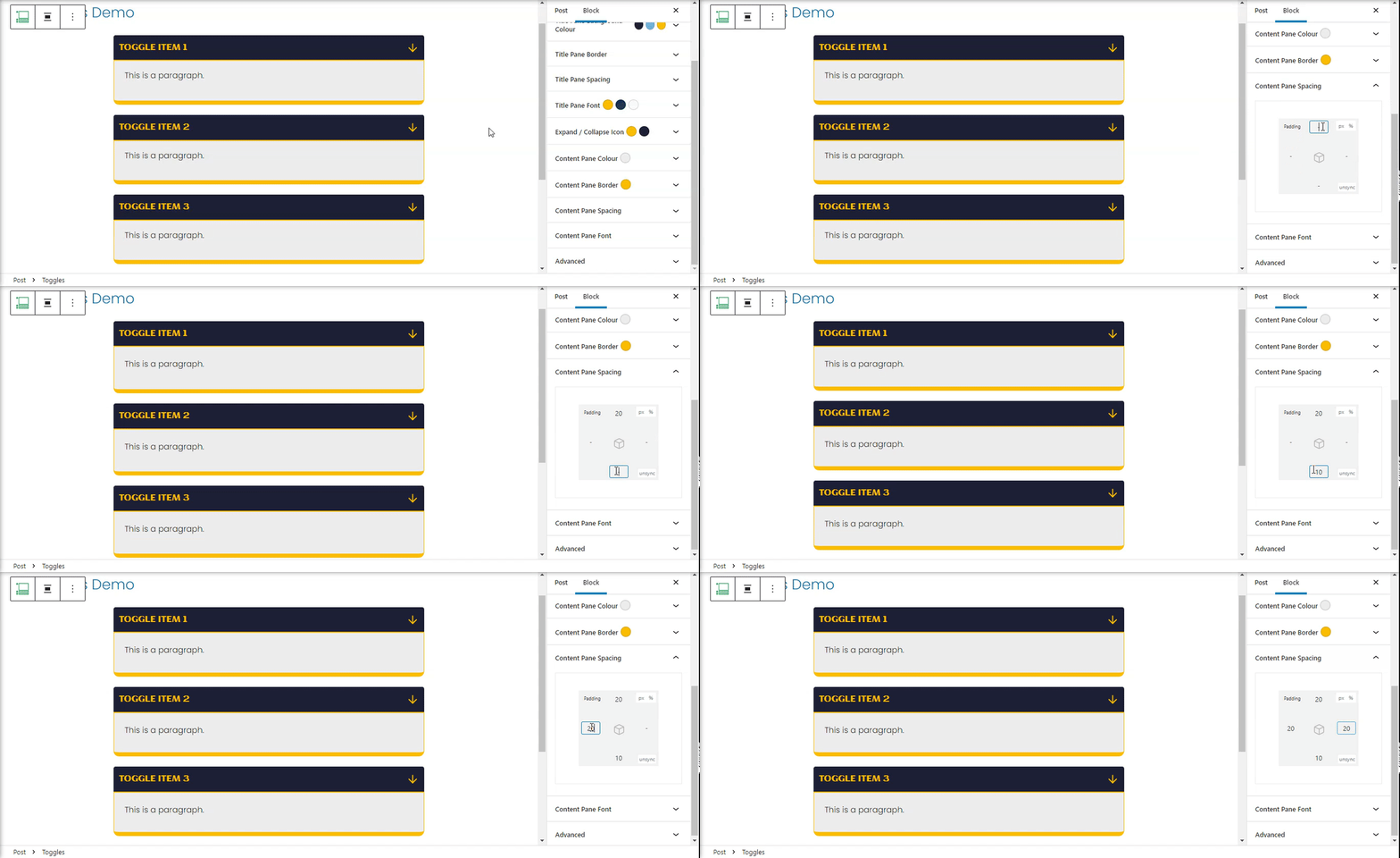
Content Pane Space
Add a custom space between content and container borders.
Content Pane Fonts
Like on titles the content also have a option for custom fonts. Setup a general font for all the items content.
Advanced
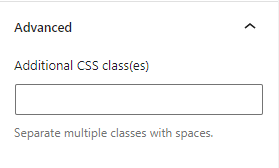
The advanced tab lets you add a CSS class to your block, allowing you to write custom CSS and style the block as you see fit.
Toggle Items
*Note: Changing a setting for a individual item will override the ones from general.
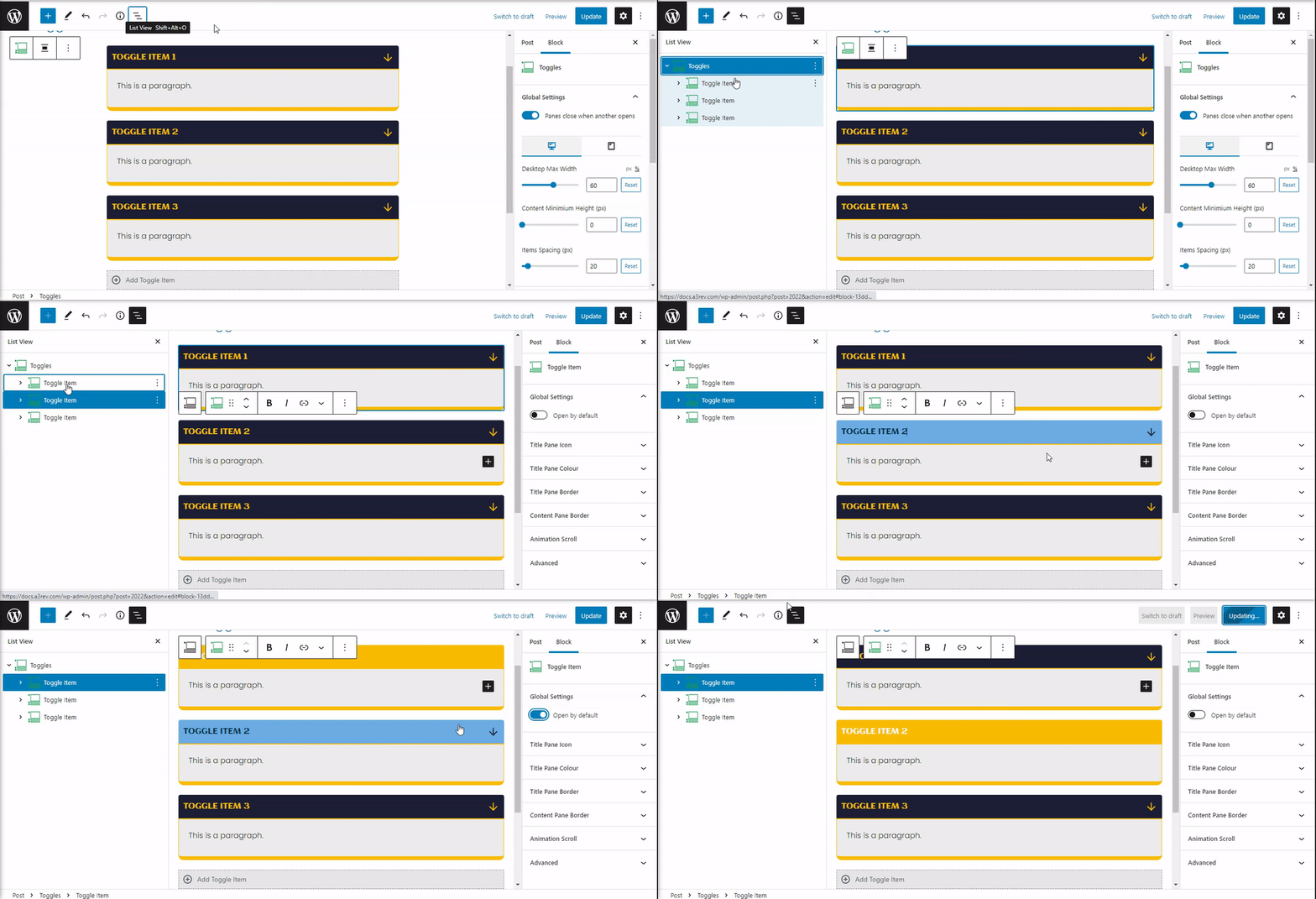
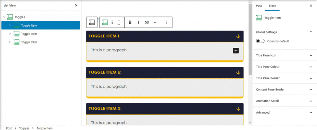
Choose a toggle item by selected from List View or clicking directly on it. The settings will reveal on right side.
Each toggle item can be Open by default by selecting the option On.
Title Pane Icon
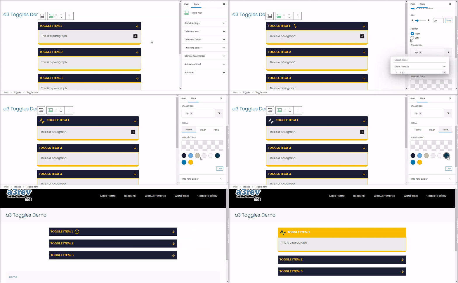
Set On and you can add a custom icon for the toggle item title.
Title Pane Colour
Change the font and background colour of a selected pane title.
Title Pane Border
Add a custom border for the selected title pane item.
Content Pane Border
Add a custom border for the selected content pane item.
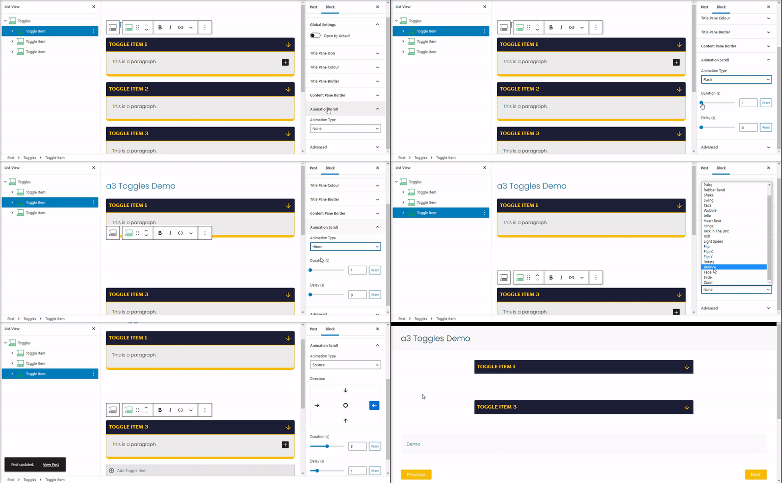
Animation Scroll
Add amazing scrolling animation for Toggles Items. Each item can have individual animation. Has 21 animation styles with option for Duration and Delay
Advanced
The advanced tab lets you add a CSS class to your block, allowing you to write custom CSS and style the block as you see fit.

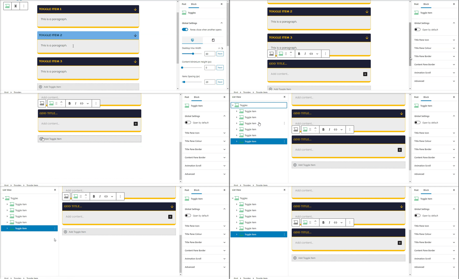
Add New Toggle Item
To add a new toggle item just press the + symbol below each of the tabs.
