a3 Row Block allows you to insert text, media, and other types of content into up to four columns. When used one after another, the columns create responsive layouts for your pages and posts. With the responsive settings, you are able to easily control the way your columns collapse in mobile or tablet screens.
Navigation
Getting Stared
a3 Row Block allows you to insert text, media, and other types of content into up to four columns. When used one after another, the columns create responsive layouts for your pages and posts. With the responsive settings, you are able to easily control the way your columns collapse in mobile or tablet screens.
Our Row Block is much more powerful and flexible version of the core Gutenberg columns block, having easier column management and more precise column controls. It brings a flexible advanced Columns block that acts as an outer wrapper and ability to add other blocks, not limited to a3 blocks, inside the columns.
So to get started chose the a3 Row block from a3 Blockpress block list.
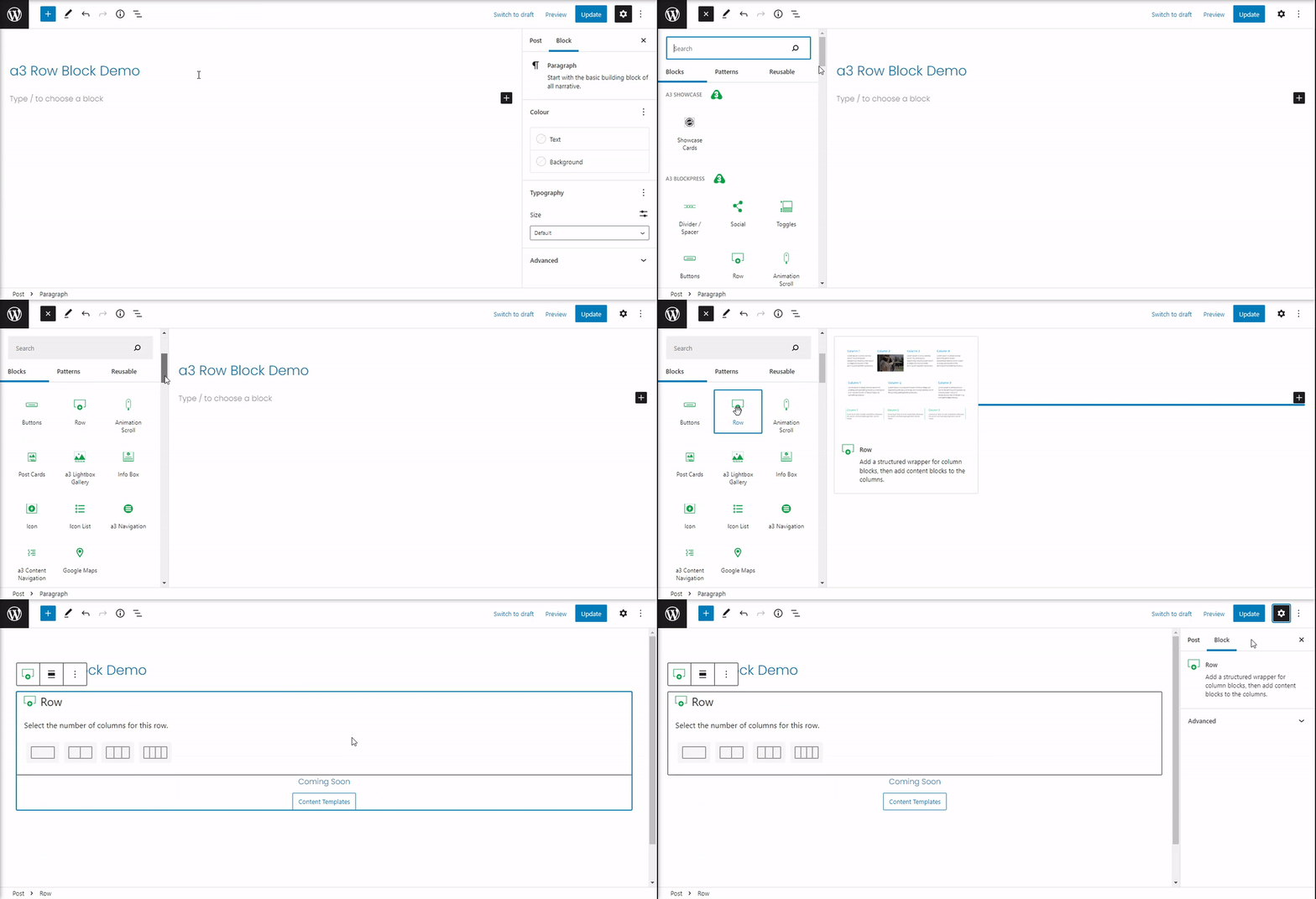
Select Row Layout
After the block is insert you will need to select the number of columns for this row. You can have a maximum of 4 columns (there is a way to insert more columns by adding another row in a column > see section). The number of columns can be edit/remove also from the Row Settings Panel (see later in this documentation).
Next after the number of columns where set we need to select a layout for them. You have the option to choose from a couple of layouts with pre-set column widths. All the column widths are flexible, so you can customize them as you need.
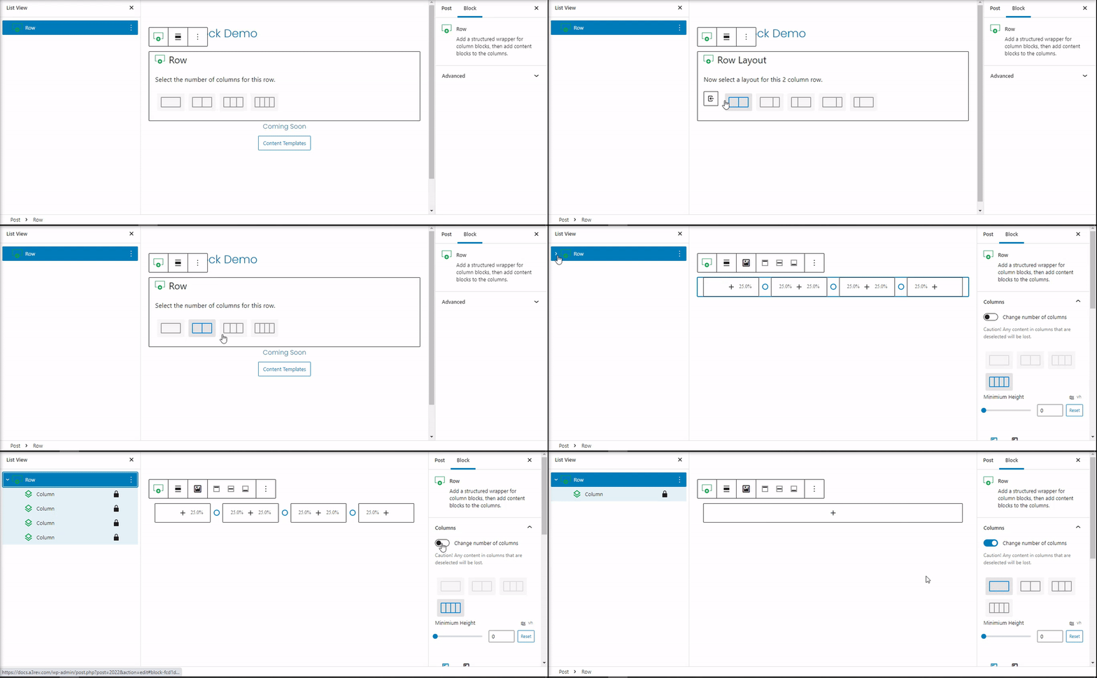
- Caution! Any content in columns that are deselected will be lost.
Configure Columns
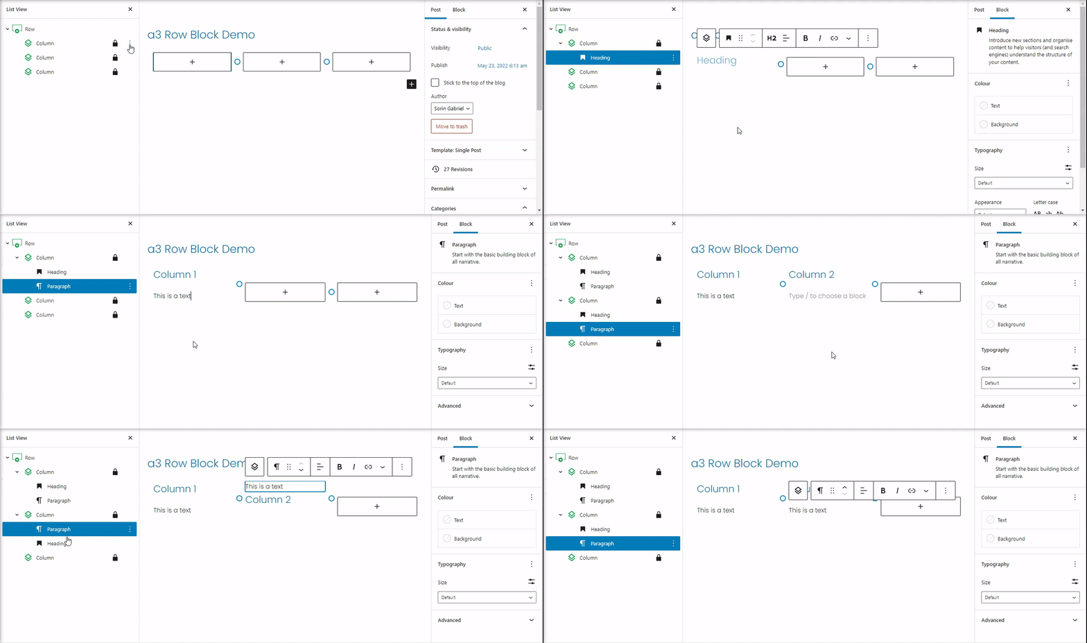
If you wish to adjust the column’s widths afterwards, you can do so by easily dragging the corners of the column. When hovering over the column, you will find a small circle on the side which indicates that you can drag it in order to resize the column.

Access Block Options
To make sure that this block can be used in unlimited situation the row and columns have separate option.
The row settings are for the entire wrap of the columns. Sets as Minimum Height, Content Max Width, Gutter Space (spacing between columns), Row Background, Dividers, Fonts, Visibility settings for Devices or User.
The columns settings let you style each column different as they have settings for Spacing, Background, Font, Borders, Animation, Visibility settings for Devices or User.
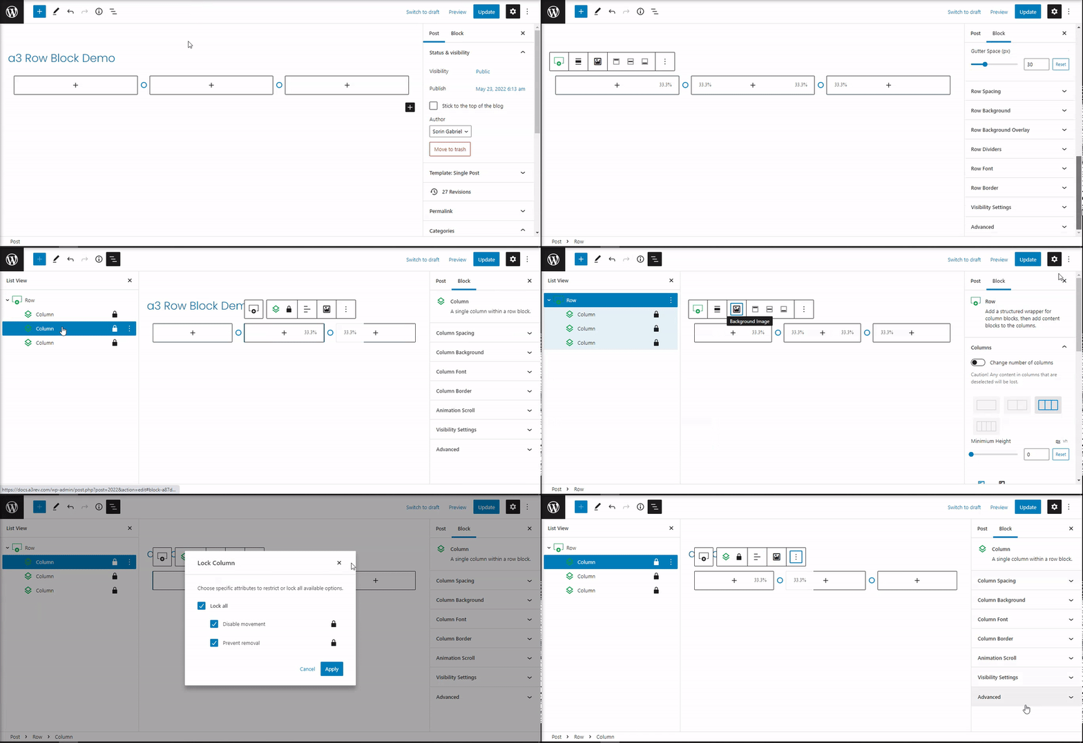
To access the row or column options you can click on directly on them or select them from View List. After so the Toolbar and the block options will be reveal.
Add a block
Now that we have set up the configuration for our Row it’s time to add a block and some content. You can use any Block, select the column from View List or just simply click on the + sign on witch column you want to add content. After the content is add you can easily change the blocks between the columns with click and drop.

Row Options and Style
Ok so now that we cover most of the utility’s of the block it’s time to get thru Row Settings, Options and Style.
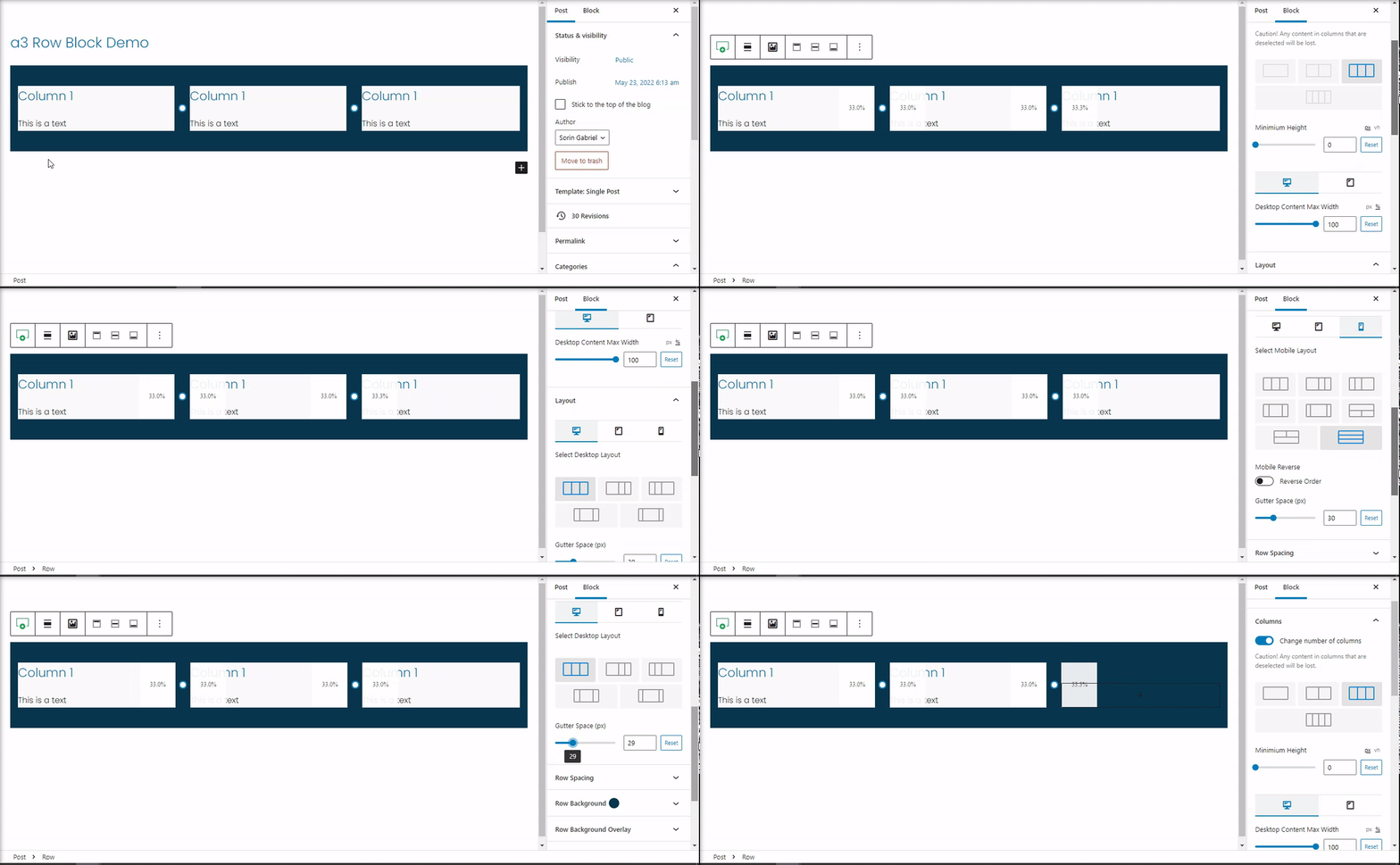
When the row layout block is selected, you should see options for adjusting the number of columns, adjust the Minimum Height of the layout of your columns, Desktop Content Max Width with setting for Pc and Tablet, Select the layout for desktop, Tablet and Mobile devices . Below that, you should see options for the column gutter (spacing between columns).
Row Block Toolbar
Every Row block have their own block-specific controls that allow you to manipulate the block right in the editor.
The a3 Row Block shows five buttons:
- Drag
- Arrow
- Change Alignment
- Background Image
- Vertical Top
- Vertical Middle
- Vertical Button
- Block More Settings

Row Block Spacing
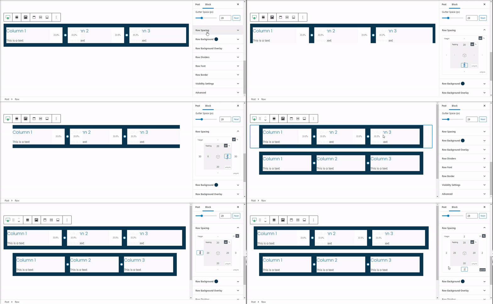
The padding and margin settings will allow you to adjust the blocks spacing in relation to the other blocks on your page. The space can be in px or % for a full control of the row wrapping also the values can be synchronize or unsynchronize.
Row Block Background
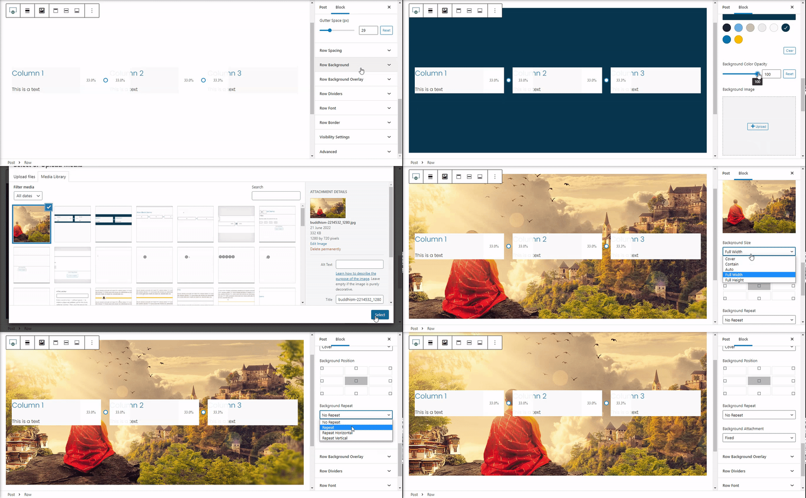
Following your spacing settings, you can move into setting for background. Toggle on the Background setting and then select your background color or image.
Row Block Background Overlay
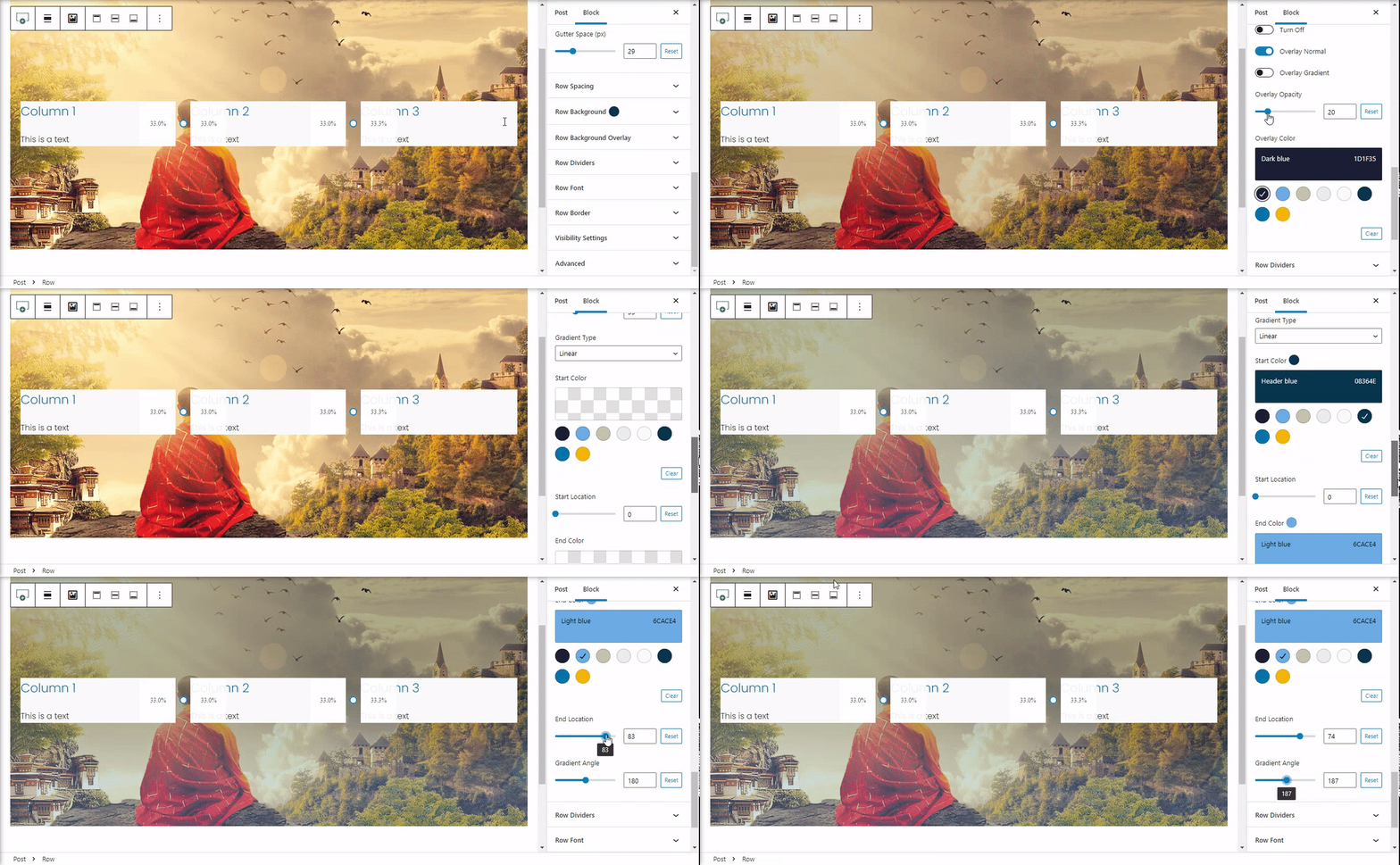
Using the overlay color options, you can add a color overlay to the background image. By default, this is off. Choose from a solid color or a gradient.
Row Block Dividers
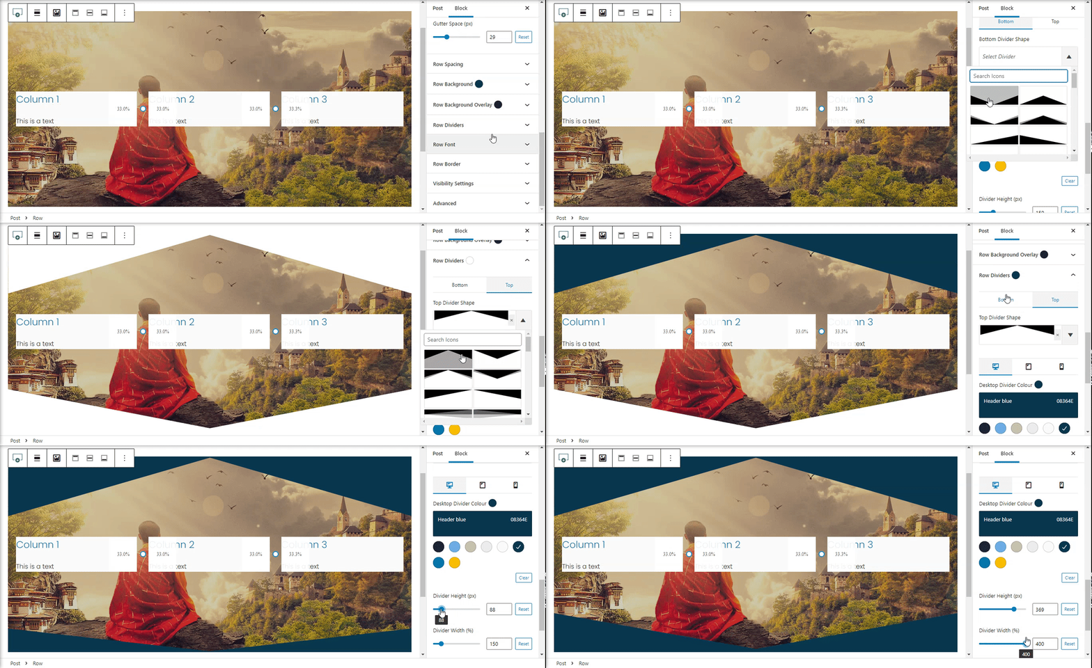
You can use the Block Dividers along side with Block Backgrounds to enhance your section designs.
It provides shape dividers for outer wrapper column.
- Dividers can be added to top as well as bottom of the column
- Different shape dividers are available along with color, height etc settings
Row Block Font
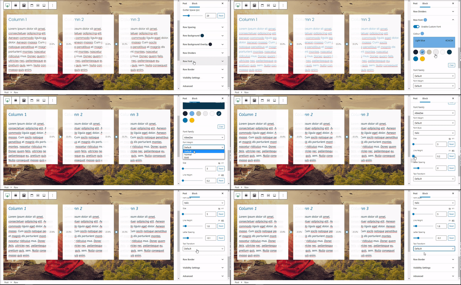
Once you’ve selected the Row Font, you should see that the Custom Fonts is Off. Turn it On and all of the options will be display. Set up a custom font will let you very easy to define a general font for all your row columns. Remember that you can set custom fonts on each column individual. See Columns Fonts Settings.
Note: The blocks that have settings for custom fonts will override Row Custom Fonts size.
Example: Gutenberg Paragraph Block have option for custom font, like you see on the bellow video the size of the font will not change. This option is usually use for blocks that don’t have Custom fonts like > HTML block.
Row Block Border
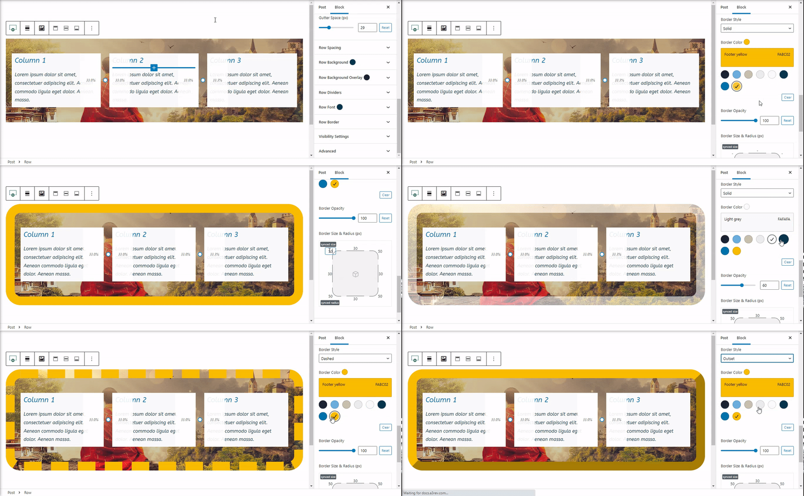
Add a border to the row container. Style the wrapper section to match your website design.
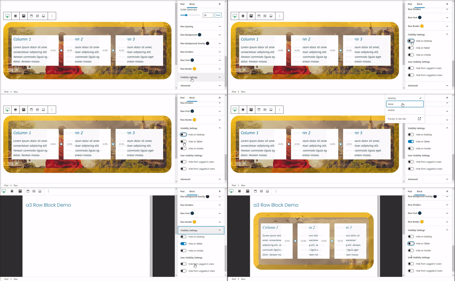
Row Block Visibility Settings
This setting is giving users complete control over how they want to manage block visibility.
There are two types of options:
- Visibility for devices: Desktop, Tablet and Mobile
- User Visibility Settings: Hide from Logged in Users with a optional option for Hide from Specific User Roles or Hide from Logged out Users
Advanced
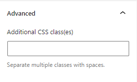
The advanced tab lets you add a CSS class to your block, allowing you to write custom CSS and style the block as you see fit.
Columns Style and Options
a3 Row block also allows for customization of each individual column. By selecting the column within your row layout, you can adjust the settings individual of all other columns.
First select the column you want to style and the options will be reveal on sidebar settings and also on toolbar.
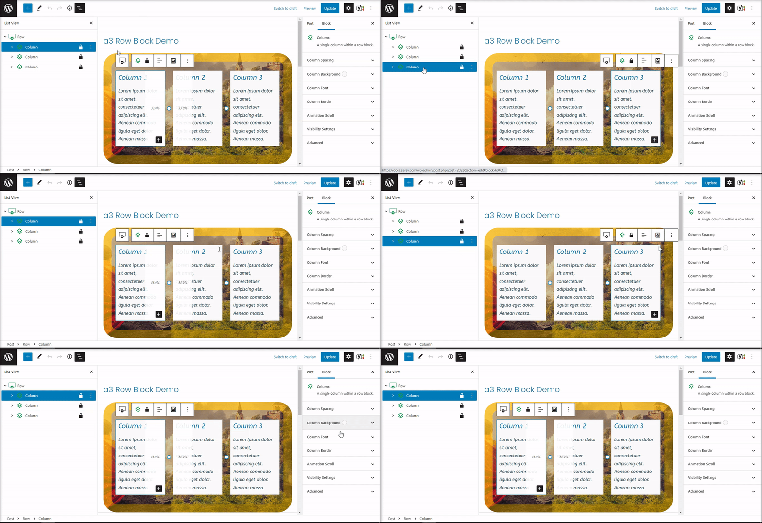
Column Toolbar
Most blocks have their own block-specific controls that allow you to manipulate the block right in the editor.
The a3 row Block columns shows five buttons:
- Transform to – Select the row of the specific column.
- Lock/Unlock – Choose specific attributes to restrict or lock all available options.
- Change text alignment – You can change the text of a column to right center or left.
- Background Image – Add directly from here a image to be used as background for the column.
- More options – The block general options.
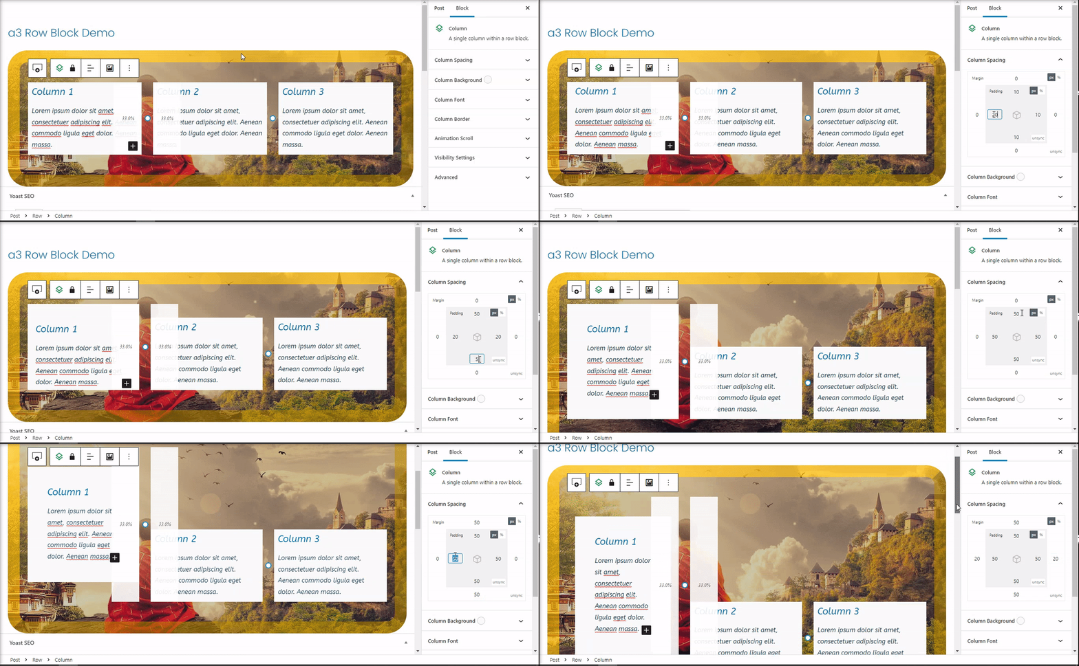
Column Spacing
For individual Column you are able to customize the padding and margin with options as shown below.
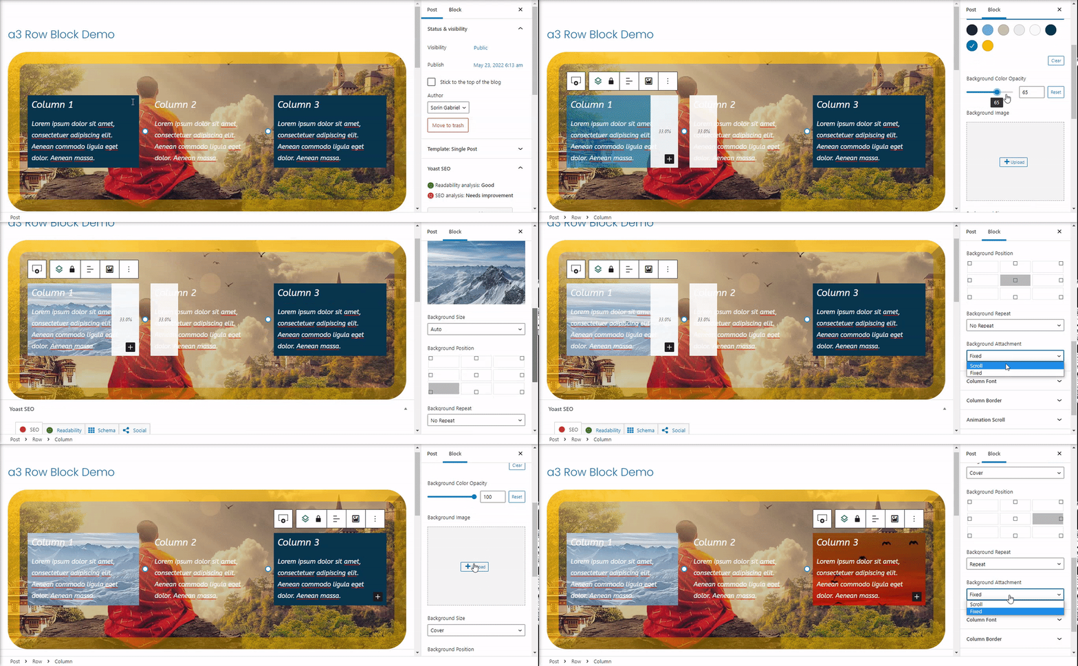
Column Background
Adding a Background to individual columns will enclose the contents of the block in a styled container.
Just select the specific column, and then navigate to the Column Background, where you will see the Container Background option. Toggle it on and then select the background color or image with next options.
Column Fonts
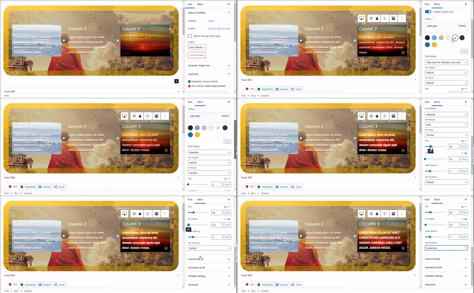
Each column have option for custom fonts. Once you’ve selected the Column Font, you should see that the Custom Fonts is Off. Turn it On and all of the options will be display. Set up a custom font will let you very easy to define a individual fonts for each column.
Note: The blocks that have settings for custom fonts will override Column Custom Fonts size.
Example: Gutenberg Paragraph Block have option for custom font, like you see on the bellow video the size of the font will not change. This option is usually use for blocks that don’t have Custom fonts like > HTML block.
Column Border
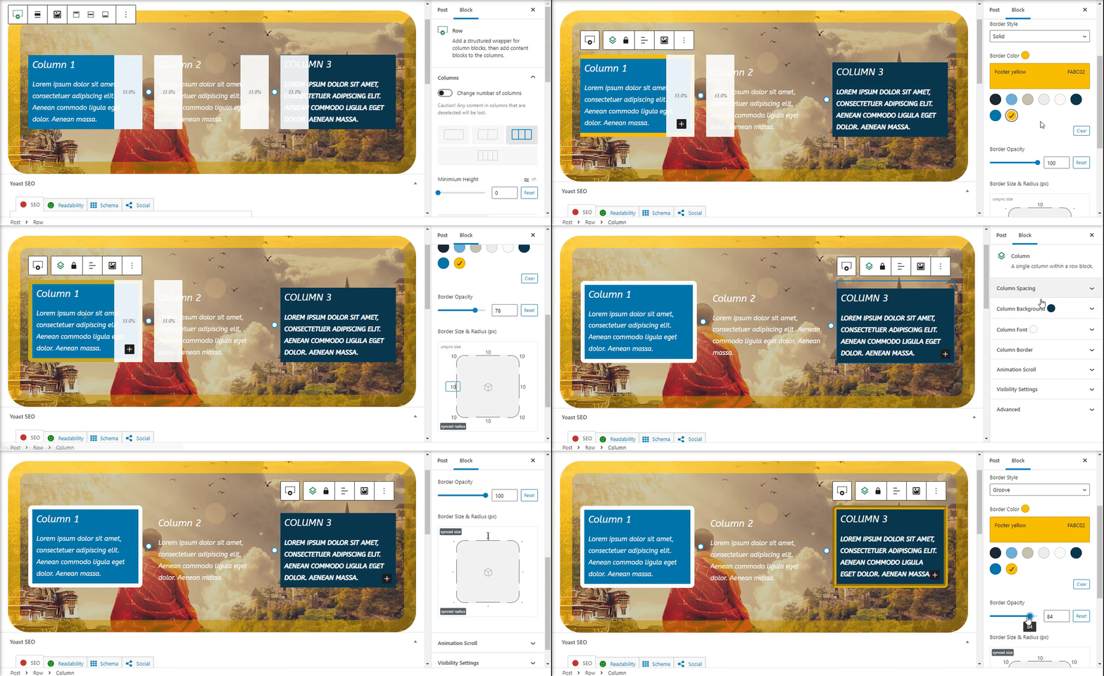
The next setting are for borders to the columns container. They work exactly like Row Border just for columns you can have individual borders for each of them.
Animation Scroll
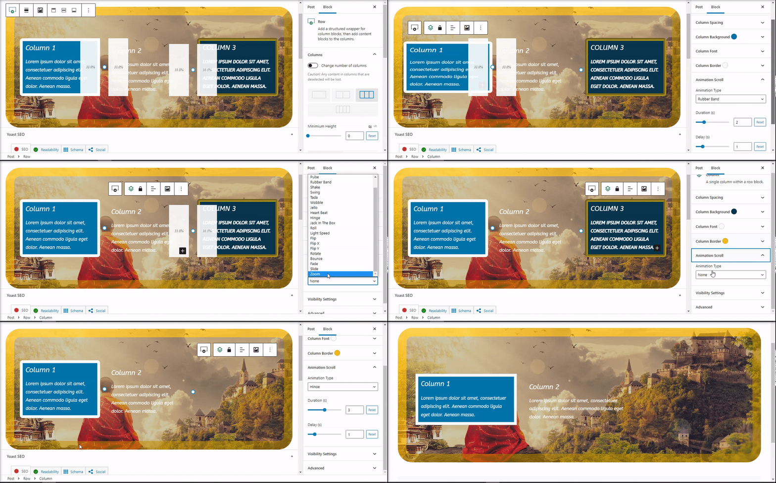
This option if it’s On will add a animations for your columns to make them more dynamic when scrolling. Choose from our 21 animation type. Each column can have it’s individual effect.
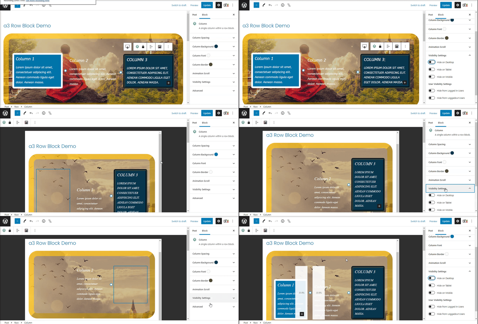
Visibility Settings
Like on Row we have same settings for visibility of columns. Giving users complete control over how they want to manage columns visibility.
There are two types of options:
- Visibility for devices: Desktop, Tablet and Mobile
- User Visibility Settings: Hide from Logged in Users with a optional option for Hide from Specific User Roles or Hide from Logged out Users
Advanced
The advanced tab lets you add a CSS class to your block, allowing you to write custom CSS and style the block as you see fit.

Mobile and Tablet Settings
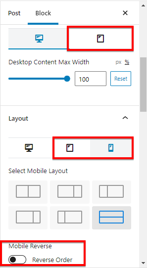
The Row Block has options for how to display the content on tablet and mobile browsers. So where you will see the icons for mobile and tablet they have special settings for them. In that way you can customize your content to match on all devices.
Mobile Reverse Columns
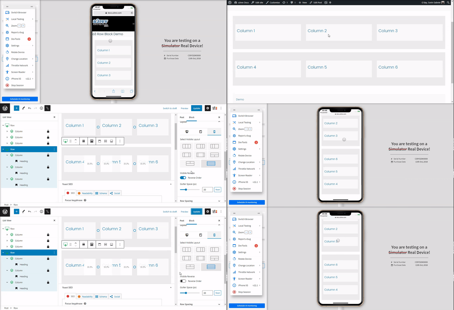
This is a great feature to create a full responsive layout. When seeing your page in a mobile, you may have noticed that the order of the columns might be undesirable. You can use reverse column switch if you want to change the order of the columns for a section in different screen sizes.
Tips and Tricks for a3 Row Block
Some helpful things that wasn’t mentioned above.
Duplicate Rows
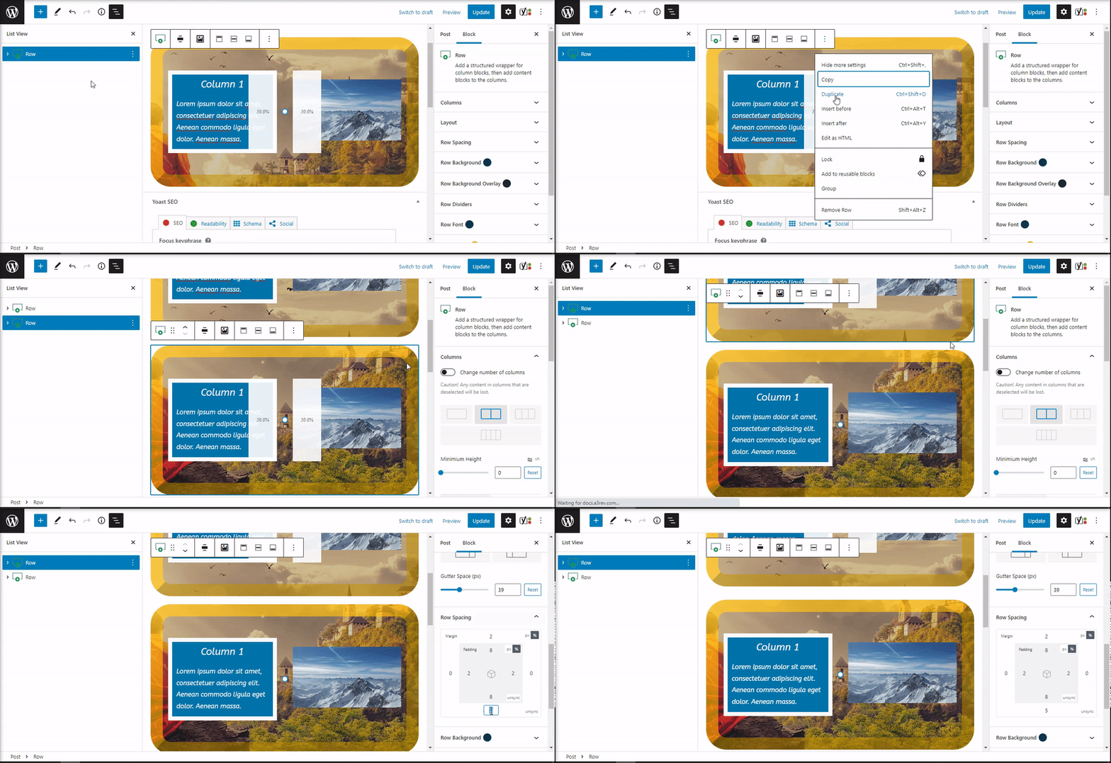
In order to duplicate a row you will need to use block More Options. The row will have same settings like the row you duplicate.
Create new Layouts
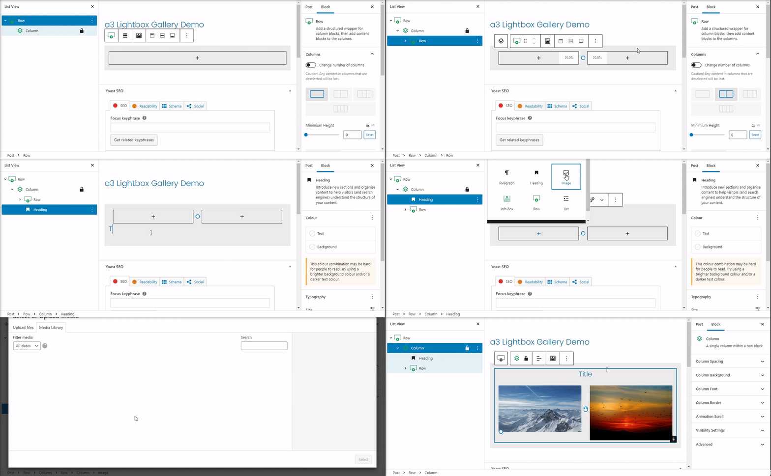
If you need to create your custom layouts you can do that by adding others rows into a column like in the example bellow. It can be use in so many way. For example you can add a title to your row.
