Getting Started
a3 Content Navigation is a very useful block when you have more context to display. Edit your site’s navigation adding quick page jumps to the page sections based on the headings, including built-in H2-H6 heading styles. Both in terms of structure and design. Will come in hand because of it’s simplicity to use but in the same time cover all your needs to have a very structural content. A good way to see how it work it’s already this page. Below will gonna see the option and veracity.
Add the Content Navigation block in the desired location
In order to add a a3 Content Navigation, click on the add block button and select the a3 Content Navigation block. You can also type “/navigation” block to add one quickly.
- Just like you do in Gutenberg, click on the (+) icon to insert a block.
- Search for the Navigation block and select.
- Make sure your contents have different headings for this block to work. When it will be add will come with a pre made structure.
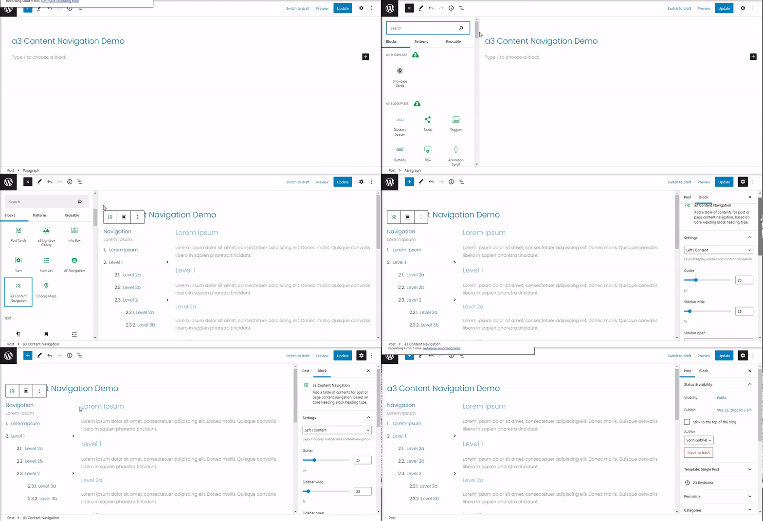
Block Configuration
After adding it, the block will generate a table of contents based on the headings presented on the page. You can remove, edit or add new headings. Basically those will be you navigation menu.
Let’s see how it work on a real situation
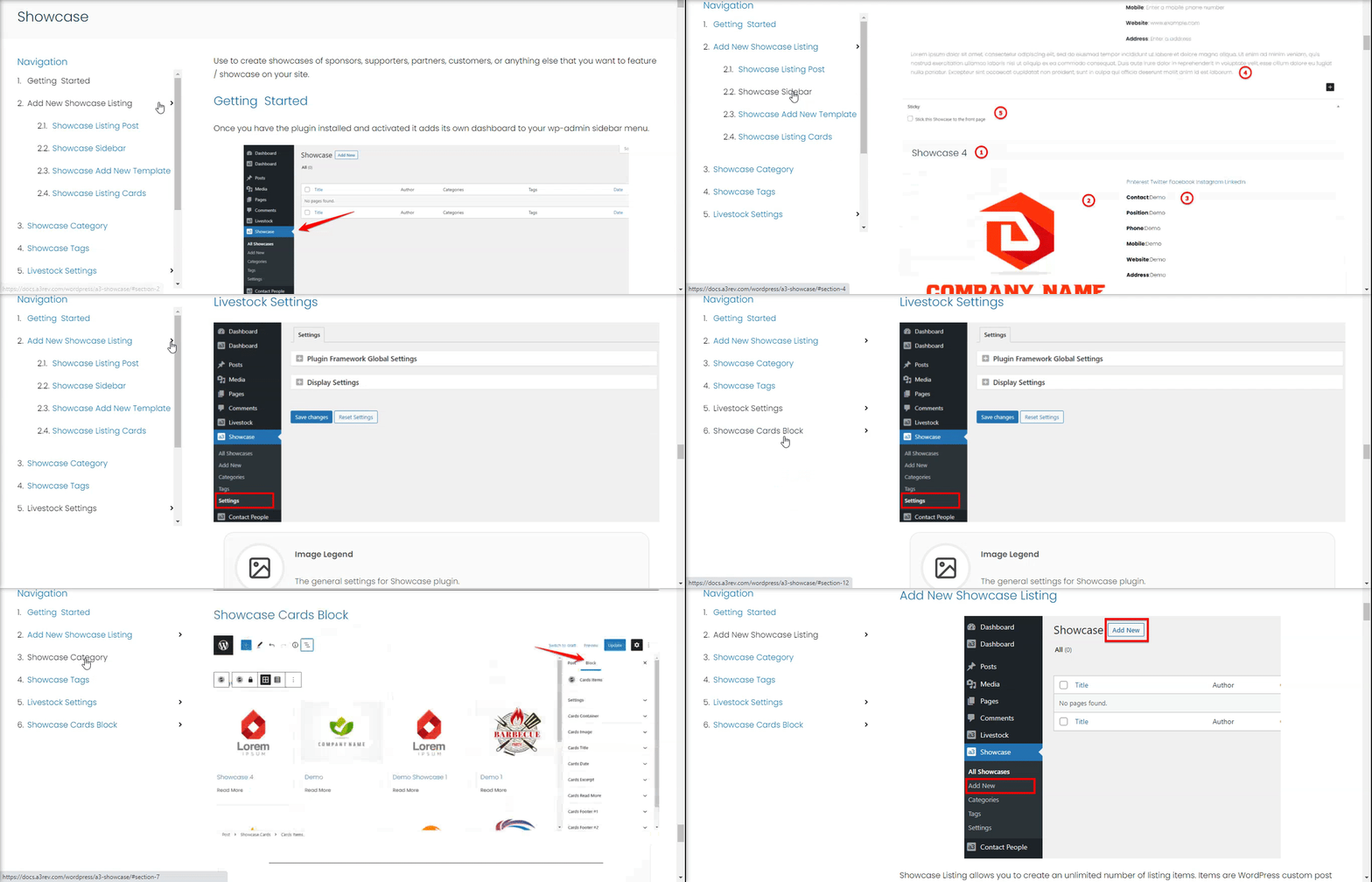
The long text is potentially off-putting for the readers, so you can try to improve a post’s presentation by including a navigation for your content. It will bring the reader to the desirable page part in a click like in above example.
The content navigation will show hierarchical headings and subheadings according to your post.
Content Navigation Settings
Layout display sidebar and content navigation
From all the Navigation or Table content blocks available at this date this one have the most option and settings to implement a long content hierarchically.
You will have to choose from 4 layouts:
- Default
- Hide Sidebar
- Left | Content
- Content | Right
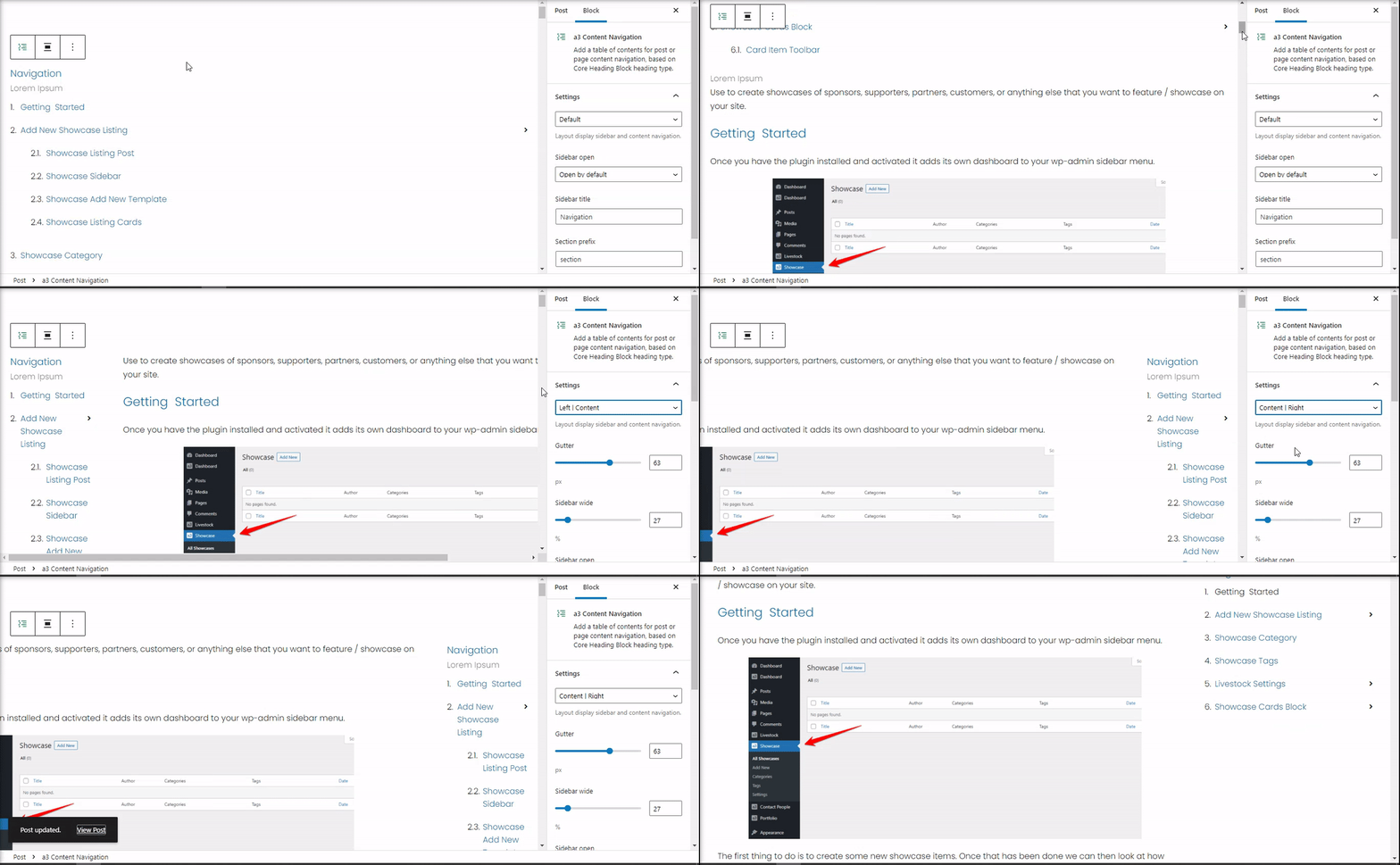
Select the Gutter and set the content wide.
- Note: The sidebar wide changes are not visible on backend page.
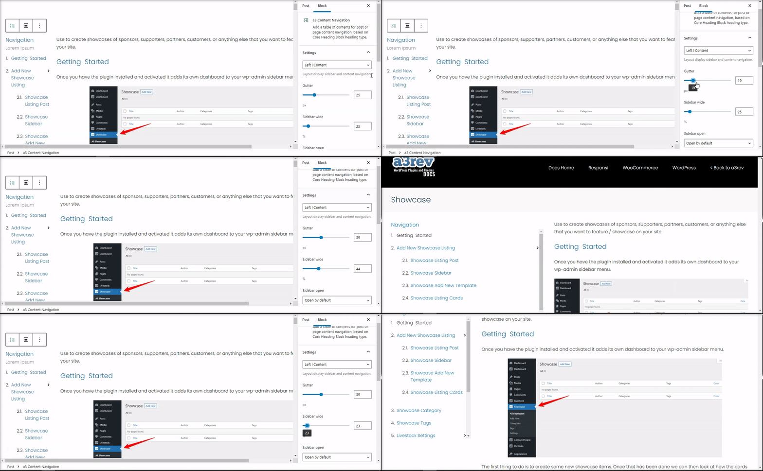
Sidebar open
You can chose how the content navigation sidebar will be open:
- Open by default
- Open on mouse click
- Open on mouse hover
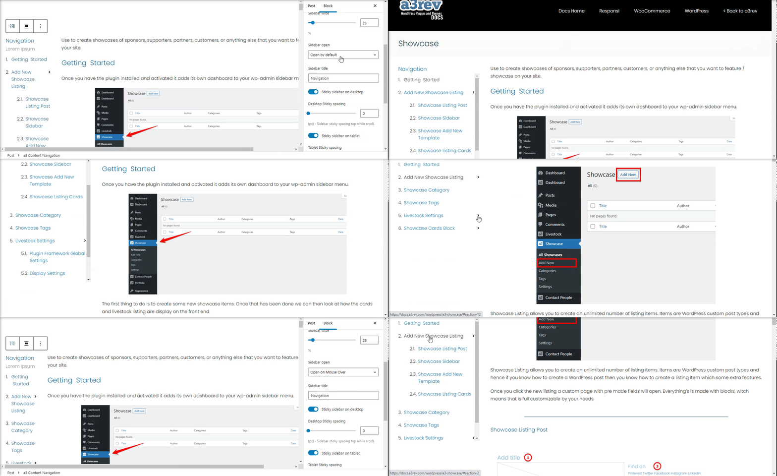
Sidebar title
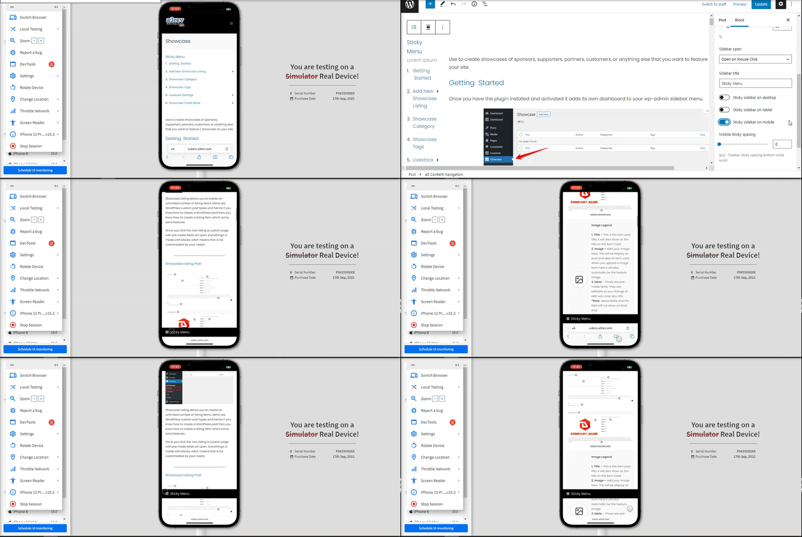
You can choose a name for the navigation or leave it and the sidebar will have no tittle. The default one is “Navigation”. Also can have the option to make your Sticky sidebar on desktop, tablet or mobile. To make it suitable for all devices you can set spacing top while scrolling.
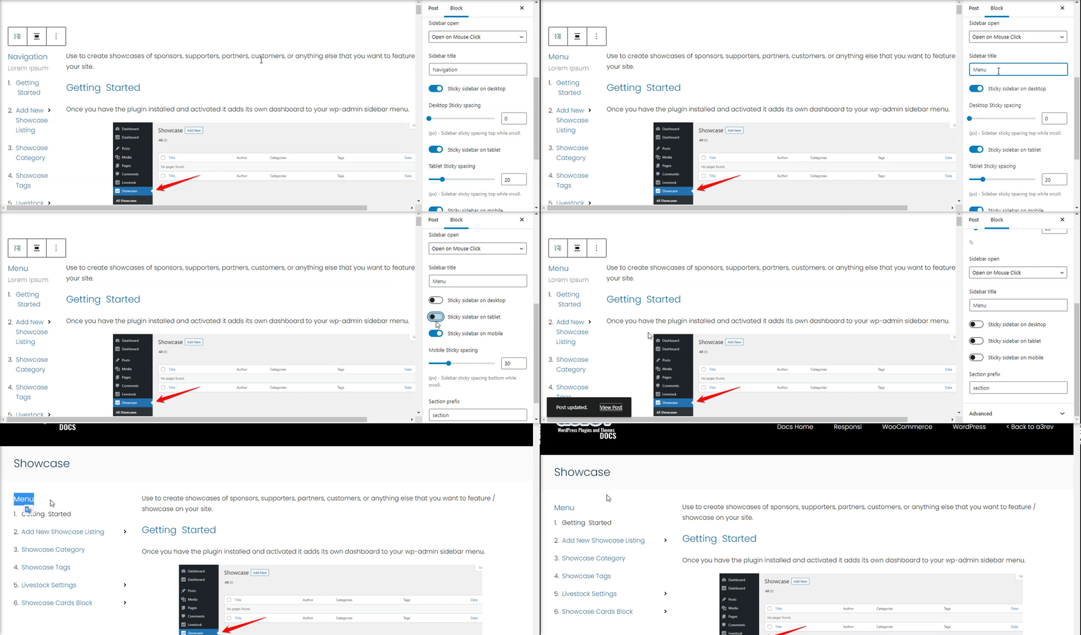
The Sidebar Content can be sticky that mean will roll with your content on scrolling or can be fixed. Desktop Sticky spacing will let you customize the layout to be same height like your content. There are option for Table, Mobile and PC.
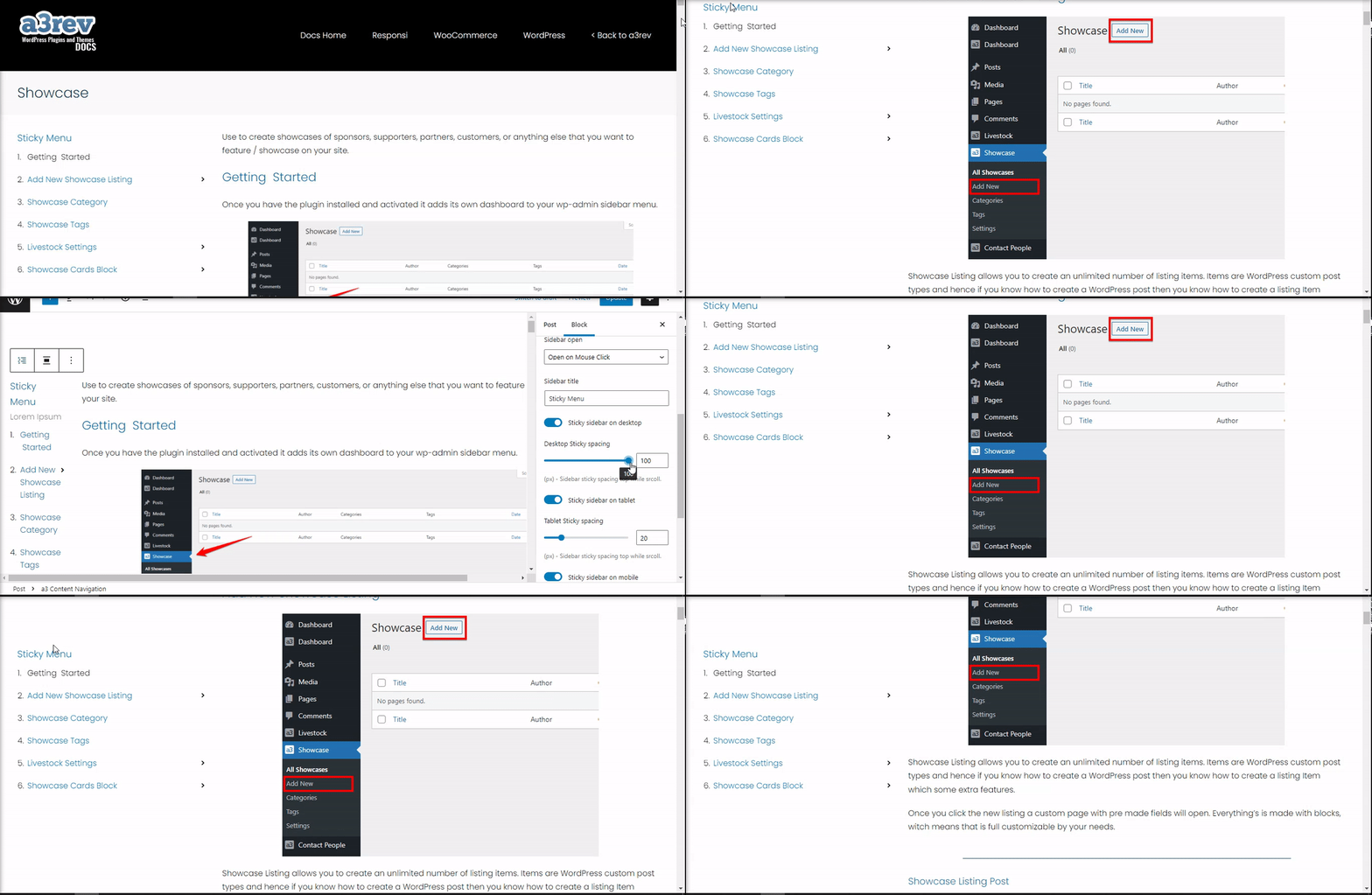
Tablet and Mobile devices
a3 Content Navigation is build to for all devices, make it sure your content will be easily enhance your user experience by providing an easy navigation process for website visitors.
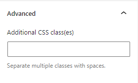
Advance
The advanced tab lets you add a CSS class to your block, allowing you to write custom CSS and style the block as you see fit.
